

ETF Mean Reversion Methods: Mean Reversion Mini-Portfolio Creation - Part 2
How four independent mean reversion systems combine into one adaptive mini-portfolio.


Welcome to the “Systematic Trading with TradeQuantiX” newsletter, your go-to resource for all things systematic trading. This publication will equip you with a complete toolkit to support your systematic trading journey, sent straight to your inbox. Remember, it’s more than just another newsletter; it’s everything you need to be a successful systematic trader.
I recently launched a portfolio tracking website (updated daily) that tracks my systematic trading portfolio performance, along with many supporting metrics. You can check in on my personal systematic trading portfolio performance anytime here: TQX Portfolio Tracker
Introduction:
In Part 1, we covered four independent mean reversion systems, each measuring oversold conditions in a completely different way.
Z_Reversion: uses z scores.
Vol_Reversion: uses volatility bands.
Vol_Reversion_2: enters and exits at different times and with different methods than Vol_Reversion.
RSI_Reversion: utilizes pre-calculated RSI entry levels and enters with a different timing mechanism than the other three systems.
Each system scales into positions across three sub-entries, and all four systems trade a multi-asset ETF universe spanning equities, bonds, gold, and bitcoin. This takes an “All Weather Portfolio” like approach to the trading universe.
If you haven’t read Part 1 yet, see the link below.
ETF Mean Reversion Methods: Four Systems Built for the Dip - Part 1

I’ve spent a lot of time in the past trying to build mean reversion systems on the entire US stock universe. I figured if I could find that perfect signal, it should work across everything. People say the US is a very mean reverting market, and maybe that’s the case, but I’ve always struggled to develop a system I’ve determined to be robust.
So, what happens when you stop evaluating systems in isolation and start combining them into mini-portfolios?
As I hinted at in the part 1 article, we will be combining these four systems into a mean reversion mini-portfolio.
Why use the term “mini-portfolio”? (warning, I use the term “mini-portfolio” a lot in the next few paragraphs)
Well, because I like to think of my own systematic trading portfolio as a portfolio of many smaller portfolios.
Trend mini-portfolio
Momentum mini-portfolio
Mean reversion mini-portfolio
Hedging mini-portfolio
etc.
The portfolio effect is super powerful when it comes to creating superior risk adjusted returns. One strategy may have mediocre performance on its own, but combined into a portfolio of many other strategies, that portfolio of mediocre strategies can look fantastic.
I like to look at mini-portfolios of similar methodologies first. I’ll get all the allocations and volatilities properly adjusted relative to each other. Then I’ll combine the mini-portfolio into the overall systematic trading portfolio. This just helps me build up my portfolio one block at a time. This is why I use the term “mini-portfolio”.
Take any one of these four systems and run it standalone. The stats look okay, nothing special. That’s fine. Because the real story isn’t the individual systems. The real story is what happens when you put them together to make the mean reversion mini-portfolio.
This part 2 article covers the mini-portfolio construction of these four mean reversion systems. I’ll show how four similar systems combined together beat one. Even though these are all mean reversion systems on a similar universe, because they all enter and exit positions using slightly different measurements and and methods, you can still get some powerful diversification benefit.
In this article we will cover:
The mechanics of how the combined portfolio works.
System correlations.
A system ranking mechanism that adapts allocations over time.
A Note For Paid Members:
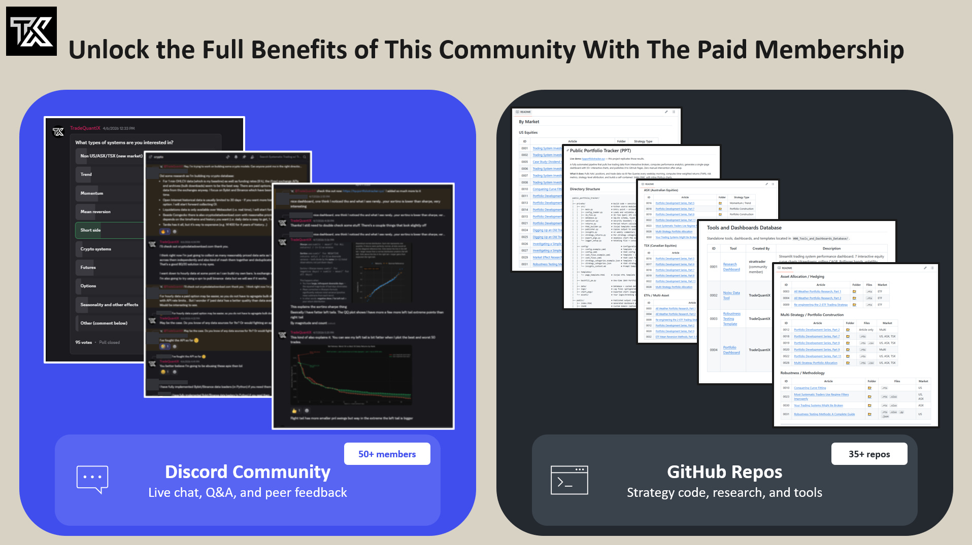
If you are a paid member and have not joined our Discord community, you can do so with the link at the end of the article.
Also, we launched a GitHub to cleanly store all our strategies and tools. When you join the Discord I’ll give you access to the GitHub (or if you don’t use Discord, just message me and I’ll give you GitHub access).
Part 1 Quick Recap - Sub-Entry Scaling Design:
In Part 1, I mentioned that each of the four mean reversion systems use three sub-entries to scale into positions. A couple readers asked why three sub-entries specifically, and why equal sizing across all three entries. So, let me address that here before we get into the mini-portfolio creation.
Why 3 sub-entries?
Why 3 sub-entries, not 2 or 5 or 10? Well, two sub-entries is really not that many more than just one entry, which is what every other system uses. Sure, two is still better than one and you’ll see lot’s of improvement going from 1 to 2 sub-entries to scale into your systems positions.
But, three is like that 80/20 principle where you start to get a genuinely more continuous measurement of oversold conditions without that much extra work.
You could go to five, but you need enough capital allocation to trade five sub-entries with meaningful size and you’ll probably need automation because placing 5 trades to scale into a single position would be very tedious manually.
As the account grows, I will increase sub-entries from 3 to 4 to 5 or more, and keep adding more mean reversion systems to this mini-portfolio. Three sub-entries is the sweet spot for my current capital base. It’s enough granularity to capture the average oversold price, but not so many that each sub-entry is “too small to matter” and I get eaten up by commission costs.
Why equal 1/3 allocation per sub-entry?
Why equal 1/3 allocation per sub-entry? Why not some biased allocation where you scale in more in the first entry and less in later entries, and vice versa?
Think of each sub-entry as a fractional allocation of the total signal.
Sub-entry 1 is a one-third signal strength.
Sub-entry 2 brings you to two-thirds signal strength.
Sub-entry 3 is the full signal strength and the full position size.
Equal weighting is deliberate. It may make intuitive sense to weigh later entries more heavily (buy more at better prices), but you have to be very careful with this. Optimizing for different sizing allocations on different sub-entries is a quick path to curve fitting.
Equal allocation for each sub-entry is the simplest, most robust approach. It scales linearly with the strength of the signal without introducing another optimizable parameter. It’s simple and it works well.
I am not against using non-equal weight scale-ins (to be honest, I’ve done it before), you just have to be super careful how you do it and not use that lever to curve fit the backtest to look better.
Remember, we care about future returns, not backtested returns. Keep in mind which approach is more robust and make sure that a non-equal weight scaling approach proves with absolute certainty to be just as robust as a stupid simple equal weight scaling in approach.
The Portfolio Effect: Why Run All Four Systems:
This is where a lot of systematic traders get tripped up. They look at the individual backtest results and think:
“System X has the best performance, why would I waste capital on the other three? I’ll just trade the best one.”
This is system level thinking. We need portfolio level thinking.
If you are only trading the system with the best backtested results, there is a high likelihood that something about those results is curve fit. It may not be wildly curve fit, but every system is curve fit to some degree.
If you only trade the best backtested system, sometimes it’s hard to know if it’s the best because it is actually better, or if it’s actually just the most curve fit.
The best way to get consistent, reliable live trading performance is to spread your risk across multiple different ideas, entries, and measurements. That means you are also inherently trading systems that do not backtest as nice as your best one. And that is okay.
Not only does this spread risk across the time axis (space entries over time) and price axis (space entries across different prices), but also the third hidden axis; which in this case is diversification. Diversification can be thought of as diversification of assets, but also diversification of ideas and implementation.
Spreading your trading across multiple ideas within multiple systems reduces the impact to the overall portfolio if one system underperforms. This basically is mitigating the impact of system failure risk.
Careful portfolio construction account for all these axis. Who cares what each individual system does. What matters is how they all fit together and how they spread risk across time, price, assets, ideas, and systems. The mean reversion mini-portfolio is just applying that same philosophy at a smaller scale.
The smooth, attractive equity curve you’ll see later in this article is a direct function of the portfolio effect in action. To get the portfolio effect with these four mean reversion systems, we will:
Combine multiple semi-uncorrelated strategies together.
Where each one looks at oversold conditions in different ways.
Where each one scales in over time and price in different ways.
Using a diversified basket of ETFs.
And scaling in to get the average oversold price.
When you combine a bunch of intentionally different strategies together, you can end up with an amazing looking portfolio.
The portfolio effect is the only holy grail in systematic trading.
This article is just applying the portfolio effect at a smaller scale with mean reversion specific strategies, creating a mini-portfolio that then plugs into your overall portfolio at a scaled down allocation so the broader portfolio benefits too.
An example of the Portfolio Effect in action:
Now let me give you a real example of the portfolio effect and it’s benefits in action. The Z_reversion mean reversion system has struggled on bonds (TMF) recently. The portion of this system that is allocated to bonds is in a significant drawdown.
Bonds have performed terribly with this system while the equity, gold, and bitcoin ETFs have done much better. But bonds stay in the basket of tradable ETFs and within the mean reversion mini-portfolio because it is an uncorrelated asset to everything else.
One day, bonds may save this mean reversion mini-portfolio when everything else is struggling. And when you look at the combined four-system portfolio as a whole (next section in this article), the bond drag barely even shows through to overall results. Today’s laggard may be tomorrow’s star. I intentionally selected this basket of ETFs to be diversified across assets.
The whole point of being diversified across assets is such that when one performs poorly, the others make up for it. That’s the “All Weather Portfolio” approach.
Removing bonds just because it has performed poorly recently is nothing more than pure curve fitting; and it also defeats the purpose for why these assets were selected in the first place.
The image below shows the equity curve of trading bonds with the first sub-entry of the Z_reversion mean reversion system.
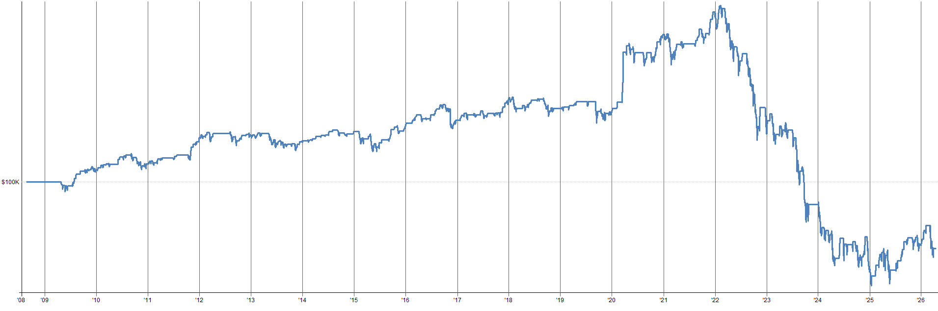
Looks terrible right? I agree.
It worked for awhile, but has recently started to not work too well. But, we have three sub-entries, not just one. How are the others performing?
See below for the equity curves of all three sub-entries of this Z_reversion mean reversion system on bonds.
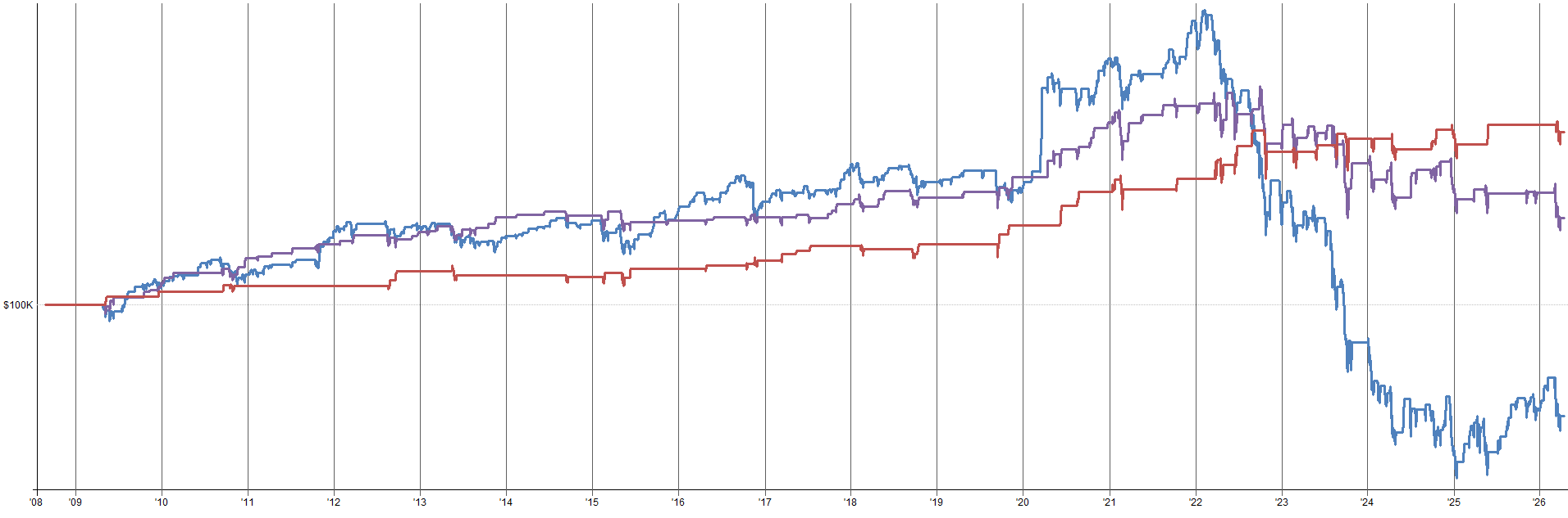
Sub-entry two (purple) is down recently too, but not nearly as bad. Sub-entry three (red) is actually still up and to the right and is not in a drawdown. While sub-entry one looks terrible, sub-entry two and three look significantly better.
So, simply using the three sub-entry scaling mechanism for entry time and price diversification is already very helpful. You could think of these sub-entries as the first three components of the mean reversion mini-portfolio.
The next image shows the three sub-entries equity curves one bonds in context with the three sub-entries on all other instruments this Z_reversion system trades.
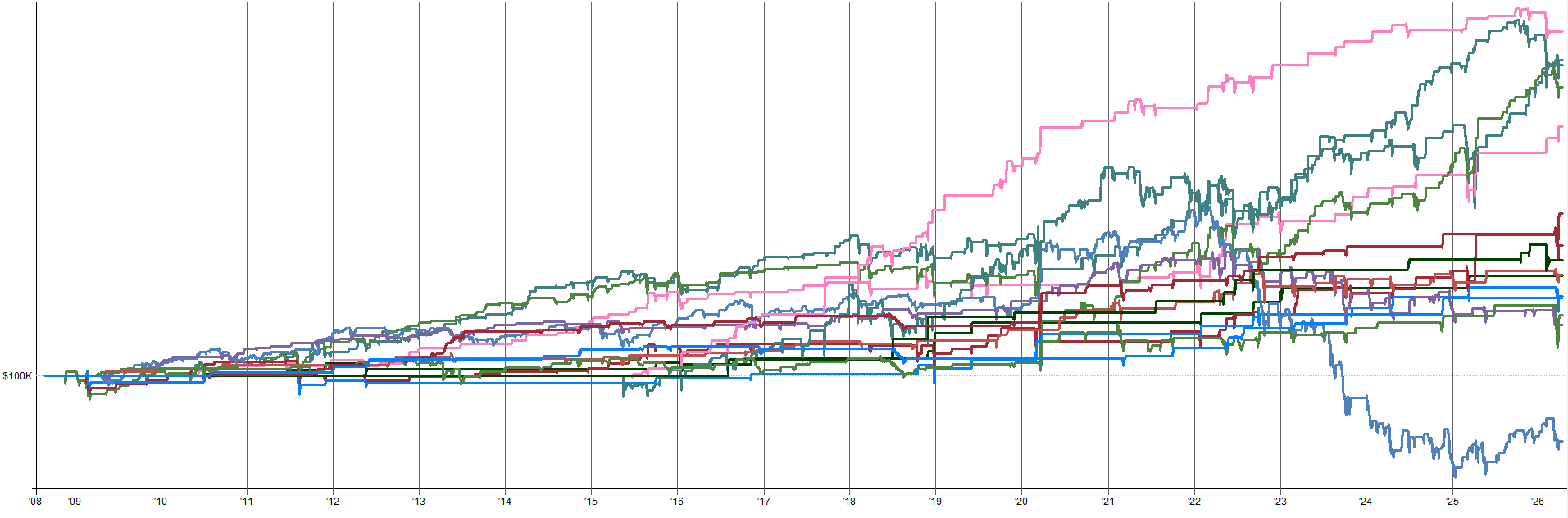
You can see sub-entry one on bonds on the very bottom of the plot (blue), underperforming everything else. But there are many other assets and sub-entries way outperforming the bonds first sub-entry equity curve.
Once we combine all of these individual equity curves of different assets all being scaled into across three sub-entries into a “mini-mini-portfolio”, we end up with the Z_reversion system itself.
You can think of the Z_reversion system as like a mini-mini-portfolio of different assets with different entry times and prices all within a mini-portfolio of other mean reversion systems; which will eventually get plugged into the overall portfolio. That’s portfolio inception if you ask me.
The image below shows the Z_reversion mean reversion system equity curve once you add all the other assets the Z_reversion system trades and their three sub-entries into one final system equity curve.
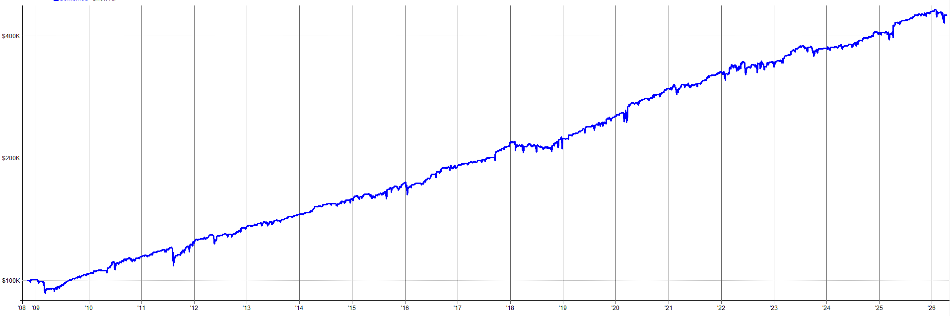
At this level it looks pretty good. In recent times, the system is in a ~7% drawdown, but that drawdown just started and overall the system looks unphased by the poor bonds trades.
This is the portfolio effect starting to creep in.
The system is diversified doing different things at different times. Also, each individual position size is small so if one or two underlying sub-entries on a singular asset look poor, it hardly matters as there are many other assets and sub-entries to pick up the slack.
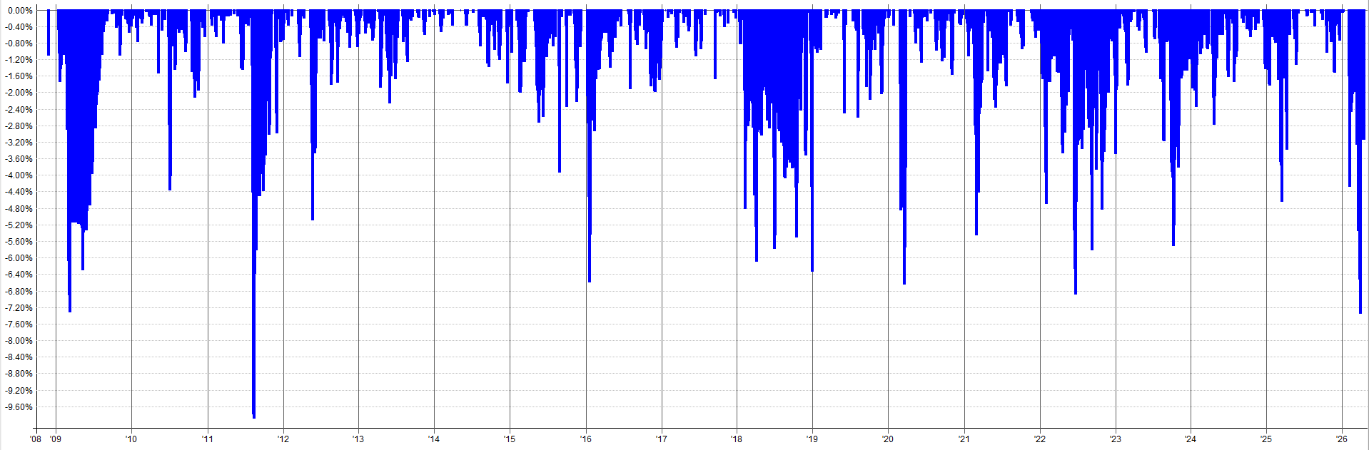
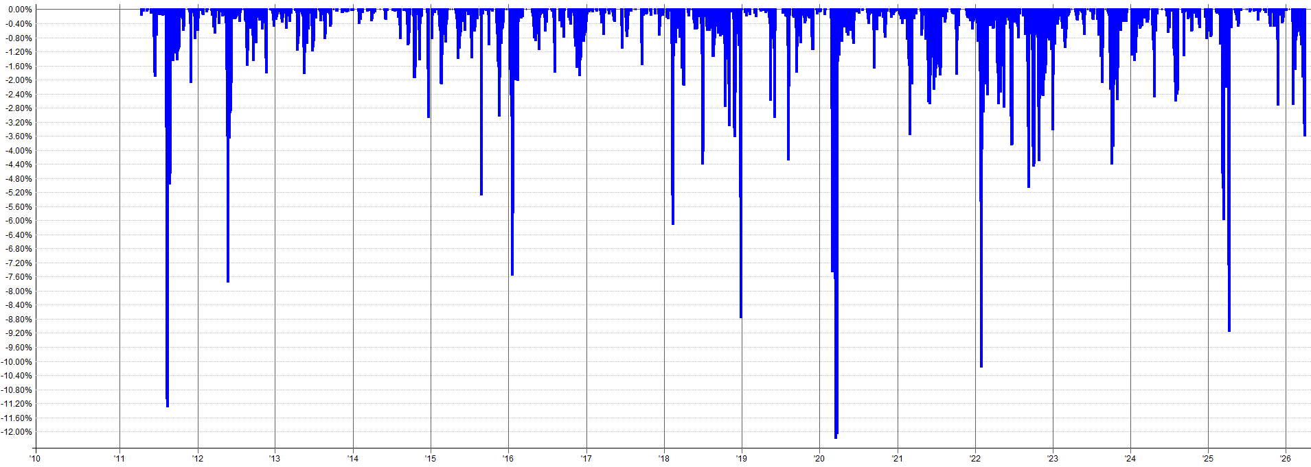
The image below shows the drawdown equity curve of the combined Z_reversion system as a whole (dark blue) compared to the bond first sub-entry (light blue) drawdown.
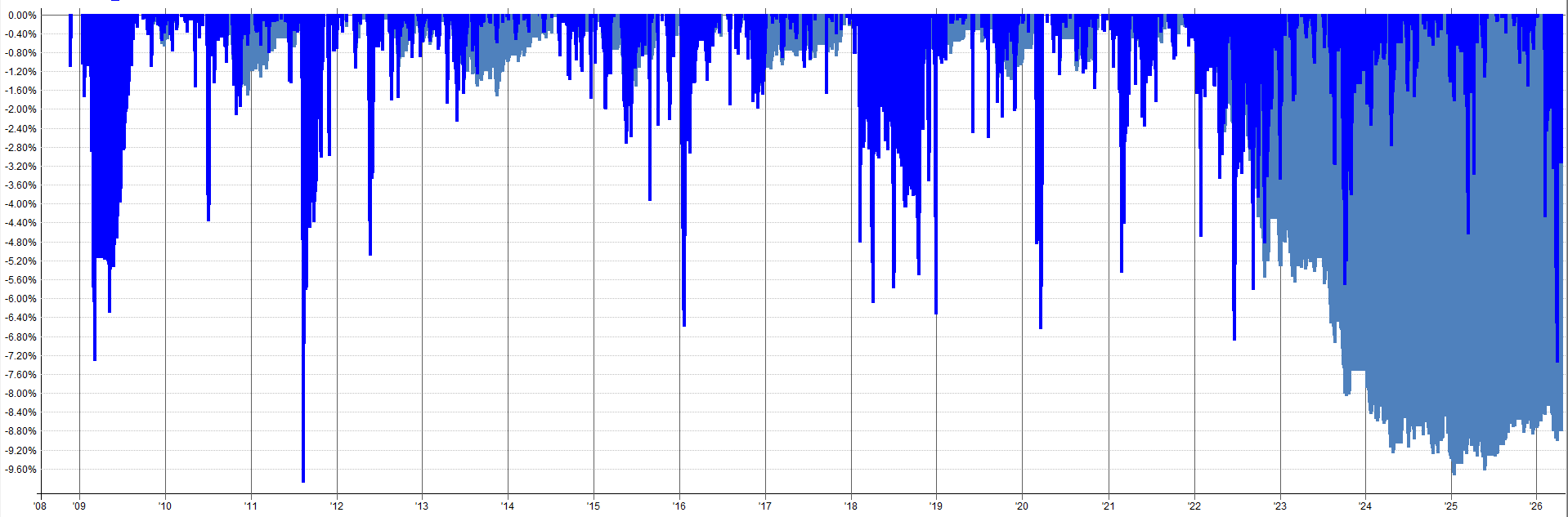
While the first sub-entry on bonds drawdown (light blue) respective to itself is in an ugly drawdown, the combined system drawdown plot (dark blue) is completely unphased. The combined system drawdown plot is just doing its own thing and seems to not care at all that the first sub-entry bond system is hemorrhaging.
This is the portfolio effect in action at the mean reversion system level. Each system is like a mean reversion mini-mini-portfolio of different assets and different sub entries.
It then will become the mean reversion mini-portfolio in the next article section where all mean reversion systems get combined together.
You’ll see after all mean reversion systems get combined, the performance of one sub-entry on one asset within one system really doesn’t matter at all. There is so much diversification across time, price, assets, and systems that the underperformance of the first sub-entry on bonds is, frankly, irrelevant.
The Combined Mini-Portfolio:
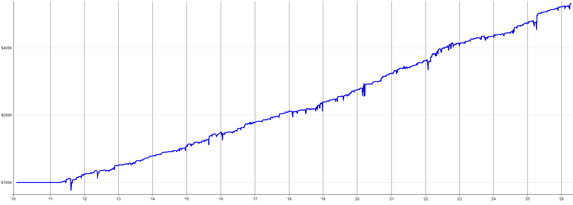
I just spent a bunch of time showing you the portfolio effect on a tiny system-specific scale. Now let’s look at what happens when all four systems are actually pulled together into one mean reversion mini-portfolio (code to do this is at the end of the article and on the GitHub).
This equity curve shows the results of the four mean reversion systems combined together trading the leveraged ETF versions of its trading universe.
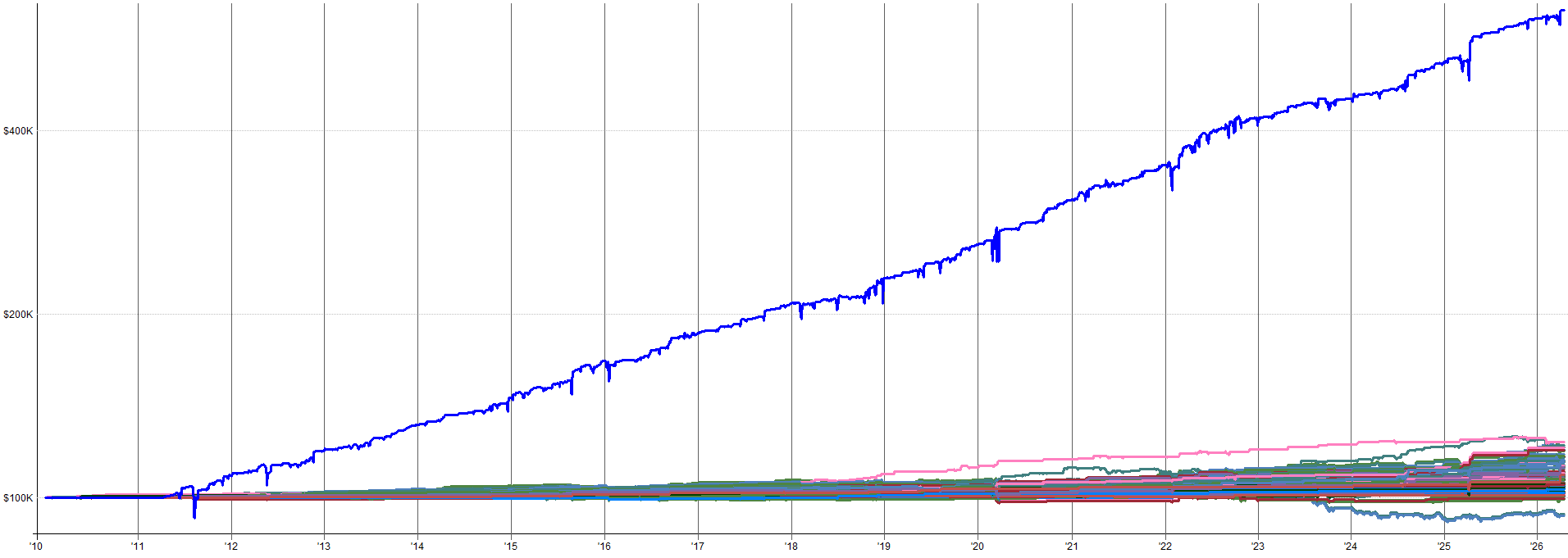

Like I mentioned, at this level one specific underperforming asset within one system on one or two sub-entries doesn’t even matter. The combined mean reversion mini-portfolio is so diversified across:
Price
Time
Assets
Systems
Oversold measurements
System failure risk
etc.
that the entire mean reversion mini-portfolio as a whole is super robust to some underperformance on specific assets / sub-entries within itself.
To see what this mean reversion portfolio looks like on the non-leveraged ETFs, check out the equity curve and drawdown plots below. Non-leveraged ETFs allows us to test further back in time since leveraged ETFs became available around 2011, but the un-leveraged versions have been available since the early 2000’s.
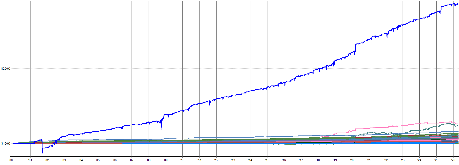

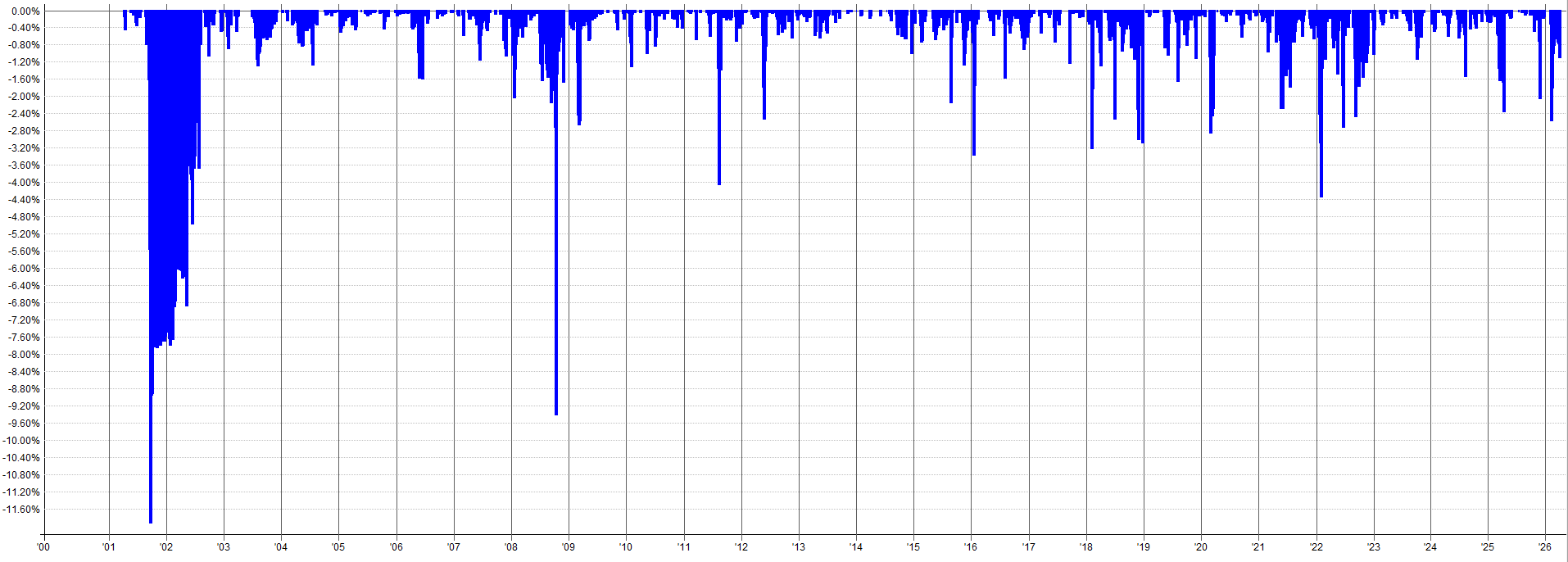
Still looks great to me. 2000 had a somewhat bad drawdown, but that’s just the game we play with the negative skew of mean reversion. The system recovered and continued to perform beautifully after that. Oh, and I’ll talk about this more in the part 3 article, but pre-2011 and post 2018 is all out-of-sample.
If I show all the individual equity curves that comprise the non-leveraged mean reversion mini-portfolio, it looks like what’s shown below.
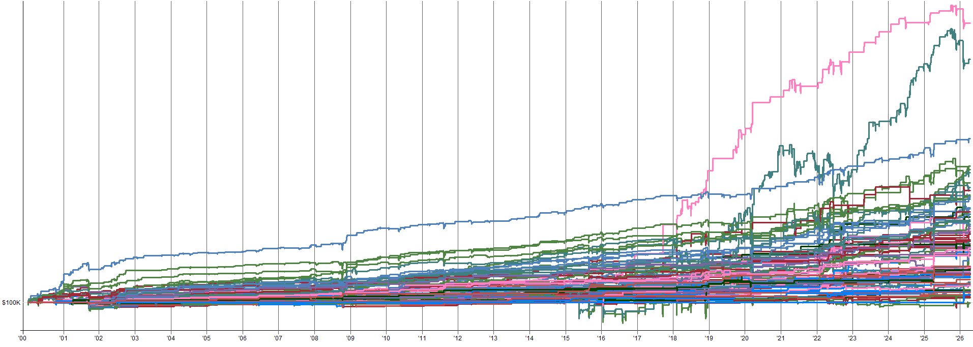
It’s worth noting the pink and green lines way above everything else are the bitcoin ETF results. The same ETF is used for the un-leveraged and leveraged backtest because the market is already super volatile and a leveraged ETF doesn’t exist with solid history.
If I remove the bitcoin results from this equity curve plot so you can better see the rest of the equity curves across all the systems and sub-entries, it looks like the following.
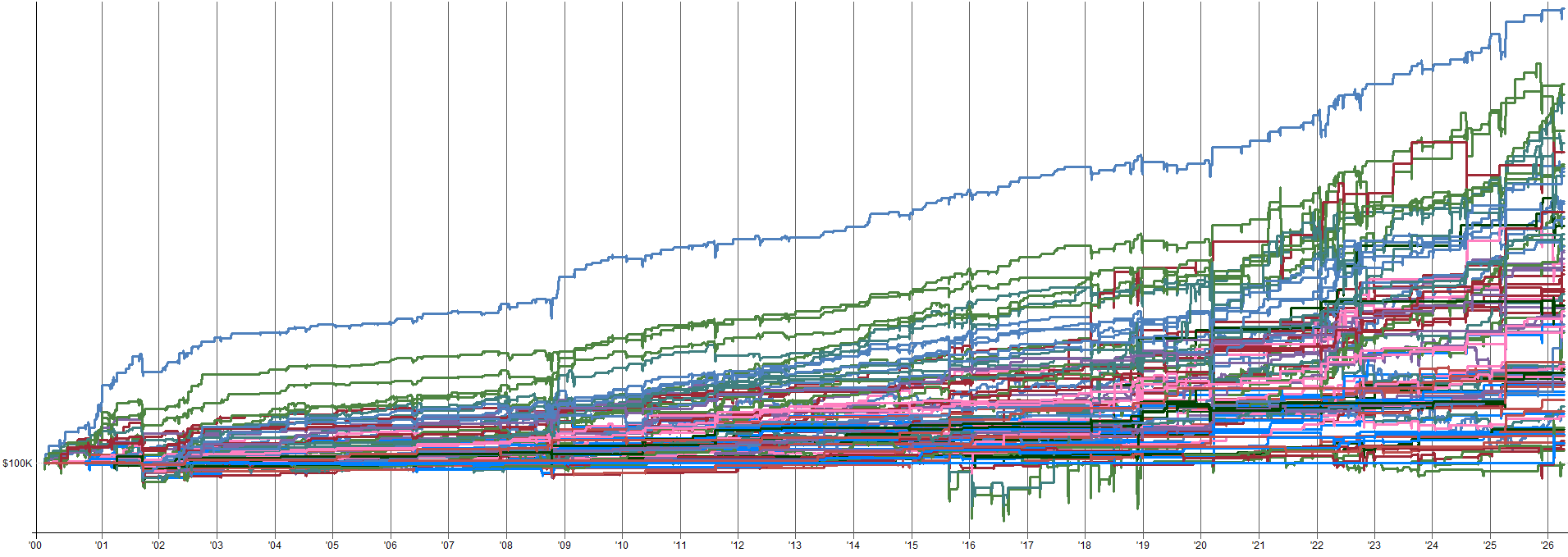
Most equity curves look up and to the right. Exactly what we want to see. Some curves are choppy and have many ugly spots, but when you combine it all together it all averages out to something pretty smooth.
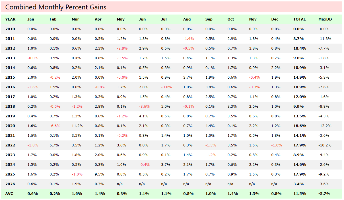
Monthly and Yearly Return Heatmap
Let’s look at the combined mini-portfolio’s monthly returns laid out in a grid. This is one of my favorite ways to understand the performance of a portfolio because you can immediately see the consistency (or lack of it) across time.
Leveraged ETF monthly/yearly returns:
Unleveraged ETF monthly/yearly returns:
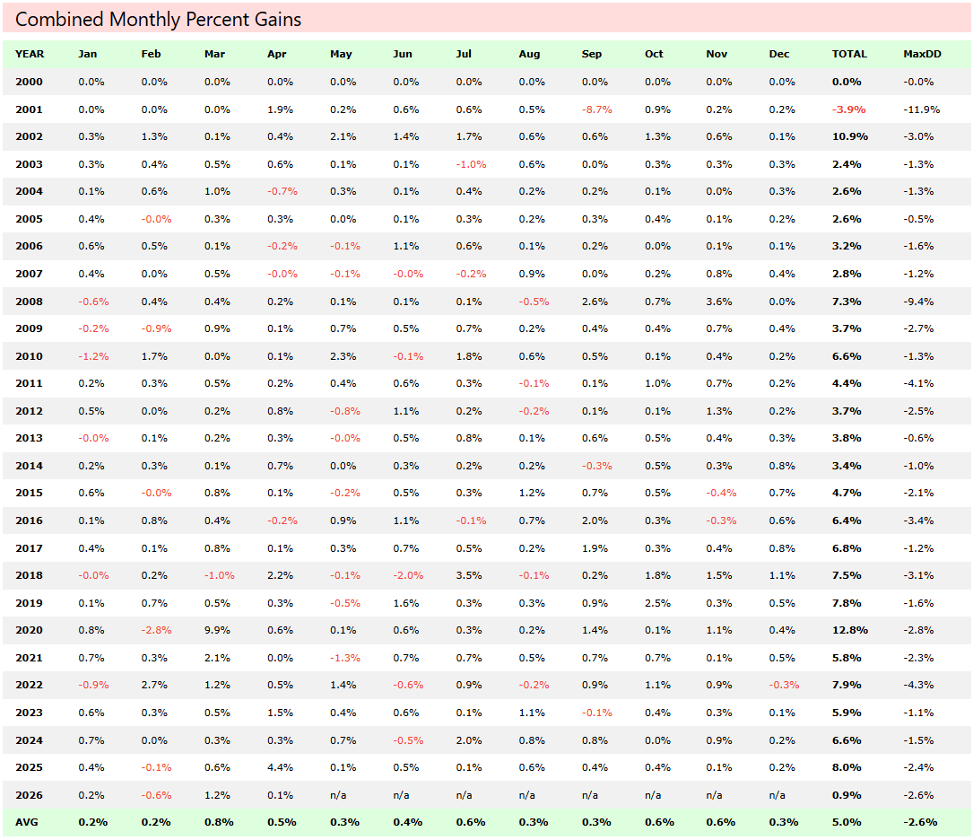
Not a single losing year in the in-sample or out-of-sample time period (in-sample is from 2011-2018, everything else is out-of-sample). This system does not have just a few massive months carrying the whole portfolio. Instead it is a slow but steady drip of positive months across different market environments.
I like how this mean reversion mini-portfolio is very consistent, which is different than all of my other trend/momentum/hedging systems. All my other systems have long drawdowns and flat performance periods.
This mean reversion mini-portfolio is the opposite. It has very short periods of flat performance and quick drawdown recoveries. It slots into my portfolio well and provides me with great portfolio level performance benefits.
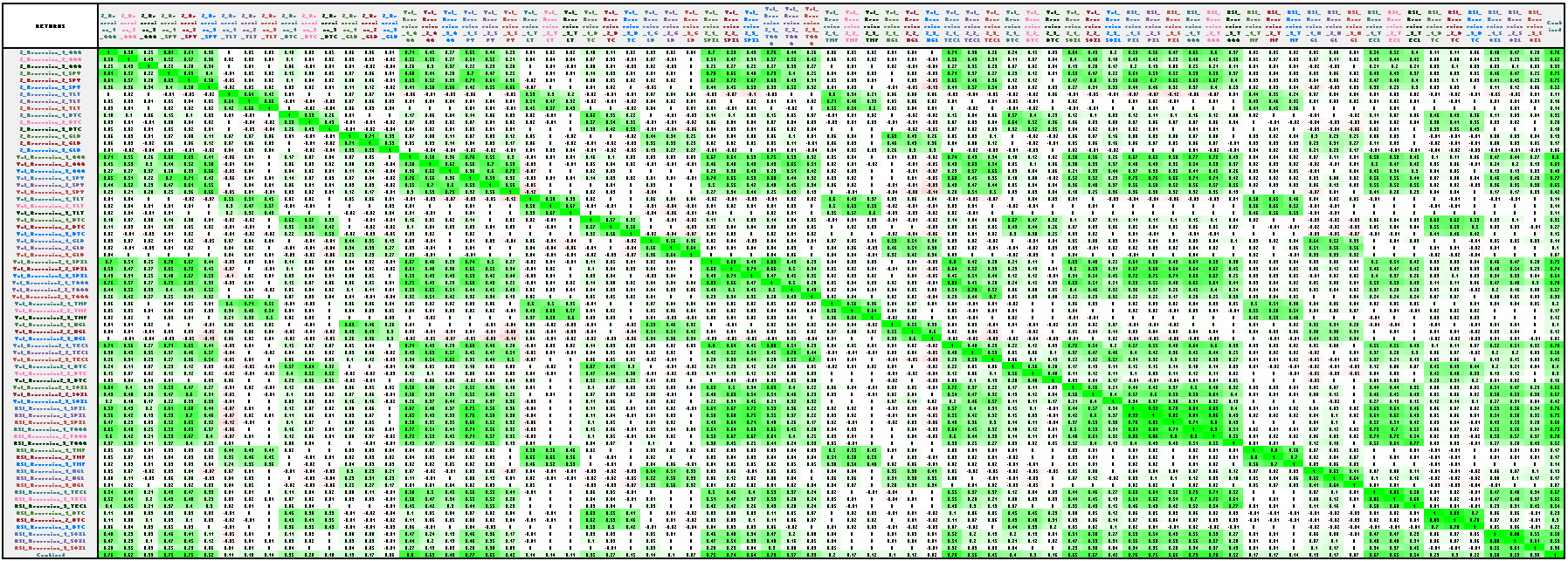
Correlation Matrix
So I just spent 1.5 articles telling you that these four systems are genuinely independent and that combining them gives you diversification. Let’s look at the correlation table and see if that is actually true.
Below is the correlation matrix of daily returns and drawdowns between the four systems. I could not get this entire correlation matrix into an image that was actually readable so you’ll have to rely on the colors. I’ll upload this excel sheet into the GitHub for you to check out if you’re interested.
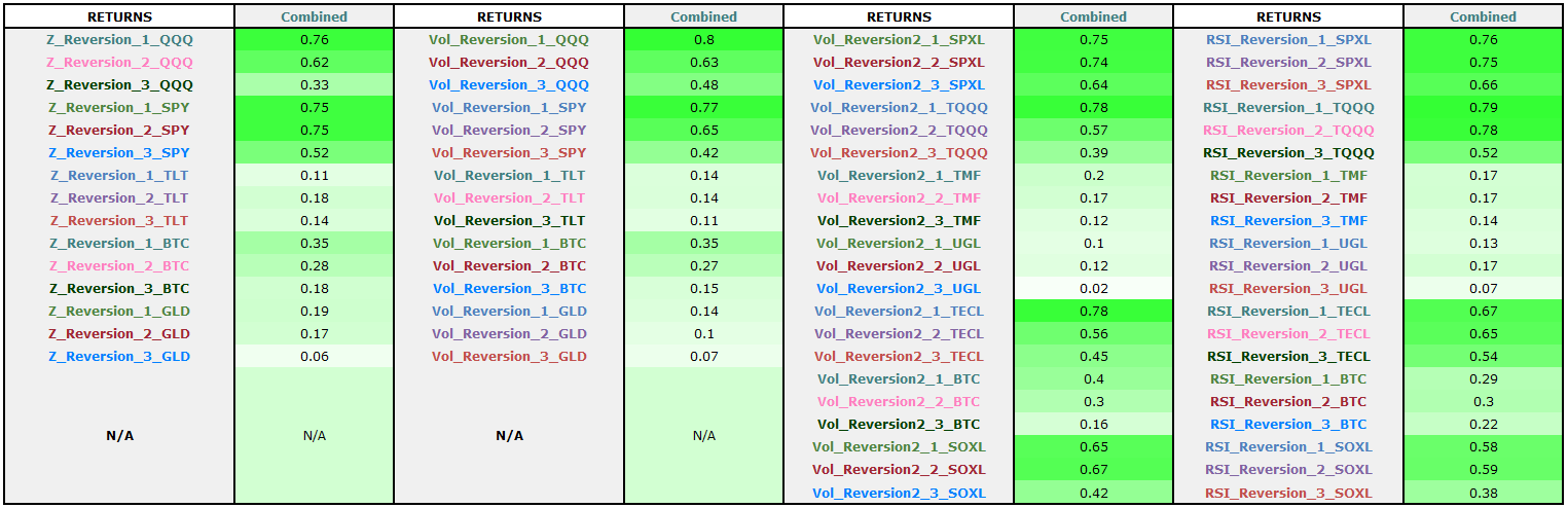
I did however add a summary correlation table showing the average correlation of each system relative to all the other systems, this table is more digestible and I can fit within an image in the article.
Combined Mean Reversion Mini-Portfolio Returns Correlations:
Combined Mean Reversion Mini-Portfolio Drawdown Correlations:
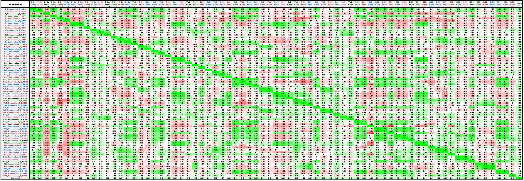
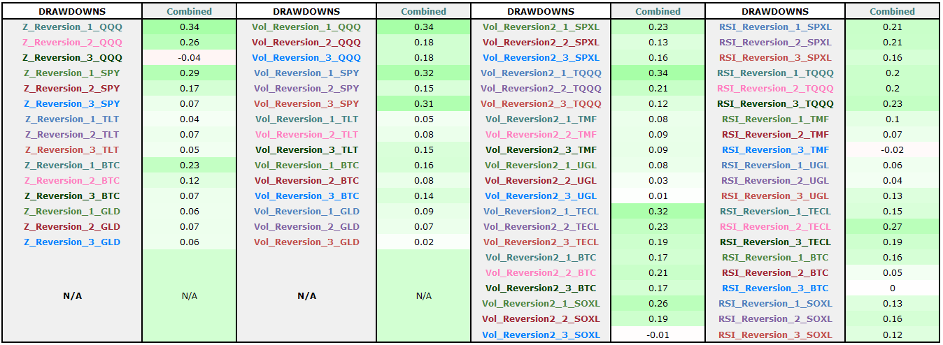
The average drawdown correlations are all ~0.34 and lower, that’s awesome from a diversification standpoint. This is why the combined equity curve of the mini-portfolio is so smooth.
The returns average correlations have a wider range, between 0.06 and 0.79. Still relatively uncorrelated on average.
This is the quantitative proof behind “why run all four systems and not just the best one?”. It is not just a feel-good argument about diversification. These numbers show that there is massive benefit to running as a mini-portfolio and take advantage of all the different measurements of oversold into account on different assets. This makes it so return streams that don’t move in lockstep.
Excluding Systems - The Ranking Mechanism:
There is an interesting dynamic layer within the mean reversion mini-portfolio code that I have not discussed yet. The portfolio has the ability to rank all individual equity curves (an equity curve being one sub-entry on one asset within one system) using a risk-adjusted return factor.
The ranking formula looks like this:
StratFactor = ROC(S.Equity, 252) / (StdDev(ROC(S.NetPct, 1), 252) * SQR(252))This is the 1-year return divided by the annualized daily volatility of returns. Essentially ranking based on a rolling 1-year Sharpe ratio per equity curve.
This ranking method preferences equity curves which are increasing at the steepest slope with the least amount of volatility. This makes particular sense for mean reversion because when you are catching a lot of bad trades, the negative skew plays out and the equity curve gets very volatile as you catch falling knives.
Referencing equity curves with low volatility and high returns is essentially filtering out the ones currently exhibiting that negative skew. The ones with the best returns and least volatility are the ones cleanly catching bounces, rather than bleeding from extended drawdowns.
You could use other ranking mechanisms. This one is not uniquely correct, but it makes sense for the given context.
The rankings of the systems are updated quarterly. Why quarterly, not monthly or shorter? Mean reversion systems do not take that many trades. You need a long enough window to accumulate meaningful data before deciding which systems are outperforming and which are underperforming.
A shorter timeframe (monthly or less) means you are possibly ranking on noise. Systems could only have a handful of trades and the ranking excludes it based on a small sample size and you get whipsawed. One year simply felt too long because a lot changes in twelve months. One quarter was the comfortable middle ground. Enough trades to form accurately measure recent system performance, but short enough to still be responsive.
Did I spend a ton of time optimizing and testing this assumption? To be honest, not really. This was more based on gut feel and intuition of how I want it to work. The quarterly cadence was not tested against monthly or semi-annual alternatives. It was picked as a reasonable way to do things that makes sense, and then left alone.
The 252-day Sharpe and quarterly rebalance were chosen as sensible defaults, not optimized parameters. Adding optimization on top of already-optimized systems creates layered curve fitting risk. A 1-year Sharpe ratio is a common-sense metric with a common-sense lookback.
That is deliberate: the ranking overlay is not another optimizable surface. The more optimizable surfaces you add, the more surfaces you have to overfit. With that said, feel free to spend some time here playing around.
Just be super cautious with curve fitting. You do not want to layer curve fitting on top of this portfolio by being super specific with the system ranking mechanism. This is the exact reason why I intentionally picked something that intuitively made sense and just kept it without a ton of optimization and fitting. I have four robust systems, I don’t want to break them with a curve fit ranking layer.
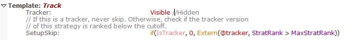
How the system ranking works mechanically
This is a little confusing, but each strategy has a parallel Tracker (hidden) and benchmark system that are used to compute the strategy rank. The SetupSkip rule checks if this strategy’s rank is worse than the lowest allowable rank.
The ExcludeWorstX parameter (default 0) lets you drop the N worst-ranked strategies from taking new trades. Setting ExcludeWorstX to 10 would prevent the 10 worst-performing strategies from taking new trades.
TotalNumSystems: 72	// Total strategy count across all 4 systems (includes benchmarks and tracking systems for ExcludeWorstX usage)
ExcludeWorstX:	10      //Dont trade the worst 10 systems
MaxStratRank:	TotalNumSystems - ExcludeWorstX

Template: Track
	Tracker:	Hidden
	// If this is a tracker, never skip. Otherwise, check if the tracker version
	// of this strategy is ranked below the cutoff.
	SetupSkip:	if(IsTracker, 0, Extern(@tracker, StratRank > MaxStratRank))
If the strategy rank is below the threshold, it skips that systems entries.
This is what makes the portfolio dynamic, not just four systems bolted together. It provides an adaptive layer that reduces allocation to strategies that have been underperforming recently, without you having to manually decide which system or asset to drop.
Again, this is completely optional. To be honest I don’t use it at the moment, but I have it commented out into my mini-portfolio code just in case I do want to enable it someday.
Sensitivity analysis: how performance changes as you exclude more equity curves
I ran the system ranking on the mean reversion mini-portfolio and slowly excluded more and more strategies based on the Sharpe based ranking method and the quarterly ranking timing.
The table below shows the results for excluding 0 equity curves up to excluding the 50 worst performing equity curves (and when I say equity curve, that’s one sub-entry, on one ETF, within one of the four mean reversion systems):
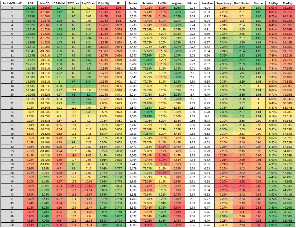
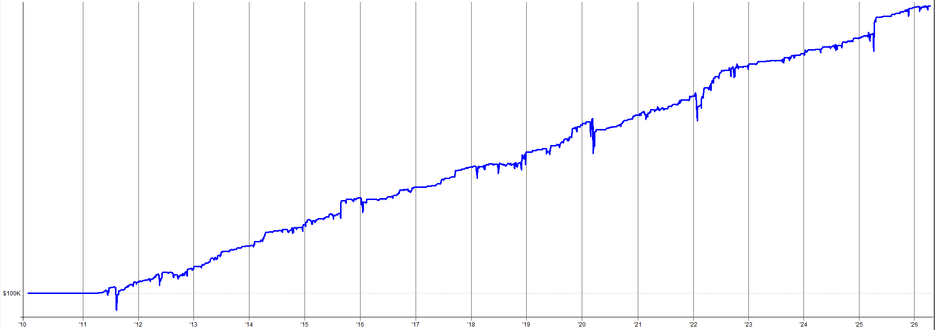
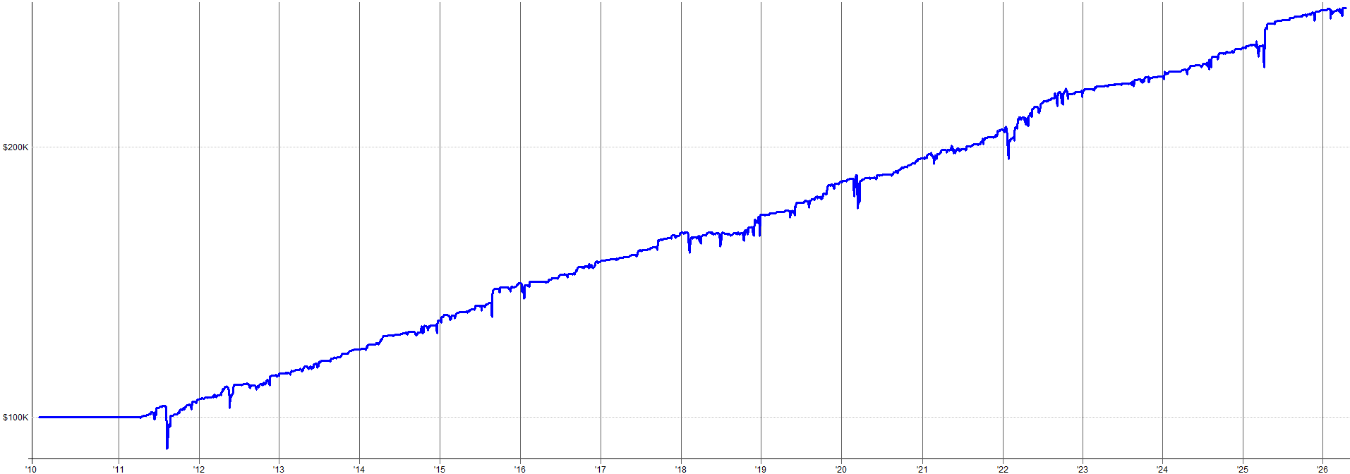
The images below show the mini- portfolio results when you exclude some of the worst equity curves within the mini-portfolio. I show four examples so you can get a feel for how robust the ranking and selection logic is for excluding poor performing equity curves.
Exclude worst 50 equity curves:
Exclude worst 35 equity curves:
Exclude worst 15 equity curves:
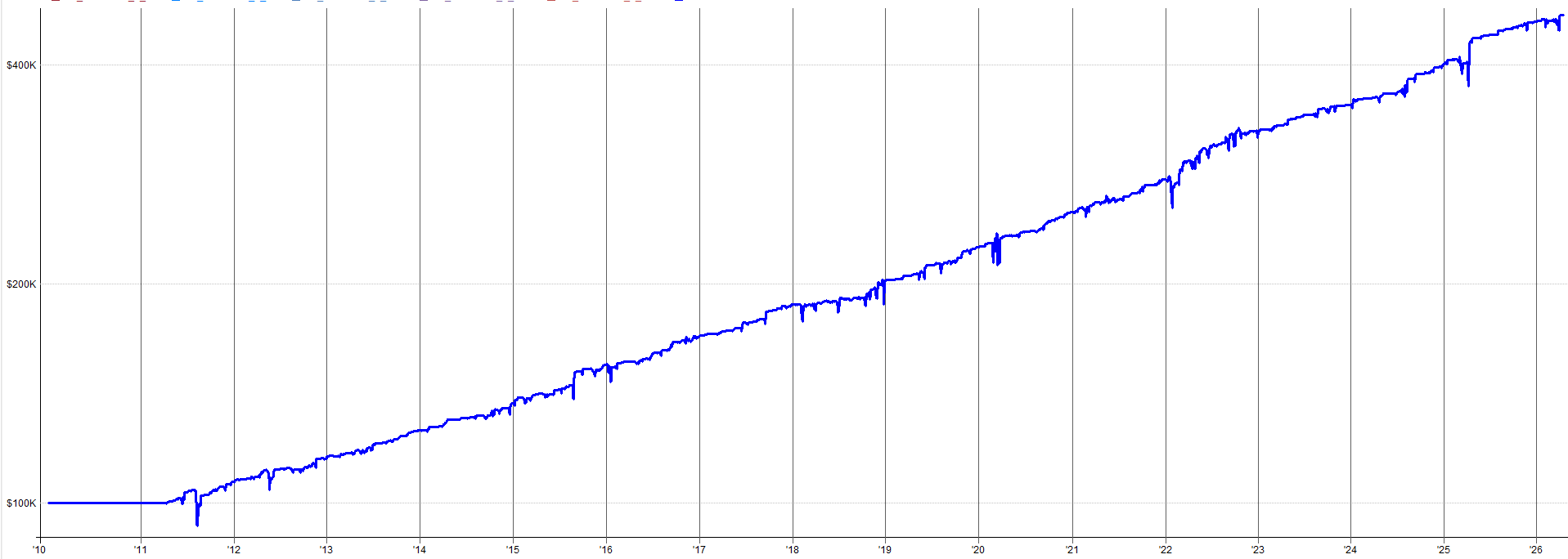
Exclude worst 0 equity curves (none are excluded):
To see the equity curve rankings over time, simply update the tracking code from “Hidden” to “Visible”.
Then go to the “sdRank” tab in plots.
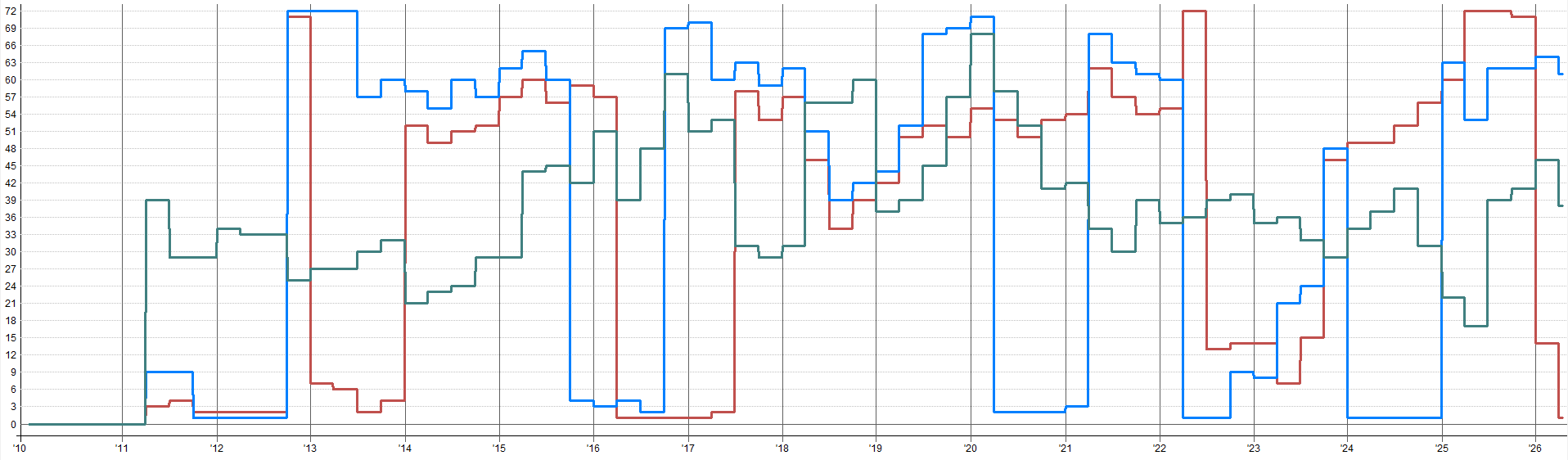
See the image below for all equity curve rankings over time.
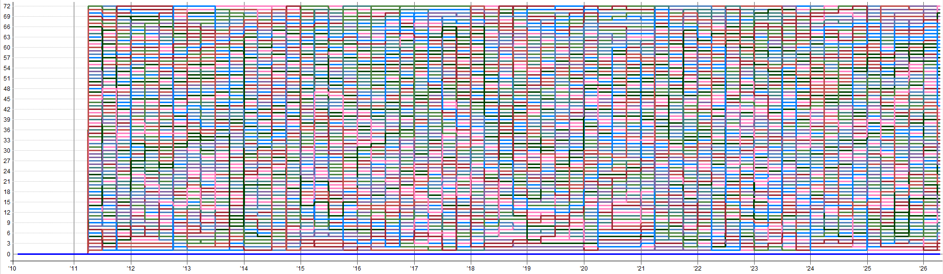
See the image below for a down selected view of all equity curve rankings over time.
The default ExcludeWorstX of 0 means all equity curve within the mean reversion mini-portfolio trade. Excluding the worst-ranked equity curve generally makes performance slightly worse (you use less exposure and potentially miss out on some recovery trades from temporarily underperforming equity curves that got turned off before recovering), but it helps control total mean reversion mini-portfolio exposure.
This is a lever more for managing how much capital the mean reversion portfolio deploys at any given time; rather than a performance enhancement tool. It’s a way to make the mean reversion mini-portfolio more capital efficient by skipping the underperforming equity curve.
When would you increase ExcludeWorstX in practice?
You hate the idea of running systems that are underperforming and want a systematic way to turn them on and off dynamically.
It may provide a phycological safety net to know that the weakest-ranked systems are not trading. Doing this systematically and automatically is a much better approach than randomly turning off systems or reducing allocation across the board with a discressionary decision in the heat of the moment.
When you want to be slightly smarter about capital allocation and not waste exposure on systems that are underperforming right now.
Maybe you’re already running hot on portfolio margin and you want to be smarter about how you allocate to this mean reversion mini-portfolio
Don’t go crazy with it. Don’t optimize the lookbacks, Don’t optimize the ranking method. Pick a sensible value or leave it at 0.
The moment you start optimizing backtesting different lookbacks and ranking methods and trying to pick the best one, you’ve added another layer of curve fitting on top of everything else. Everything else is already robust by design, don’t ruin it with a curve fit top layer. That defeats the entire purpose.
Conclusion
Four systems beat one. Not because any individual system is exceptional, but because when you combine four genuinely uncorrelated approaches to measuring “oversold,” the portfolio effect takes over.
The correlation matrix shows that even though all these systems are buying dips on similar assets, there is still major diversification benefit to trading all four systems. The systems all fire at different times, using different signals, at different prices, and exit with different mechanisms. This produces a return stream that is smoother than any individual system could create on it’s own.
The quarterly ranking mechanism is what turns the four standalone systems into an adaptive portfolio. It’s not required, but it is a nice way to exclude the worst equity curves if trading “losing” sub-components of systems bothers you (like the first two sub-entries on bonds in the Z_reversion system).
Be very careful not to use the ranking overlay as another optimization surface. Use sensible defaults, check similar methods/parameters also produce similar results, and avoid anything super specific to prevent multi-layered curve fitting.
ExcludeWorstX really is more of an exposure management lever rather than a performance optimizer. Simply use it not to waste capital on underperforming systems (if you want) to make the mean reversion mini-portfolio even more capital efficient.
The whole point of this mini-portfolio is that no single strategy, sub-entry, or asset class carries it. The smooth returns come from the combination of all these things, and the optional adaptability comes from a ranking layer.
The full code for the combined mean reversion mini-portfolio script is in the appendix below.
In Part 3, I’ll get into:
In-sample vs out-of-sample validation.
Robustness testing.
What it has actually been like to trade this live since August 2025.
So, see you in Part 3 and in the mean time, have fun with these systems and please ask any questions you have.