

Q2 2026: TQX Portfolio Performance Review
Results from a live portfolio of 30+ trading systems across US, ASX, and TSX equities. What worked, what I learned, and what's next.


Welcome to the “Systematic Trading with TradeQuantiX” newsletter, your go-to resource for all things systematic trading. This publication will equip you with a complete toolkit to support your systematic trading journey, sent straight to your inbox. Remember, it’s more than just another newsletter; it’s everything you need to be a successful systematic trader.
I recently launched a portfolio tracking website (updated daily) that tracks my systematic trading portfolio performance, along with many supporting metrics. You can check in on my personal systematic trading portfolio performance anytime here: TQX Portfolio Tracker
Introduction:
Now that the second quarter of the year has passed, we have already crossed the mid-year mark for 2026. This year has flown by, at least for me. In this article, I’ll cover my systematic trading portfolio performance thus far in 2026.
I ended Q1 just slightly red, with the portfolio still climbing out of a mid-March drawdown. You can catch up on that recap here if you want:

Since the end of Q1, the portfolio has recovered very well.
Here’s what we’ll go through in this article:
The live portfolio dashboard
Q2/YTD 2026 live portfolio performance
System highlights
What’s next
Let’s get into it!
The TQX Portfolio Tracker Dashboard:
Just as a refresher, I built and launched a live portfolio tracking dashboard called TQXPortfolioTracker. You can find it at: tqxportfoliotracker.xyz.
This is what I have been using to track my personal systematic trading portfolio performance. It automatically pulls my raw portfolio performance data, current positions, closed positions, fees etc. from my broker, calculates key metrics, generates a bunch of plots and tables, and pushes everything to the website. All auto-updated.
If you want to follow along or check in between quarterly performance articles, it’s live and always up to date.
Q2 2026 Portfolio Performance:
My systematic trading portfolio has returned about 18.2% YTD in 2026. Basically all of that return has come from Q2, because at the end of Q1 my portfolio was down -0.22% due to a large-ish 15% drawdown during March.
Portfolio Equity Curve:
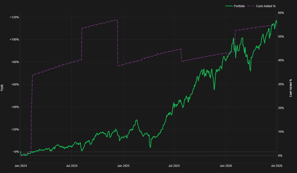
Since the end of Q1, the portfolio has been pretty consistently driving upwards. I’ve had a few ~5% drawdowns along the way since March, but that’s expected. And I am sitting within 2% of all-time highs right now.
So, now I’m just patiently waiting for the next market freak-out and the start of the next large drawdown in my portfolio.
Looking at the monthly view, you’ll notice Q2 has been on a hot streak.
7.38% return in April
6.35% return in May
5.26% return in June
My systematic trading portfolio has now returned 8-9 months of average market returns each month, for three months in a row.
Now, that won’t always happen, but if that continues for a few more months this year, we are on track for another stellar year of returns (in 2025 I had over 60% returns on the year).
But of course, now that I said that, the rest of the year will probably be lackluster.
I’ve probably just jinxed myself.
Oh well.
Monthly Returns Heatmap:
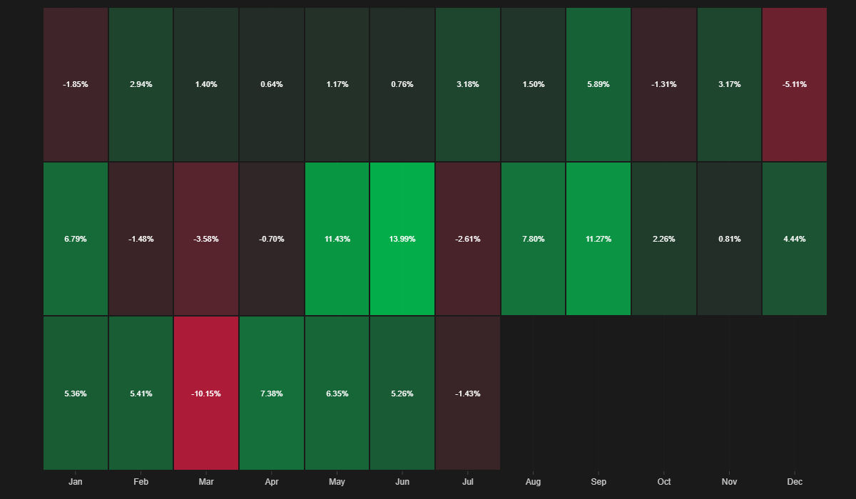
(The bottom row on this monthly return heatmap is 2026.)
We can also look at my drawdown underwater profile. You’ll notice the larger and longer drawdown starting in February and going until mid-April. Since then I’ve experienced short spikes to the downside of 2-5%, followed by quick recoveries to all-time highs.
It’s been a little bit choppy to the downside, but also choppy to the upside with aggressively quick recoveries, sometimes as quick as just a few market days.
Drawdown Underwater Plot:
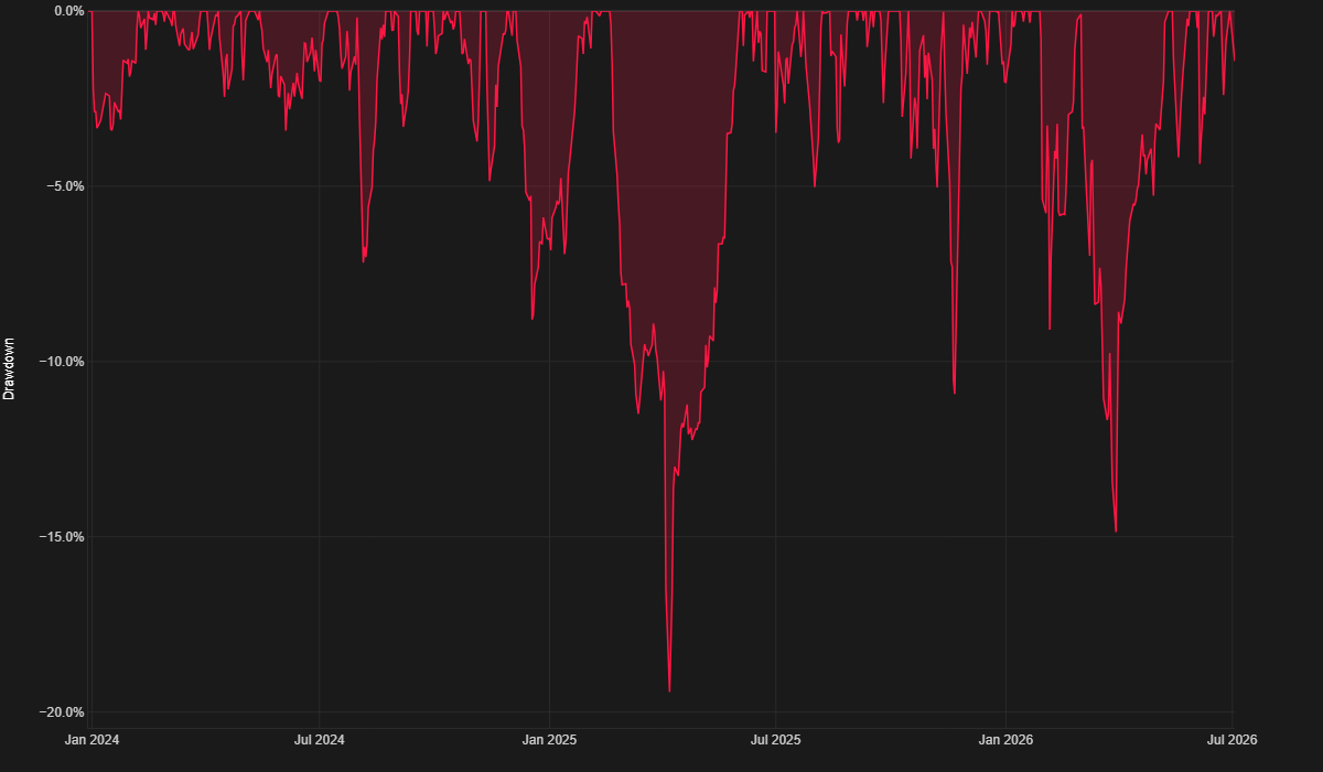
But I have nothing to complain about. I’d rather have the quick and annoying drawdown/recoveries than the more prolonged and deep drawdowns like in March of this year.
You can also observe my drawdown plot in length of drawdown (days underwater), rather than max depth as shown in the plot above. Drawdown length and depth both take a toll on the psychology, so it’s important to contextualize both.
This plot tracks how many consecutive days the portfolio has spent below its prior equity peak.
Drawdown Days Underwater:
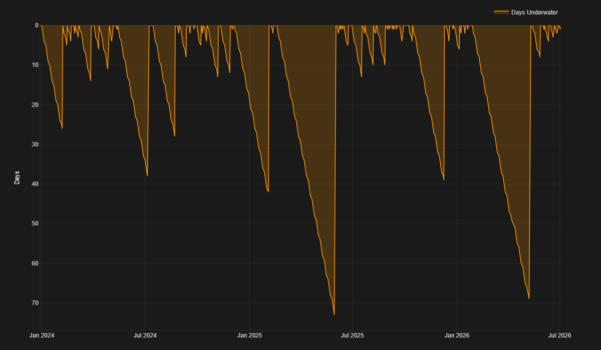
The drawdown that started in March lasted almost 70 days. That means it was my second-longest drawdown ever, with my worst drawdown being in 2025 and lasting just slightly longer, at almost 75 days.
You’ll notice many of my drawdowns last 10 days or less. Those are the easy drawdowns. They don’t last long enough to make you question your processes.
While the drawdown in March was long and deep, I never second-guessed myself or my systems, though I will admit it was a little bit annoying to sit through. It was a month straight of basically red every day. There were three brief bounces to the upside, followed by more bleeding.
But I continued following my systems and did nothing different, and by mid-May I was making new highs. It can be hard to trust your systems, but it’s the only thing we can do.
It’s easier said than done to trust a system, especially when in a drawdown. But I’ve found that the more systems I add that look at the markets in different ways, the more comfortable I have become.
When I had only 2-5 systems, I used to panic at every drawdown. I used to have to take stress relief walks to a park to take my mind off of the drawdowns.
Now that I’ve added many more systems across:
Multiple timeframes
Multiple markets
Trading different market phenomena
Diversified across many parameter sets
Diversified across entry/exit logic
Diversified across entry/exit timing mechanisms
Scaling in and out of trades across price and time
Etc.
I’ve started to become significantly more comfortable with drawdown. I know that soon enough, one of my systems will start to find its groove and profit again.
It’s just a matter of patience.
I am now at over 30 systems and plan to keep adding even more, further increasing the breadth of opportunities the portfolio can profit from.
Just recently I added five new meta-systems from the Market Effect Research Series I’ve been writing about the past couple months.
I say meta-systems because each system is comprised of multiple sub-systems that are diversified across parameters, entry/exit timing, entry/exit logic, position sizing increase logic etc.
So, while it’s 5 different main trade concepts, each is comprised of small pieces trying to take advantage of the trade in a slightly different way.
None of these new systems are game changers on their own, but when you trade all of them together and add them to the overall portfolio, it starts to make a more meaningful difference. So I am excited to see how they play out over the next few years.
You can read more about the Market Effect Research Series here:
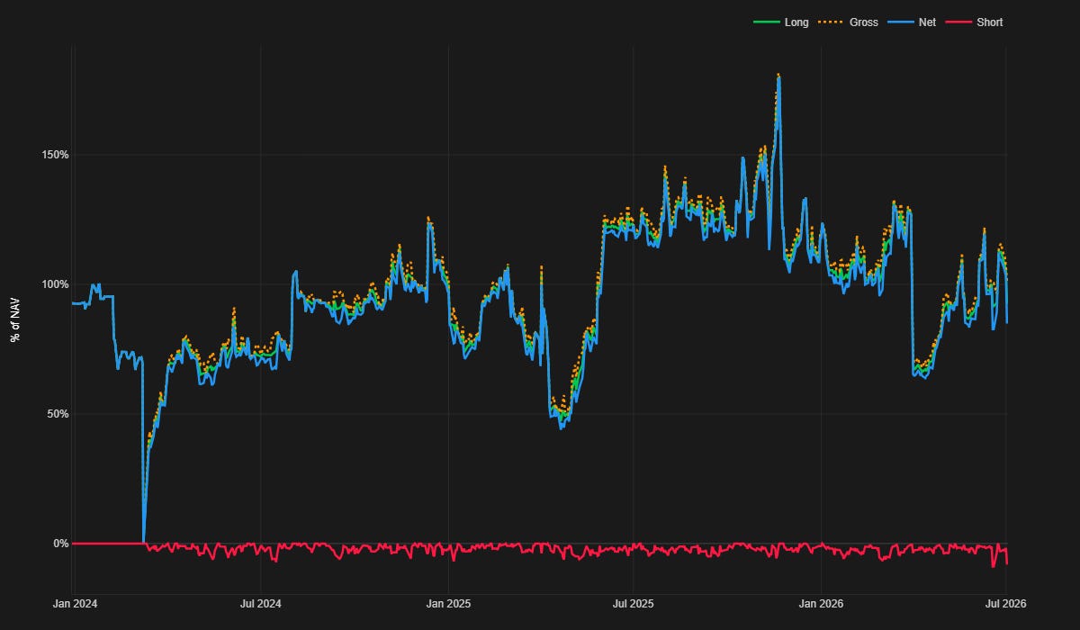
Next plot to look at is portfolio exposure over time.
In March, my total portfolio exposure went from ~130% to ~60% overnight. I had multiple systems that operate on monthly rotations, and they all determined the markets were risky and should be risk off.
Portfolio Exposure:
This is good and bad.
It’s good because it’s my portfolio damage control stepping in to reduce risk while the portfolio is falling into a drawdown.
It’s bad because the fact they all went into risk off mode at the same time means I need more diversification of my risk off filtering/timing. I’d much rather have had a gradient of risk off happening over days to weeks, rather than all at once in the same day.
This was slightly annoying because this risk off portfolio exposure reduction happened just days before the markets started to recover and rip up violently. So I missed out on a lot of that move because I was only half risk on.
Also, because these systems worked on a monthly rotational rhythm, I had to wait a whole month to get back involved in the roaring upward markets with these systems.
S&P 500:
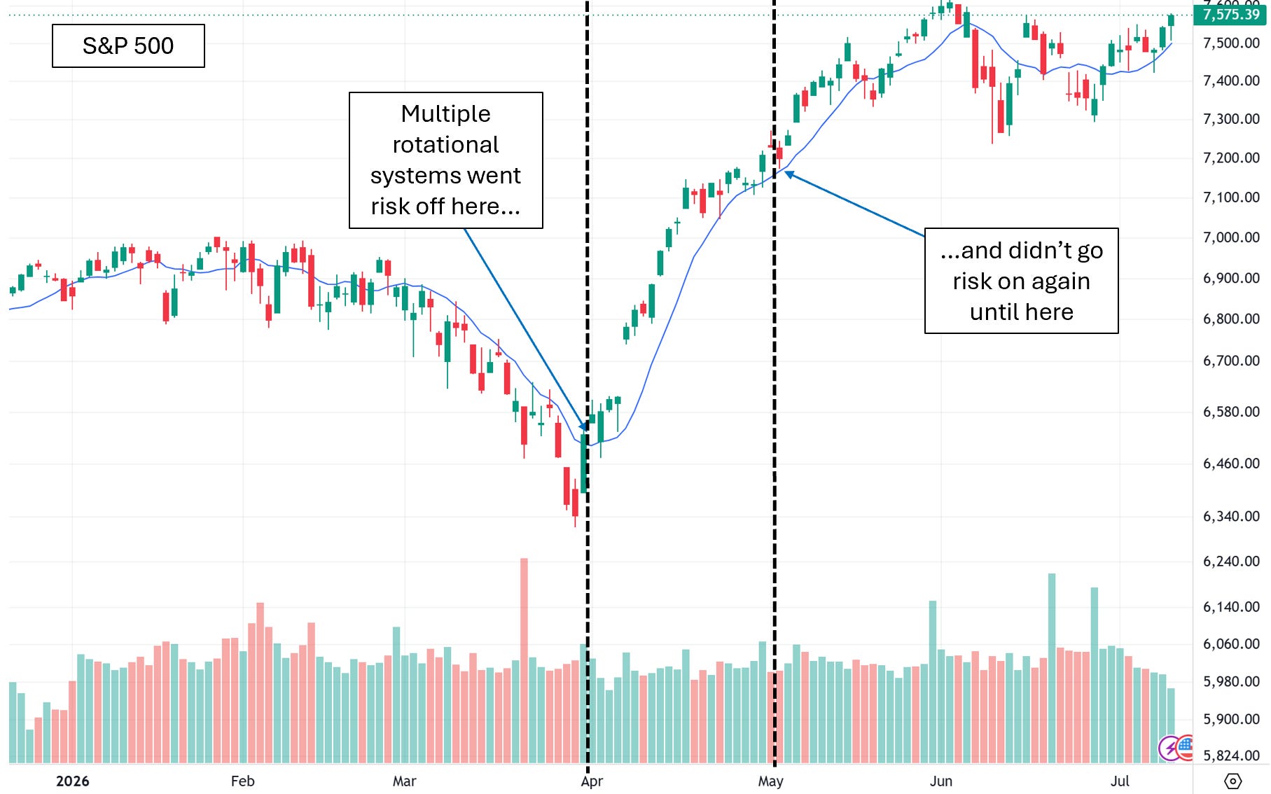
So the lesson learned is, while generally I am well diversified, I would benefit more from timing diversification of my rotational systems and I would benefit from having more intentionally different risk off measures within the systems.
I guess I’ll have to add that to the list of things to explore and improve.
The next plot I want to talk through is the YTD Equity Curve vs. 1-Year Forward Return Projection. This plot is more for fun and an experiment rather than an actual “projection” because really it’s impossible to project returns.
But what this plot shows is the current YTD equity curve in green plotted within 95% Monte Carlo confidence bands, with a white median result line in the middle.
Basically, what I did was I took the previous year's equity curve data and ran a Monte Carlo on it. Then I plotted the 95th and 5th percentile result as well as the median result. Then plotted the current YTD equity curve as well.
So basically I am trying to see if previous results are somewhat predictive of future results within some confidence level.
YTD Equity Curve vs. 1-Year Forward Return Projection:
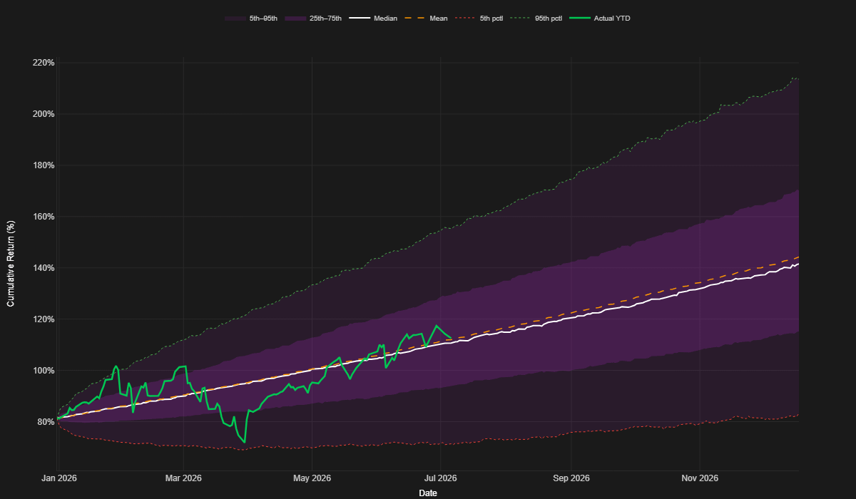
Interestingly, this year’s equity curve first hit almost exactly the upper 95th percentile band, followed by almost hitting the 5th percentile band, and is now riding the median line the past couple months.
While this is certainly mostly attributed to luck that it played out this way, it will be interesting to see how this unfolds the rest of the year, and in following years to come.
If it turns out to be moderately predictive I may be able to use it to make timing decisions such as when to add more capital to the portfolio.
Currently I am using a newly developed rolling Sharpe Z-Score for those types of decisions.
When the Z-Score of my portfolio’s rolling Sharpe is below 0, that is generally a better time to add capital to the portfolio to avoid “buying the top” of my equity curve.
Rolling Sharpe Z-Score:
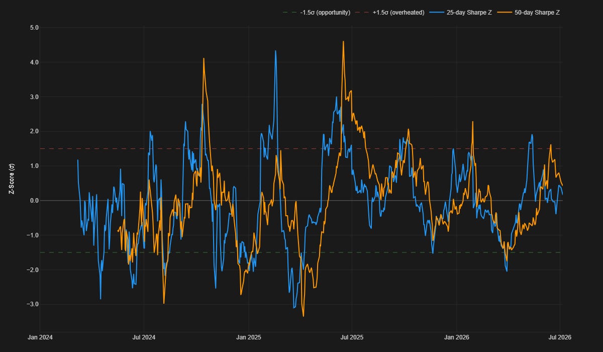
When the Z-Score of my portfolio’s rolling Sharpe is below 1 to 1.5, those tend to be extremely good capital addition opportunities.
So potentially using this in conjunction with the equity curve in relation to the Monte Carlo confidence bands could help me make much better timing decisions for adding spare capital to the portfolio.
In the long run I’m probably better off just not worrying about it and adding capital whenever I have it, but here’s my thought process.
I already add part of my day job paycheck every other week to my portfolio. The rest goes to living expenses and whatever is left over goes into my emergency fund.
Once that emergency fund starts to get a little fat, I’m looking to sweep chunks of it into the portfolio. If it can have slightly better timing of when that sweep happens and avoid large initial drawdowns on the added capital, psychologically that keeps me in a better place.
Nothing worse than adding a bunch of capital to the portfolio just to see it immediately go into drawdown.
System Highlights:
There’s just two systems I want to highlight this quarter which have had decent performance worth pointing out. The first is the US ETF mean reversion mini-portfolio.
US ETF Mean Reversion:
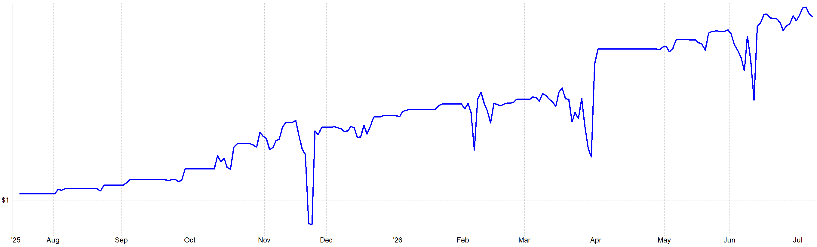
This set of mean reversion systems continues to perform relatively consistently. Though sometimes I hate that this system takes risk when the markets are selling off, that’s the exact reason why it pays.
You can read more about this set of systems from the recent series I posted earlier this year:
The next system to highlight that has worked half decently is the US momentum system I trade.
US Momentum System:
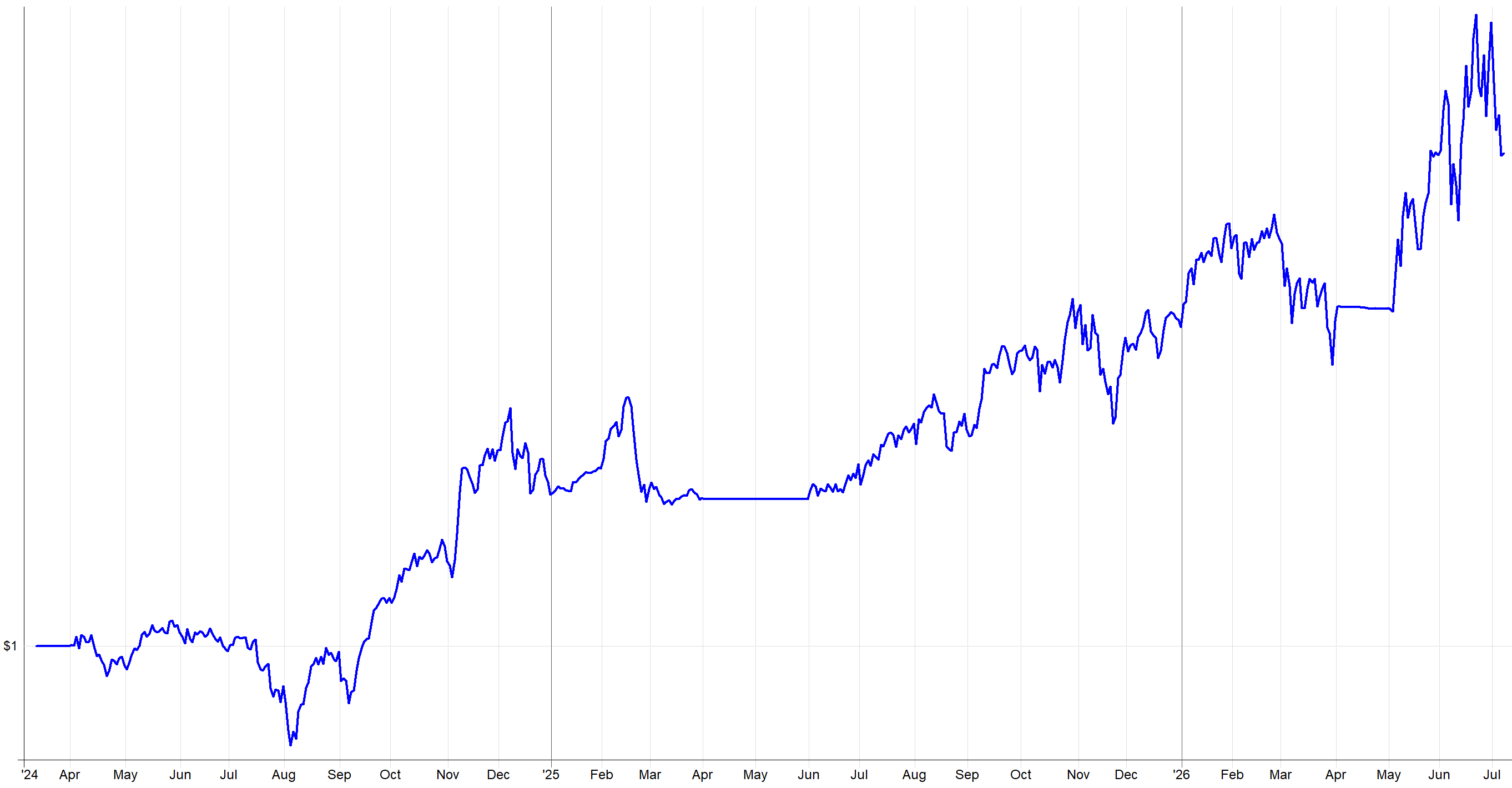
You’ll notice Q2 has been explosive, and in generally this system is working it’s way up and to the right. Recently, the system is selling off, but that’s just because that is what the market is doing.
If you want to read more about this system, it is basically 95% the same of what I wrote about in this article below:
What’s Next:
I’ve just recently bought a new notebook for jotting down ideas and keeping track of my To-Dos. I’ve tried all of the high-tech options (Obsidian, Claude, Notes etc.) out there, and I simply keep falling back to a pen and paper.
Something about physically crossing off items when they get completed and carrying around a physical notebook just makes me more in touch with my ideation side. Every time I start a high-tech notes option I just stop using it after a few weeks and default back to pen and paper again.
Anyway, here are some of the things I have written down in that notebook for short to medium-term next steps in terms of system research and portfolio expansion (in no particular order):
TSX rotational system
Long volatility mini-portfolio of systems
US momentum and trend following mini-portfolio
Diversification of rotational momentum risk-off timing
Diversification of rotational momentum rotation timing
Short side systems
The diversification of rotational timing and risk off filters comes from the experience earlier this year in March, when all my rotational systems sold their positions at the same time (as we already discussed).
I could achieve a better gradient of timing and market risk measurements by creating what I call a mini-portfolio of trend and rotational momentum systems.
By developing and adding new systems to what I already have, I can better control this gradient. Rather than completely changing all the systems I already have, I can just add more that are intentionally different.
I also used the term mini-portfolio.
That’s basically what I call a cluster of similar systems harvesting similar ideas, but all diversified in their own way. So a momentum mini-portfolio would be a bunch of momentum systems all trading momentum in different ways:
Different universes
Different rotation timing
Different regime filters
Different entry/exit logic
Etc.
Basically a diversified set of logic within a broader momentum idea. I can expand my current set of momentum systems further to build in more of this intentional diversification within the momentum framing.
I've also recently developed a TSX momentum system that I plan to share as well. I have trend following on the daily and weekly timeframe on the TSX, so I figure I'd round it out with a rotational momentum system as well (add it to the rotational momentum mini-portfolio!).
It's nothing special, but looks at the TSX market slightly differently than what I already trade, so I'm happy to get it up and running within my own portfolio in the next few weeks.
That system looks like the following:
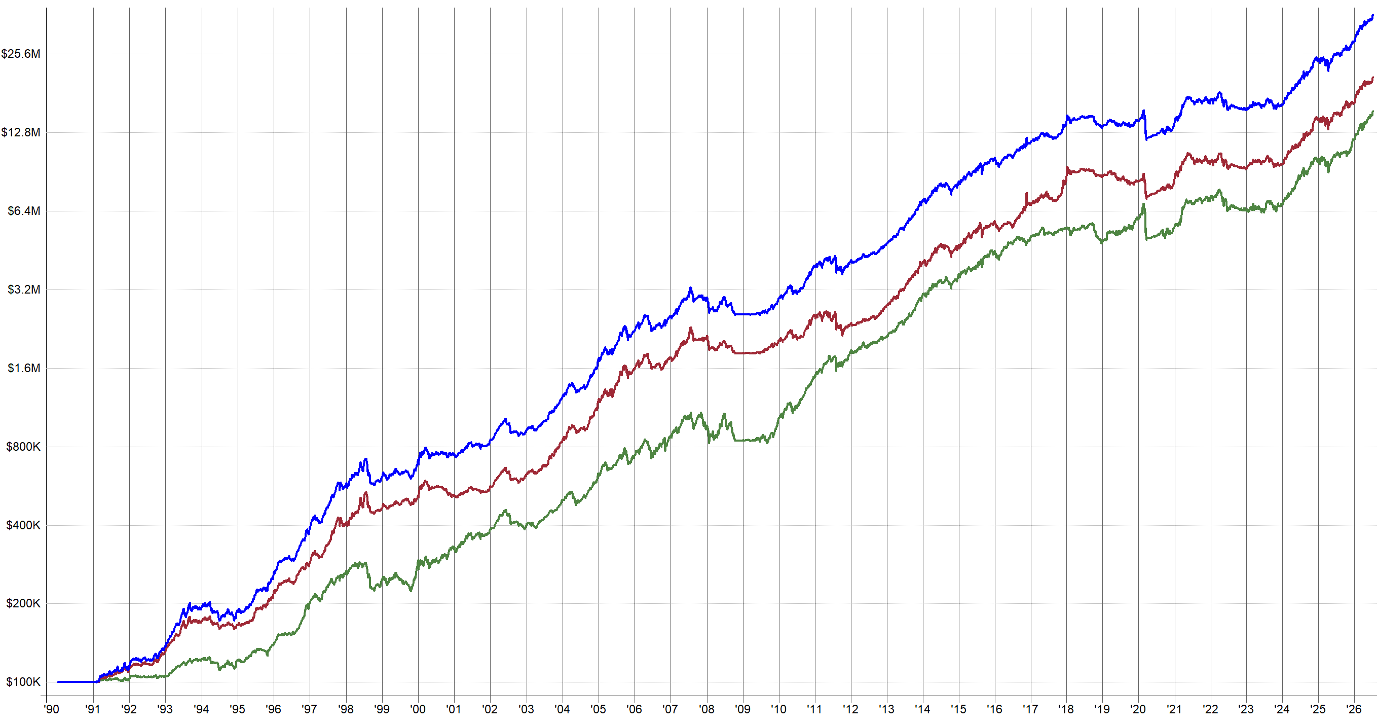

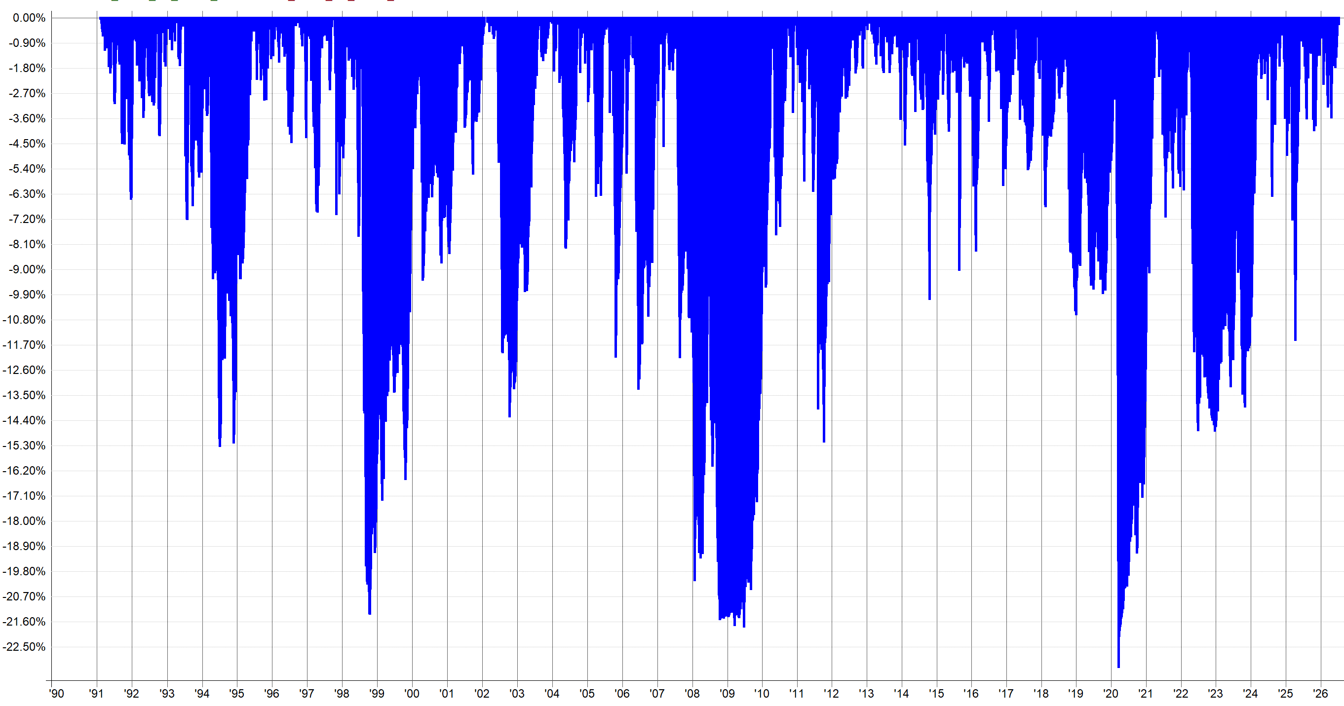
There are multiple equity curves because the system uses two different factors for ranking what stocks are the best to trade right now.
I decided to trade two different factors to help better diversify and get a slightly wider breadth of what’s considered “best” to own right now.
The darker blue line on top is the combined result of trading both factor variants.
There was a long sideways period in the later 2010s / early 2020s, but it has since started to perform again. I attribute that to the market itself not being very trendy at that time, rather than the system itself losing its ability to capture momentum.
From experience of working with the TSX market, that time period is very hard to get decent results for, which means if I am trying that hard, I’m curve fitting.
So I just let the system be, and if it wasn’t able to capture any momentum at that time, that’s life. That’s why I have a whole portfolio of other systems to pick up the slack.
I also want more long volatility and short side systems as well. Bear markets or even relatively shallow market pullbacks are my portfolio's weakness. I'm highly correlated with how well the markets are doing. If it's a good year for the S&P 500, my portfolio will also likely have a good year and vice versa. I want to work towards changing that.
Hence the need for more systems that profit during adverse market scenarios. I do already have some long volatility strategies, but I want to add more. To me, adding more long volatility strategies is like upgrading to the next tier of insurance.
Some say adding this sort of hedging is a waste of time. Just take the downside punches and deal with it. The issue is I want to be trading 15 years from now, and the easier I can make my journey to get there, the less I'll have aged in that 15 years, and the less chance of me getting wiped out.
So I want the long volatility strategies, for my personal health, mental sanity, and my portfolio's long-term health.
Conclusion:
So, to wrap up the first half of 2026: the portfolio finished at +18.2%, and basically all of that was from Q2.
I started the year red, sat through a long and deep March drawdown, kept following my systems, and came out the other side with three strong months back to back.
Halfway through the year, I have nothing to complain about. Going from -0.22% return on the year and a ~70-day drawdown, to breaking through new portfolio all time highs was only achievable because of the 30+ system portfolio I’ve been building the past few years.
I just have to let the portfolio of systems do it’s job, observe where it can be improved, research how to make it better, build, and implement. Though this is more work than it seems.
Looking forward to the second half of the year, the To-Do list hasn’t gotten any shorter. The main ideas are diversifying the timing and risk-off filters of my rotational systems so they don’t all go risk off at once like they did in March. Also, building out more long volatility and short side systems so I’m less tied to whether the S&P 500 has a good year.
I’ve also developed a new TSX rotational momentum system which I plan to deploy in a week or two, whenever I get a few hours to sit down and make sure I add it to my infrastructure correctly. Also, after writing this article and having a chance to reflect, I’ll probably check the risk off filter and make sure it’s different to what I’m already using elsewhere.
Fingers crossed for continued performance. We will revisit in a few months after Q3 has wrapped up.
Feel free to reach out if you have any questions.
Interesting approach, using a rolling Sharpe Z-score as an allocation guardrail is intuitive. My only caution is that a negative Z-score identifies below-normal recent risk-adjusted performance, but does not by itself imply higher expected returns. Have you tested subsequent returns conditional on the Z-score in a strict walk-forward/out-of-sample framework and across different lookback windows? If the mean-reversion relationship remains stable, this could be a compelling allocation overlay. BTW congrats on your returns!!!