

Q1 2026: TQX Portfolio Performance Review
Real results from a live portfolio of 25+ systematic trading systems across US, ASX, and TSX equities. What worked, what didn't, and what I learned.

Welcome to the “Systematic Trading with TradeQuantiX” newsletter, your go-to resource for all things systematic trading. This publication will equip you with a complete toolkit to support your systematic trading journey, sent straight to your inbox. Remember, it’s more than just another newsletter; it’s everything you need to be a successful systematic trader.
Introduction:
Q1 2026 is in the books, let’s discuss what happened with the portfolio.
I’ve done performance reviews before, but sporadically. This time I’m committing to making it a proper quarterly cadence. I figure it may be interesting to check in every quarter so you can see the portfolio performance in real time.
I made a live public portfolio tracking dashboard to help me perform these quarterly reviews as well; I’ll get into that in a minute.
Here’s what we’ll go through in this article:
The live portfolio dashboard I built (and why I made it public)
Q1 2026 live portfolio performance
System highlights: what worked this quarter
What didn’t work: drawdowns and underperformers
Why 25+ systems gives me long term confidence
What’s next
Let’s get into it!
The TQXPortfolioTracker Dashboard:
Before I get into the numbers, a quick note on where the data in this article is coming from.
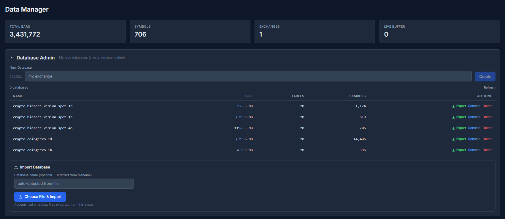
I built and launched a live portfolio tracking dashboard called TQXPortfolioTracker. You can find it at: tqxportfoliotracker.xyz.
It automatically pulls my raw portfolio performance data, current positions, closed positions, fees etc. from my broker, calculates many key metrics, creates numerous plots and tables, and then publishes to the website such that everything is public.
Sharpe ratio, volatility plots, P&L distributions, drawdown distributions and much more. The cool thing is this is all auto-calculated and pushed to the site, so there are no manual updates from me.
Now I can check in on my own portfolio whenever I want and see exactly what’s going on under the hood; which is genuinely useful for me.
Previously, I had to do performance reconciliations manually. Which meant I was only doing the work to validate and understand my performance every few months (at best). And even with that reconciliation work, I was not even 5% as detailed as what this dashboard shows.
Now I can be at the grocery store or be walking my dog and with a quick google search, know exactly how every aspect of my portfolio is performing in this exact moment. I think that’s pretty cool.
Keep in mind, I can only backfill 1 year of data back in time, so that’s all the dashboard shows. But the data will be stored and will increase over time. So while I’ve been systematically trading in this account for more than a year, I can only show 1 year back in time, but that will increase going forward as I collect more portfolio data.
I made the portfolio dashboard public because I’ve really started to lean into the Build In Public model. I want to share everything. All my wins and losses, for anyone to see.
Sharing this portfolio tracking dashboard will help keep me accountable and honest. I can’t selectively show only my best quarters and quietly skip the rest when the data is live and always current. Everything is right there. And honestly, knowing the results are out in the open makes me build faster.
I can’t make excuses to myself. It pushes me to keep improving rather than letting things slide. I’m depending on you all to keep me accountable.
So, if you see some pattern with my portfolio results in the portfolio tracking dashboard and have ideas on what I could improve with my portfolio, please let me know.
This dashboard also gives other systematic traders a live benchmark to compare their own portfolio against. When you’re in a drawdown, one of the hardest things is not knowing whether what you’re experiencing is normal.
Seeing that someone doing similar things trading-wise is also in a similar drawdown tells you that your system is maybe not broken; instead the market is just not cooperating. So, hopefully you can use this dashboard as a tool to inform your own systematic trading as well!
The screenshots throughout this article were pull directly from the TQXPortfolioTracker dashboard. If you want to follow along with this article or check it out in-between quarterly performance articles, it’s live and always up to date at: tqxportfoliotracker.xyz.
Also, I’m always looking to make the dashboard more useful. If there’s a metric, chart, or feature you’d like to see added to TQXPortfolioTracker, drop it in the comments.
I built this thing not only for myself but for the community to learn from as well; so tell me what would make it more valuable for you.
Q1 2026 Portfolio Performance:
I’ll lead with the number people care about most. My systematic trading portfolio returned -0.22% in Q1 2026:
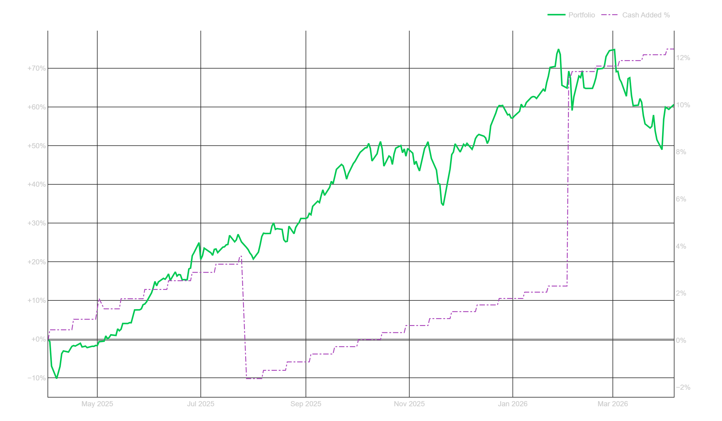
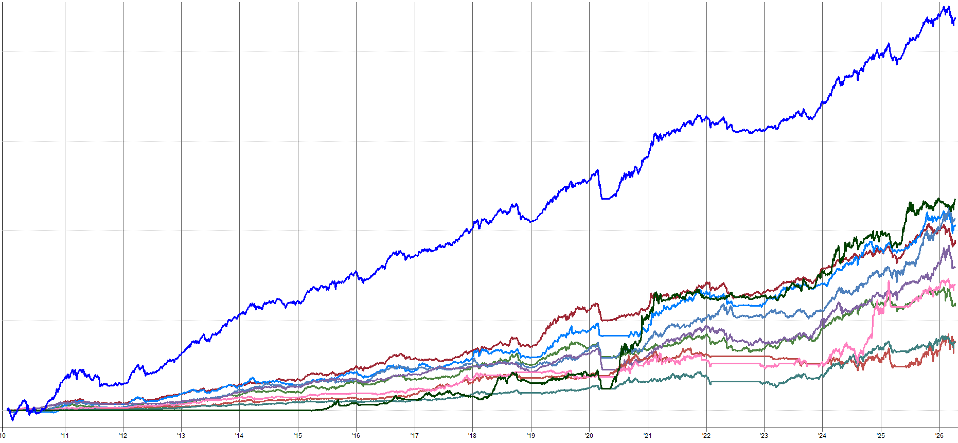
The equity curve tells the full story. The portfolio has been running up since April 2025. Through 2025 it climbed steadily, peaking around +74% before pulling back to close the 2025 year at roughly +57%.
Then Q1 2026 started with two decent months: January came in at +5.36% and February added another +5.41%. The portfolio was at all-time highs.
Then March happened.
March alone gave back -10.15%, which is what produced the sharp drop in the equity curve and the overall Q1 loss.
The portfolio had two solid months, then one ugly month that erased the gains of the two previous months. That’s just how trading is sometimes.
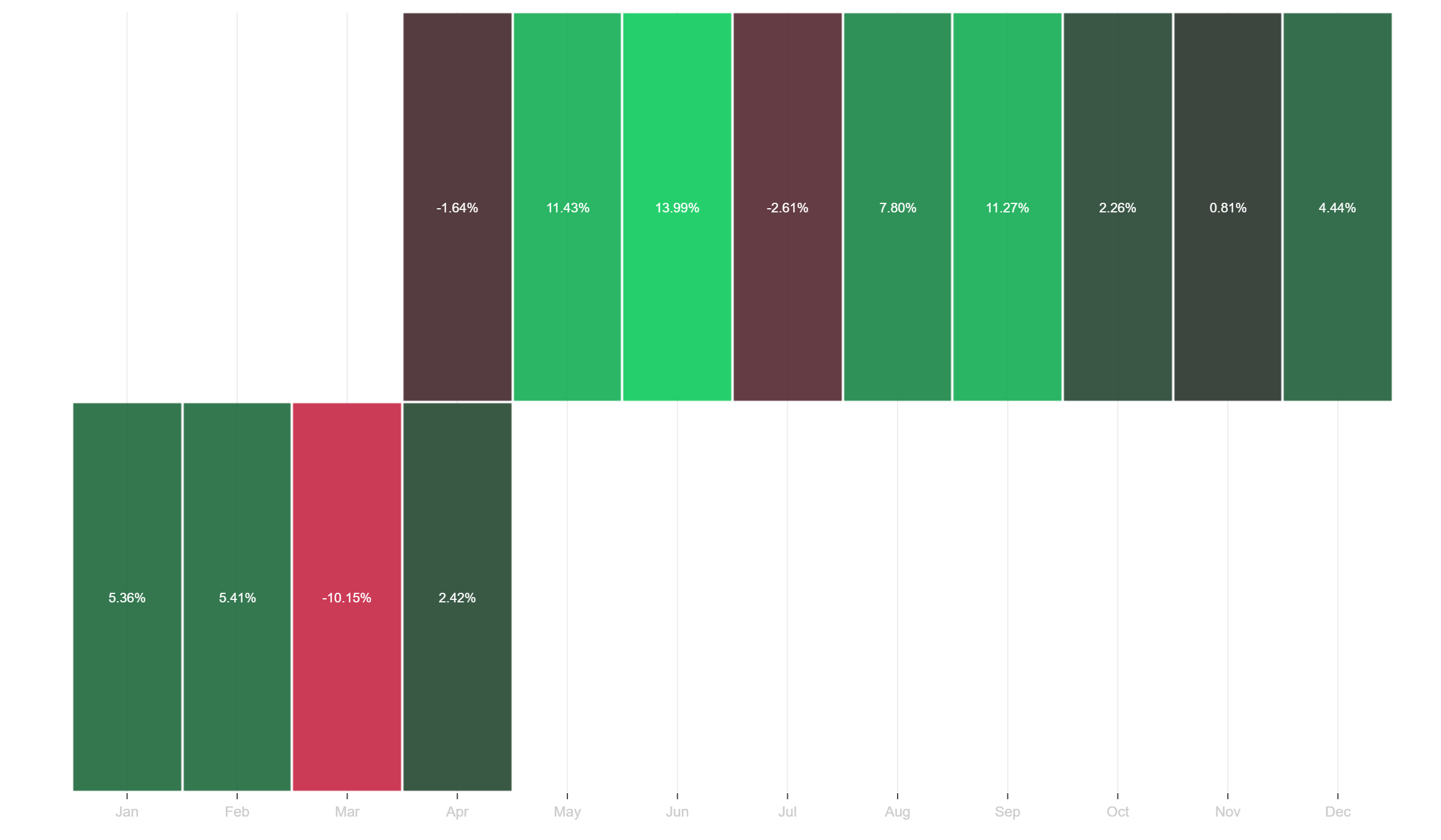
The monthly returns heatmap shows this well. Look at 2025: nine months of data, with only April (-1.64%) and July (-2.61%) in the red. The standout months in 2025 were May (+11.43%), June (+13.99%), and September (+11.27%).
That is what a strong trend and momentum year looks like at the monthly level. Consistent positive months with some isolated noise and small pullbacks.
2026 so far: January green (+5.36%), February green (+5.41%), March red (-10.15%), but April is already recovering at +2.42% (partial month). The heatmap makes it obvious how quickly one bad month defines a quarter.
Two solid months and the portfolio is up over 10%, then one bad month, and you end Q1 in the red. That systematic trading for ya. It happens, you just have to accept it and keep trading your systems like nothing ever happened.
This is why trading sucks. But we do the things that suck and eventually, in the long term, we get paid for it. That’s just how the game works. You need to have the long term mindset and not get stuck in the day to day volatility.
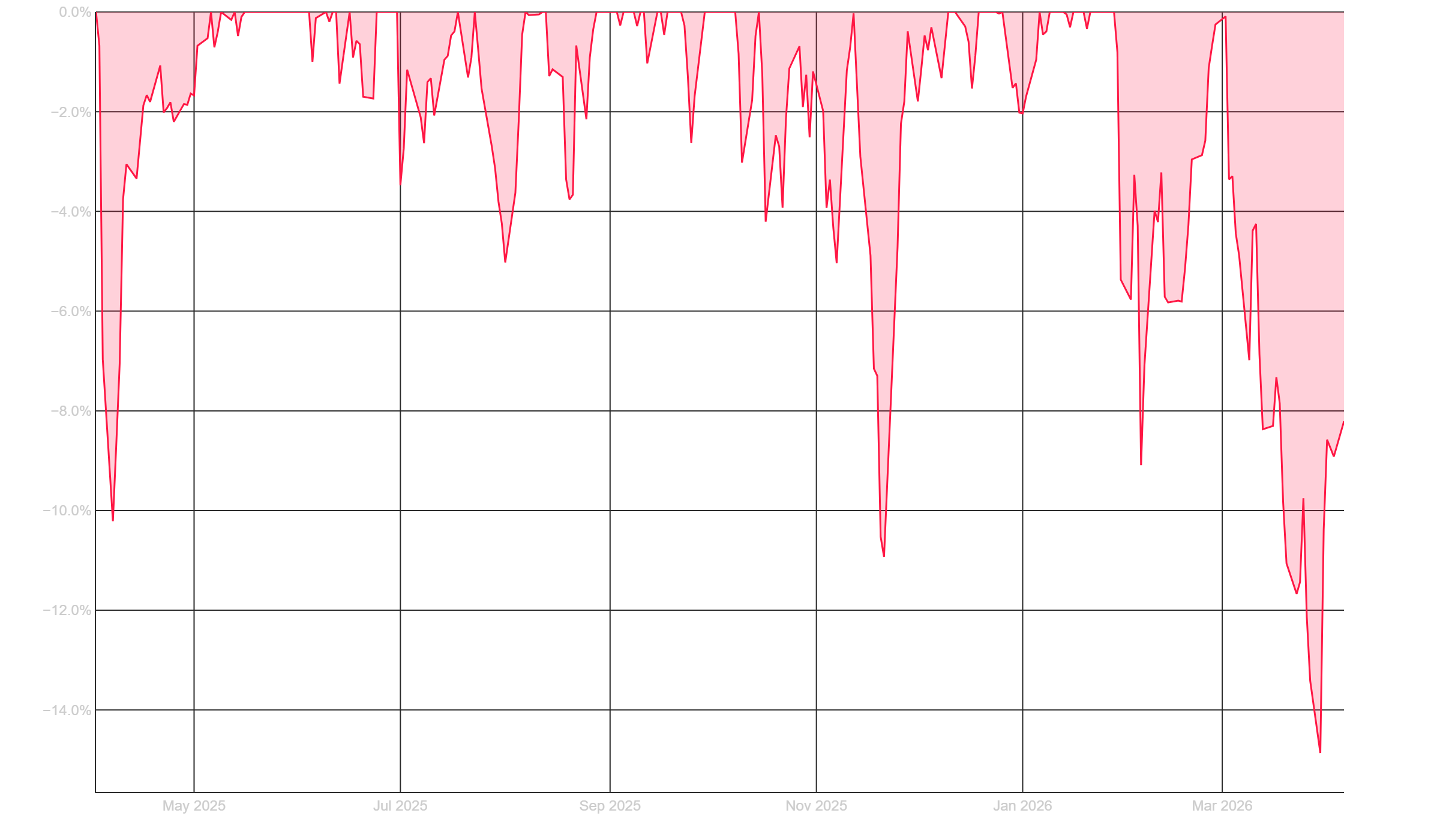
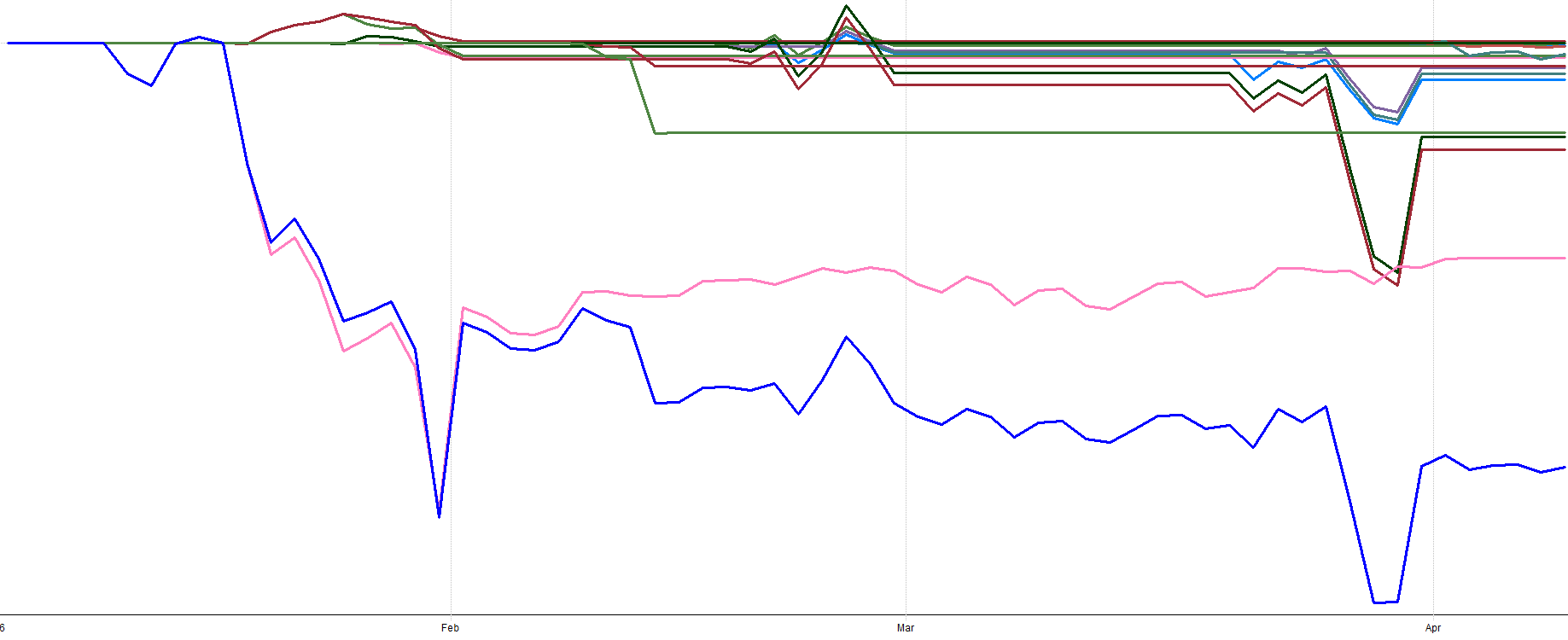
This drawdown chart gives the full picture of every drawdown since early 2025. You can see the portfolio has experienced several pullbacks along the way. Early 2025 had a drawdown near -10%. There were a couple of -6% to -8% dips through mid-2025. The October/November 2025 period saw another -10% drawdown.
But the current drawdown that started in late February 2026 is the deepest one so far, reaching approximately -15% before starting to recover recently.
Here’s an interesting comparison though. 2025 followed a very similar pattern. The year started strong, then I hit a drawdown similar to this current one, and then the rest of 2025 ended up being my best year ever at +61%. Q1 2026 is tracking a very similar shape so far.
Does that mean the rest of 2026 will also rip higher? No idea. But it’s interesting to see the pattern strta to repeat.
With that said, 61% in one year is way above my historical long term expectations and what my backtesting suggests. Some level of pullback or consolidation is completely natural after a year like that. I’d be more concerned if there were zero drawdowns after a +61% year. That would be suspicious.
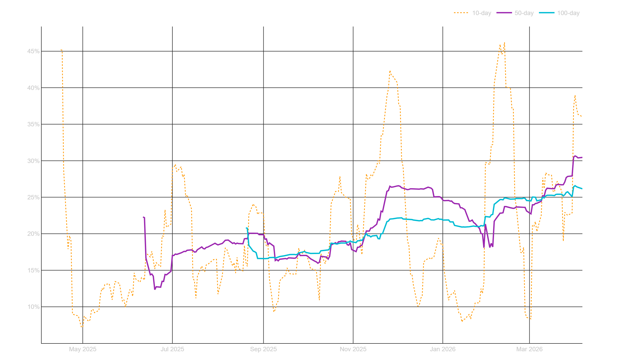
Portfolio volatility is running at 26.2% on the 100-day rolling window. But the chart tells a more nuanced story. The 10-day rolling volatility (orange dotted line) is much more responsive and has been all over the place, spiking near 40% during the March selloff. Meanwhile, the 50-day rolling window (purple) sits around 30%.
Volatility has been increasing, but high volatility is the risk you take for outsized returns, because risk and return are generally correlated. You don’t get +61% years without high volatility periods like this from time to time.
Why volatility seems to be trending up so consistently? I’m not quite sure yet, but now that I have this tracking dashboard I can monitor it and ensure it starts to stabilize.
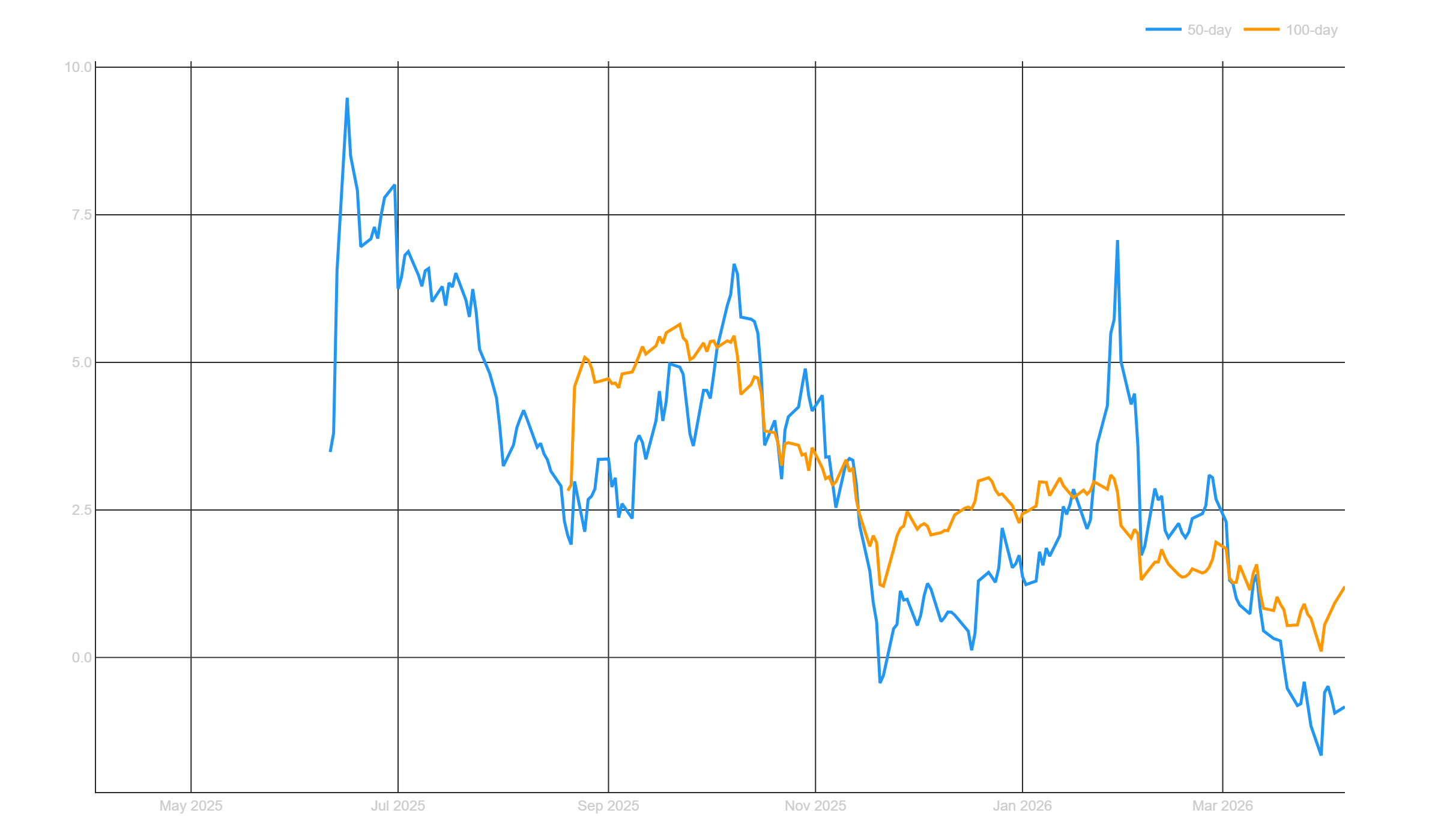
The rolling Sharpe ratio chart shows the rolling evolution of portfolio risk-adjusted return. The full-period annualized Sharpe sits at 2.07. But the rolling windows tell a different story right now.
The 50-day rolling Sharpe (blue) has dropped below zero, and the 100-day (orange) is sitting around 1.5. In 2025, the 50-day Sharpe peaked at over 7.0 multiple times during the 2025 equity run up.
But, it’s been normalizing toward the whole period average as more data fills in. A Sharpe above 2.0 over a full year of live trading is still an excellent number in my opinion. The question is where it stabilizes as time goes on and more data gets filled in.
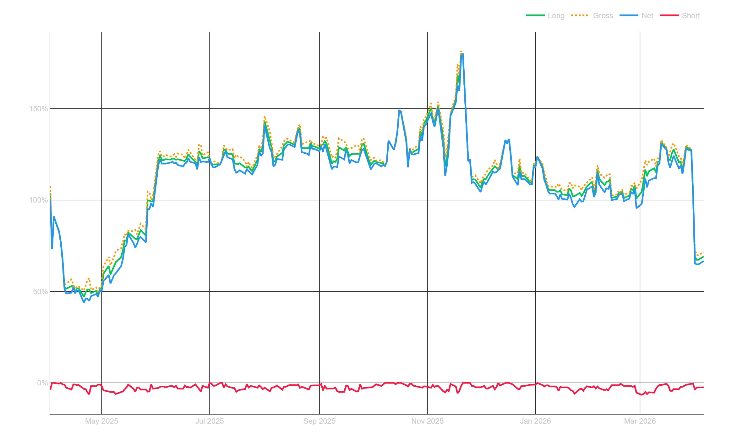
The exposure chart tells an important story about position sizing and risk management. My gross exposure (orange dotted: abs(short) + long exposure) has generally sat between 100% and 130% of portfolio value through most of 2025.
The big spike in November 2025 pushed gross exposure to nearly 175% as multiple systems loaded up on positions. I talked about this time period in my 2025 performance review, but this was when I had over a 10% drawdown that happened very fast but very quickly recovered.
My mean reversion systems kicked in at this time, the markets sold off more when I was building into my mean reversion positions. I was heading into a drawdown holding this increased exposure due to mean reversion buying. But then the markets popped, and so did my portfolio. So, the mean reversion systems caused and fixed the drawdown. Funny how that works.
Short exposure (red, near the bottom) has been minimal, staying below 5%. That’s because I don’t have enough short systems. That is still something I need to fix.
But look at the right side of the chart. As the 2026 March selloff hit, my exposure dropped sharply to around 60-70%. The systems started shedding positions as exits were triggered. This is the lowest exposure I’ve had in awhile. Currently the portfolio is more conservatively positioned that it has been recently.
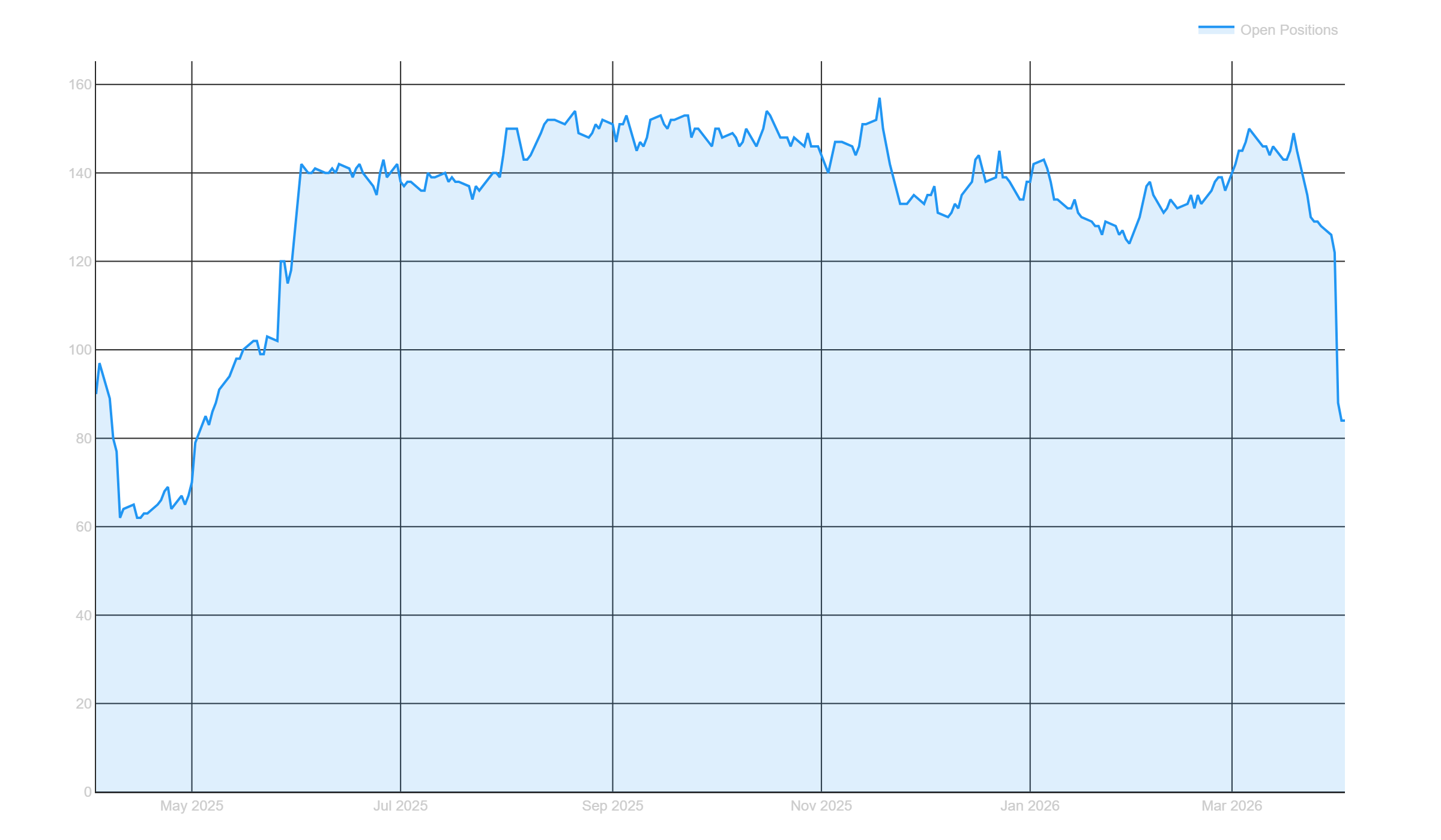
The reduction in portfolio exposure is explained by this open positions plot. You’ll notice on the far right the portfolio recently sold almost half it’s positions to cut it’s risk. No manual intervention. The systems sized down on their own as risk-on conditions deteriorated.
At its peak, the portfolio was carrying around 150 to 155 open positions simultaneously. That’s 25 systems, each running their own universe, generating a combined book of over 150 positions across three countries and multiple strategy types.
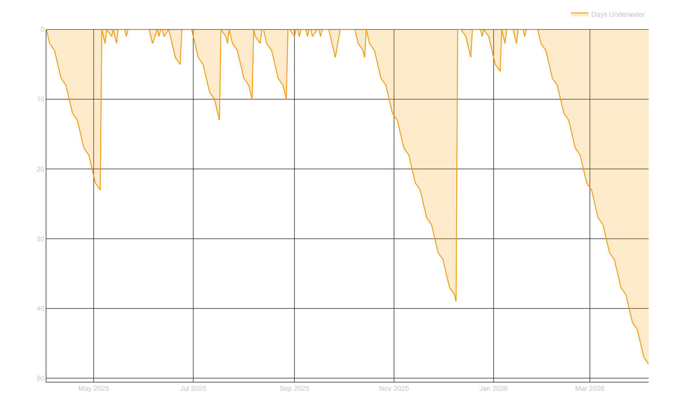
The underwater equity plot shows something that puts Q1 in perspective. This chart tracks how many consecutive days the portfolio has spent below its prior equity peak.
You can see several drawdown periods throughout 2025. There was a roughly 20-day underwater stretch early on, and a longer 40-day one in October/November 2025.
But the current underwater period that started in February 2026 is already approaching 50 days and counting. My backtesting suggests 1 year or more is within expectations for drawdown length, so I am not concerned.
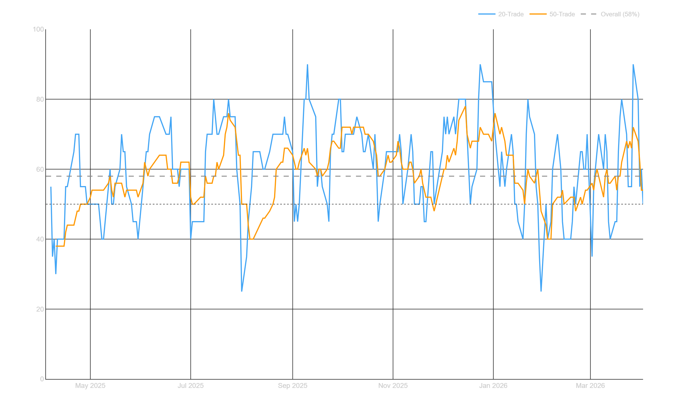
The overall win rate across all closed trades since inception sits at 58%. That means more than half of all closed trades are profitable. The 20-trade rolling window (blue) bounces around wildly but stably around the long term average.
Sometimes 20-trade win rate spikes to 80-90%, sometimes it dips to 25-30%. That’s just noise. The 50-trade rolling window (orange) is smoother and generally stays between 45% and 75%.
Even during the Q1 2026 drawdown, the 20-trade and 50-trade win rate has been hovering around 55-60%. The systems are still finding winners. They’re just not quite enough to offset the losers in a market that’s chopping against trend and momentum setups.
System Highlights: What Worked in Q1:
In a quarter where almost everything else lost money all due to one bad month, the hedging strategies were the standout. They were choppy but positive in Q1 and did exactly what they were designed to do.
These are strategies that go long volatility ETFs. When markets chop and sell off, these earn their keep. This is exactly the kind of quarter where you’re glad you have them in the portfolio.
Lots of people on X were giving me grief about running hedging strategies earlier this year.
“Don’t bother, waste of time, they just bleed PnL.”
Sure, they look pointless when markets are cooperating and everything is going up. But in a quarter like this, they proved their worth.
You don’t buy insurance after the house burns down. You have to be proactive about it and pay the premiums when times are good so you can collect the payouts when things go sideways.
In the long term, hedging strategies look like a drag on performance when things are going well. They earn their keep when things get difficult. That’s the whole point.
Post-Q1 update: the mean reversion portfolio caught the bounce.
If you’re looking at the live equity curve right now and seeing a sharp spike up after the Q1 low, that’s the ETF mean reversion systems firing:
As markets sold off hard into the end of Q1, the mean reversion portfolio built up positions in beaten-down ETFs. When the market snapped back in early April, those positions caught the bounce.
In the overall portfolio, one day alone contributed around a +5% return. That’s what a properly constructed mean reversion portfolio is supposed to do, they buy when things are oversold, and you (generally) get paid once things revert.
The trend systems were struggling because the market was chopping and reversing. But mean reversion systems thrive in exactly that environment. They are designed to profit from the snapback.
Having both approaches in the portfolio means the mean reversion systems start picking up the slack when the trend systems are struggling. That is system level diversification actually working in real time.
For a detailed breakdown of how these mean reversion systems are built and why they work, my most recent article covers exactly that:

What Didn’t Work: Drawdowns and Underperformers:
Most things didn’t work in Q1… all due to March. Trend and momentum were working well in January and February, but March turned things around… in the wrong direction.
My trend and momentum systems are currently in drawdown. But that’s okay. It’s a short term period of mild discomfort. These longer term systems are expected to have periods of underperformance. It’s the long term view on the timescale of years that matters most.
While trend and momentum is currently in a drawdown, zooming out to the longer term result of all trend and momentum systems; you’ll notice everything is within expectations:
Short term pullbacks like the current one are completely normal.
Another category of systems that underperformed are my new seasonality systems I’ve been building. These got hit pretty hard, but that’s mostly due to me being over sized on one specific system/trade. I have since cut back the allocation to that system as I learned my lesson.
You’ll notice in the seasonality portfolio, 90% of the losses are from one system. This plot is showing the combined seasonality result in blue and each individual seasonality strategy in the other colors above the combined blue line.
These systems are brand new, so it will take some time for their performance to start to shine through.
Seasonality strategies work by zeroing in on specific time periods where markets tend to go up or down more than their average drift. The seasonal “juice” is the alpha that comes on top of the market’s normal upward movement (or downward movement, just depends on what market you’re looking at).
Why 25+ Systems Gives Me Long Term Confidence:
The underperformance over the last month or so doesn’t concern me. The reason is I have 25+ systems looking across many different markets and many different setups. This means eventually a few of them will start working again.
Right now, while some systems are working, the overall portfolio is a little out of sync with the markets. But, in the long term, there are no concerns because of how diversified the portfolio is across systems, markets, and timeframes.
Most of my portfolio is trend and momentum on equities, so the bulk of returns come from that avenue. Plus some hedging and some mean reversion. When trend and momentum are out of favor, the portfolio suffers. But these things are cyclical.
It’s just part of the game. Sit on your hands and let the trends and momentum come back. The edge is there. You just have to let the market cycle back to your systems.
Diversification gives you the patience to wait. Diversification gives you the confidence to sit through the rough times because you know the portfolio is built to recover.
What’s Next:
When I’m in a drawdown, it always makes me start thinking about where to expand and what to improve. This drawdown is no exception. Here’s what’s on my radar for the coming months.
I want to get more simple seasonal effect strategies into the portfolio. These approached help me diversify beyond pure trend and momentum.
Commodity based strategies are also high on the list. Completely uncorrelated to equities, which is exactly what I need. I probably won’t venture into futures yet, but commodity ETFs are on my mind. The portfolio would benefit massively from that diversification.
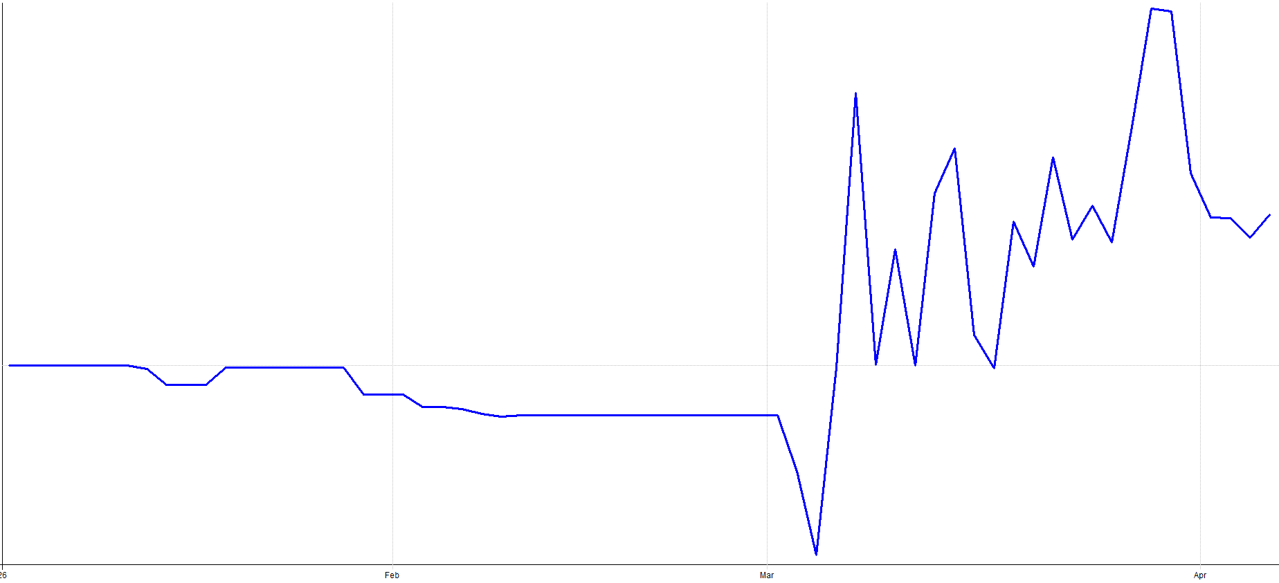
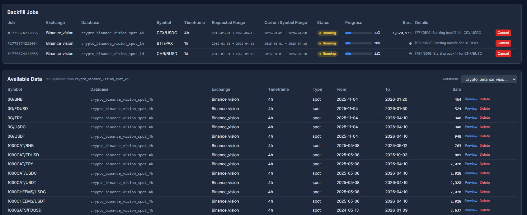
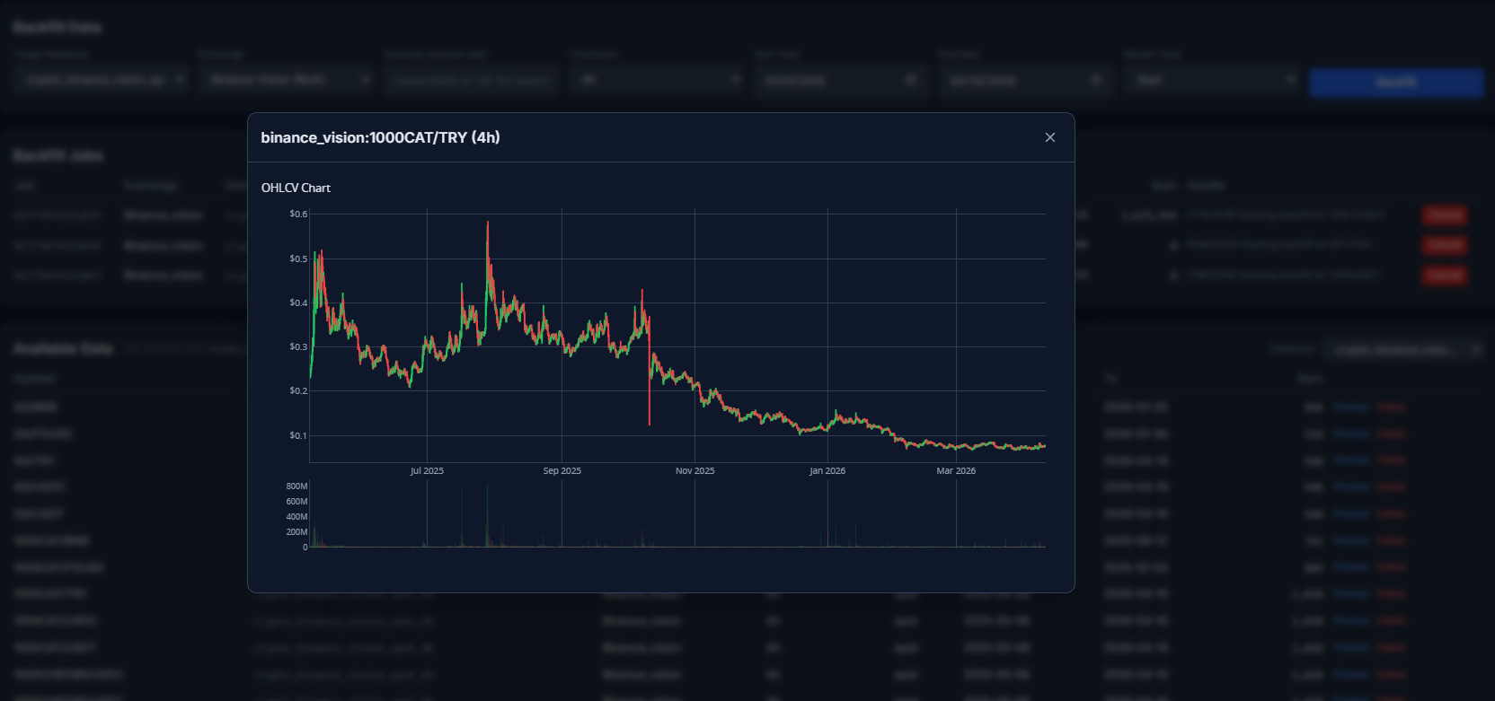
Same deal with crypto based strategies. I am currently exploring the crypto avenue, so maybe more updates to come here as well. This is a very big project, but one I feel could be very beneficial long term. Here’s a snapshot of the crypto trading dashboard I’m currently building (right now I am in the phase of collecting crypto data from many sources):
I also need to rethink the short side. I have a couple short term mean reversion systems on the short side, but every time markets pull back they don’t seem to help that much. I need to go back to the drawing board and figure out a short side approach that actually smooths the equity curve during pullbacks. I am open to ideas here if you have any.
The plan going forward is to keep building, keep diversifying, and let the systems do their thing.
What’s on the research pipeline for Q2 and beyond:
ETF mean reversion articles
VIX effects research
End of the month effect deep dive
Bitcoin seasonality
General crypto stuff
Commodity trend strategies
Short side systems
And more…
Lots of interesting things cooking. Stay tuned.
Conclusion:
Q1 2026 was essentially a flat quarter. That’s just how it goes sometimes.
But this is exactly the kind of quarter that tests your conviction. If you’ve built a diversified portfolio of robust systems, you can calmly sit through it because you know the edge is still there. The market will cycle back. It always does.
In fact, I am writing this article a couple weeks late in relation to the end of Q1 and the portfolio is already climbing out of drawdown.
Don’t forget to check out tqxportfoliotracker.xyz to see all the portfolio plots and tables!
I think there are over 60 on there now and it will surely grow over time. Let me know what questions, observations, or suggestions you have to make the portfolio tracker dashboard better!
How was your Q1? Drop a comment below. I’d love to hear how your portfolio held up.
Great, transparent and very detailed analysis, good job! 1y+ drawdown lenght would be terrifying, I dropped my discretionary stocks trading years ago after that kind of DD (and regreted it).
Short on pullbacks ideas - breakdown below any faster MA (5/10 EMA for example). I also have a one candle momentum strategy (on FX defining candle size in pips and body as % of total candle size) that goes short on a big red candles, sounds silly but it works...