

Momentum Mini-Portfolio Development - Part 1: TSX Momentum
A two factor approach to trading rotational momentum on the TSX market. System results, robustness testing methods/outcomes and how to think about minimum dollar allocation to a system.


Welcome to the “Systematic Trading with TradeQuantiX” newsletter, your go-to resource for all things systematic trading. This publication will equip you with a complete toolkit to support your systematic trading journey, sent straight to your inbox. Remember, it’s more than just another newsletter; it’s everything you need to be a successful systematic trader.
I recently launched a portfolio tracking website (updated daily) that tracks my systematic trading portfolio performance, along with many supporting metrics. You can check in on my personal systematic trading portfolio performance anytime here: TQX Portfolio Tracker
Introduction:
This is a system I’ve been wanting to build for a while now and have finally gotten to it. It’s a monthly momentum rotational system on the TSX stock market.
Well, it’s not a pure momentum system, and it’s also not even a pure rotational system. I like to bend the rules a little bit. But we will get more into how it works a little later in the article.
I wanted to develop this system to add breadth to how I look at the TSX market and my portfolio as a whole. I already have a few longer term systems on the TSX, but nothing on the momentum side that’s live yet.
I developed a rotational momentum system on the TSX as part of the Portfolio Development Series, but I wanted to take another look and see if I could implement more features to make a new system for the TSX that is even more robust and diversified.
In this article I’ll walk through a few concepts:
The reason I built this system
The system backtest results
The robustness results of the system
How to think about minimum capital allocation to the system
The hybrid rotational approach
The Reason:
I already trade TSX trend following on the daily and weekly timeframe. What I was missing was a monthly view of the same market, and one simple way to get a monthly view is via monthly rotation.
Rotation isn’t the same thing as trend. They both benefit from trends, but momentum is looking at the market holistically and comparing each stock to the others, while trend is looking more at a single stock relative to itself.
If the whole market is going up, both approaches will generally benefit. Both approaches will get into strongly trending stocks. But having multiple different ways of classifying a strong trend is always beneficial. It’s the same reason why any competition has multiple judges, so that they can all provide their own perspective and the resulting averaged score is much more stable and repeatable over time.
That’s the exact reason why I want to have multiple systems on the same market looking at trends and momentum in different ways and on different timeframes; so I end up with a more stable and average result over time.
I want as many lenses on a market as I can reasonably run, because more lenses means more chances to catch the big winners. I want to be exposed to as many trend/momentum opportunities as possible.
That same logic is also why I trade outside the US markets in the first place. Someone asked me a question recently (and frankly I get this question somewhat often actually):
“Why bother with non US markets, surely every opportunity you could want already exists within the US markets.”
My response is:
“Why limit myself to one market when opportunities exist elsewhere too? And in reality, my expectancy tends to be higher outside the US anyway, because those non US markets are less efficient. Fewer large players. More inefficiencies. A better playground for retail. And the TSX market is a good example of that.”
I want to take as many positive expectancy opportunities as I can. Many of those opportunities exist in non US markets, and usually the expectancy of those opportunities is even larger there. I live in the US, but I have zero preference for what market my portfolio trades or invests in. As long as I have a positive expectancy system on that market, I may as well trade it too.
So this TSX rotational momentum system works to fill the gap my portfolio has of having a daily and weekly view of the TSX market, but not a monthly view.
Rounding out my TSX exposure with a monthly rotational momentum type system has been on my list for over a year now. And I’m finally getting to it. What I’ll probably do is use it as part of the momentum mini-portfolio I referenced in my latest Q2 performance article that I plan to more formally build and share over time here.

A mini-portfolio is a term I think I made up, where a cluster of similar systems harvests a similar idea, and each is diversified in its own way. So a momentum mini-portfolio would be a bunch of momentum systems that all trade momentum differently:
Different universes
Different rotation timing
Different regime filters
Different entry and exit logic
Different ways of measuring momentum
Etc.
Basically, it’s just a diversified set of logic inside one broader idea. I use this mini-portfolio framing because I try to become as diversified as I can within one general idea over time. I want to build out and be as diversified as I can in the domain of momentum by trading many momentum systems all with variation to each other, then do the same with mean reversion, and the same with trend following etc.
I can keep expanding my current set of momentum systems with more momentum systems to build out this momentum mini-portfolio and incorporate more of this intentional diversification within the momentum framing.
I simply want to spend real time on how to spread risk across timing, filters, logic etc. You could think of this article as part 1 of a momentum mini-portfolio development series. I still have a lot of development work to go, so I may drift into other article topics then come back to it, I’m just sharing this one now because members of our community seemed interested in it when I shared the concept briefly over Discord.
System Results:
After working with the system for a while, these are the final equity curve results/stats. Backtests are always fun because they tell you nothing about a system except how one historical sequence of events occurred.
Hence, in the next section I'll backtrack and walk through the methodology of how I developed and stress tested it across many possible historical outcomes.
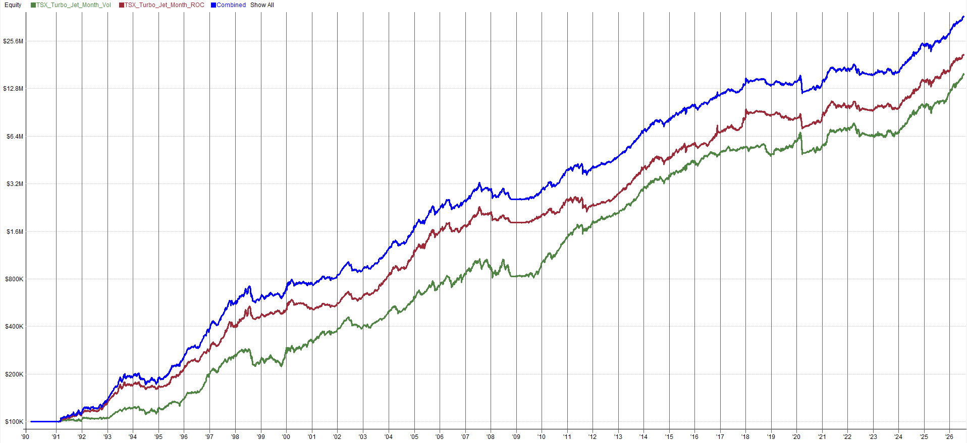

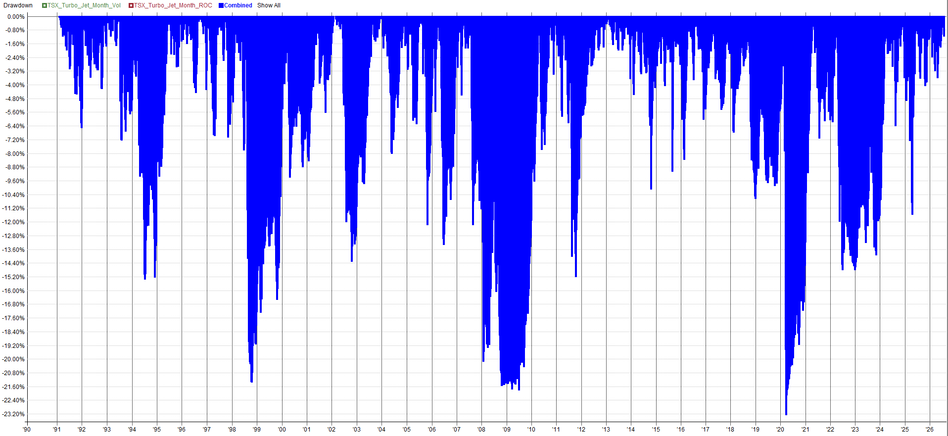
You’ll notice three equity curves on the chart. That’s because I built the system to trade two different factors independently. A momentum factor and a low volatility factor.
Why?
It goes back to diversifying across as many features as possible, and that includes diversification within a single system as well. I consider this one momentum system. It just allocates capital between two different factors / ranking mechanisms and handles them independently within the system.
Red: the equity curve of the momentum based factor
Green: the equity curve of the low volatility based factor
Blue: the combined result when you trade both factors
I picked those two factors because they tend to exhibit strong and consistent results for equities, based on my experience.
Momentum has persisted for hundreds of years in equities, and in basically every other asset class, and I expect it to keep working over a long time horizon.
The low volatility factor gets talked about less often, but I’ve done enough research over the years across different markets and timeframes to know that, on average, a low volatility stock delivers better risk adjusted returns than a high volatility stock. Low volatility stocks outperform high volatility stocks in that sense.
Both factors obviously work, and they can ebb and flow at different times. This helps again from the perspective of having as many views of the markets as you can.
I want one judge to pick me the best set of stocks based on low volatility, and another to pick a set of stocks with high momentum. Combined together, I’ll get a more stable, average, and consistent result going forward in time than if I had only listened to one of those “judges”.
Looking closer at the results, you’ll notice the system had roaring returns in the early 1990s, the 2000s, the early 2010s, and again recently. But it struggled through the 2008 financial crisis (just like basically every long side momentum or trend based equities system did).
It also had a little struggle in the early 2000s too, and then a longer flat patch recently, from roughly 2018 to 2023. But ever since 2023 it’s come back to life, as strong as ever.
A lot of people would look at that 2018 to 2023 stretch of underperformance and decide the system was broken or dead (or worse, they would conclude the system needs more optimizing!).
I’d say the opposite.
The TSX market itself had a rough patch where not much was trending during that period of time. If not much is trending, it’s hard to make money from trend/momentum systems.
Not every year will our systems work.
Or in this case, not every 5 years will our systems work.
From experience working with the TSX, that period of time is very hard to get decent looking results out of. Which if I look hard enough introspectively, that tells me something: if I’m trying that hard to make that stretch of time look good in a backtest, I’m curve fitting.
So I just left it alone. If the system couldn’t capture momentum during that window of time, that’s life. That’s exactly why I run a whole portfolio of other systems to pick up the slack, and it’s why we’ll start building out a momentum mini-portfolio soon, to smooth the returns from momentum style approaches.
And even beyond the momentum mini-portfolio, I can lean on general trend following systems, mean reversion, long volatility etc. sets of systems to carry the portfolio when one individual system lags during one period of time.
So as you may have picked up on, I’m not that concerned about a system having a portion of a backtest that looks ugly. Stop going back and trying to smooth it out. You can’t go back in time and trade that period anyway, so why does it matter?
All you’re doing is curve fitting. This results in overstating the upside and understating the downside. Then when you go to allocate capital, you end up handing more capital to a curve fit system.
Your allocation framework sees a system with a higher Sharpe than it actually has and thus more capital generally gets allocated. In reality the upside is smaller and the downside is bigger than what your allocation calculation was working with. Unfortunately this results in overallocation to a curve fit system that is actually more risky than you thought. A lose-lose situation.
So just let the backtest be. If a system doesn’t work during some period, that’s what would have actually happened during that period of time.
We don’t work hard to make holy grail systems.
We work to make portfolios of many systems.
Or multiple mini-portfolios of many systems that all roll into the overall portfolio. However you want to think about it.
Develop enough systems that are all different to each other and that ugly period of time within one system gets smoothed by another one that isn’t correlated to it. When in doubt, zoom out. The portfolio effect is what we care about, not the performance of one system over one small period of time.
System Robustness:
I used the period of time from the early 1990s to 2020 for the initial code up of the idea, and for the work of breaking it out into a two factor system. Then, once the system was in the state I’d envisioned, I ran optimizations from 2005 to 2020.
A couple of things to specify here. I didn’t use any pre-2005 data for optimizer related fitting, because if you go back that far the way the markets worked was just different. I’d rather use pre 2005 as a soft validation that I didn’t completely screw something up, rather than as data to perform fitting to.
The markets were just too different that long ago. Things like decimalization, the shift to computer trading, pit trading etc. It’s still good data for a momentum system though, both to confirm the effect still shows up and to get a feel for the kind of variance you might see in the equity curve across different macro regimes. Hence why I still use it as validation data, just not for fitting.
The other thing is that word, “optimize”. I hate that word. It’s misleading. And it leads system developers to do the wrong thing. Contrary to the definition of the word, I’m not actually optimizing and looking for the best looking parameters, and I’m not trying to “optimize” to make the backtest look better.
I’m actually uninterested in how the backtest looks during an optimization. What I’m doing is checking that the parameter values result in stable outcomes and intuitively make sense as values. I’m not trying to prove the 257 day moving average is the best. I want to instead understand if the 150 day, 200 day, 250 day etc. moving averages all work and provide stable results, and if so I’ll pick a parameter value around the middle at a whole number (like 200 days).
When I “optimize” I run very wide, very crude optimizations. I want to know what a 50 day long term moving average looks like versus a 400 day one. I might run that in steps of 50 days. I’m not searching for the perfect value in between. I’m just trying to understand how the results vary.
Ideally I see a huge range of parameter values that all give more or less the same result, within about plus or minus 5 to 15 percent. If that’s the case, I just pick a value in the middle and continue on. I don’t care that, for example, a 207 day moving average is a little better than the 200 day, I can assure you picking 207 over 200 would be curve fitting to noise.
On the other hand, if a parameter turns out to be super sensitive during the optimization, with no wide band of stable results and no stable gradient where the results decay slowly as you move the value up or down, then I don’t cherry pick the one value that happens to look good. I go back to the system and brainstorm new rules to test that behave in a more stable way.
No sense in trying to force an unstable rule / parameter to work. I’d rather just find another implementation that works in a more stable, consistent, and crude way. I don’t want to have to be precise with my parameters or rules, I just want something that works across the board, and if it doesn’t, I try to find a replacement that does.
Better still, to take this to the next level, rather than try to find the “perfect” or best “optimized” parameter, I’d rather trade a wide variation of the parameter set. This is much more robust than just picking one value. Then I’m not stressing over finding the perfect parameters.
If I trade a spread of parameters, then I am more likely to experience the average system result going forward into live trading. This is much better than betting on one parameter set and letting luck determine if it makes lots of money live trading or not.
Because no matter how carefully you built the system to strip out bias and minimize curve fitting, the specific path the future equity curve takes is pure luck. For every new system I develop, I want to mitigate that luck somehow.
This concept is great in theory, but can be tricky in practice. I don’t have infinite money, so I can’t just trade 100 permutations of every system I build. I wish I could, because then my future returns would be way less exposed to luck and way more purely tied to the outcome of the effect being traded. Instead I live in the real world and have to find ways to mitigate luck without needing infinite capital, time, or resources.
For this system, the way I chose to mitigate the luck of future outcomes was by implementing two ranking factors. The factors rank the stocks that get selected for trading (one variant ranks on low volatility and the other on high momentum). That factor rank matters a lot for the future path of the equity curve.
As an example, if 25 stocks meet the entry criteria and the system can only hold 10 positions at once, buying stocks ranked 1 through 10 gives you a completely different equity curve outcome than buying stocks ranked 15 through 25.
The 10 stocks that get selected out of the viable 25 are purely determined by the ranking factor within the system. So, to diversify my luck and methodologies, I decided I wanted two independent looks at that ranked factor list to pick out which 10 stocks are considered “best” to own now.
It also gives me exposure toward two different factors, low volatility and high momentum. That’s interesting to me because for one, all of my rotational systems currently are exposed to momentum only factors. So having exposure to a low volatility factor is diversification for me.
Also, factors go in and out of favor at different times. They’re generally highly correlated, but there are stretches of time where one factor underperforms or outperforms the other. In the end, this helps smooth out the equity curve roller coaster.
This won’t give you as much smoothing or diversification benefit as a completely uncorrelated set of systems, but it does give some small benefit within the system itself. We will add in uncorrelated systems when we build a whole portfolio anyway, so at the system level I am just trying to get as much benefit as I can and mitigate luck as much as I can in this smaller system specific design space before I move on to larger portfolio construction related diversification/correlation/luck mitigating techniques.
Anyway, once I settled on the two factor system design and had my very broadly working parameter sets chosen, I ran a set of robustness tests to prove to myself the system was not overly curve fit. There is always some degree of fitting done, the key though is to ensure it wasn’t overdone.
So I ran a suite of pretty tricky robustness tests to ensure that this system could still pick up on the quality trades, even when a bunch of noise and variation was added to the system.
The robustness tests I ran:
Test 1: Ran a plus or minus 25% parameter variation and added 20% noise to the ranking mechanisms.
Test 2: Added 20% noise to the entry signal and added 20% noise to the ranking mechanisms.
Test 3: Added a time shift to the entry/exit, so the system rotated not at the end of the month but at day 1, day 2, day 3 of the month, and so on.
Test 4: Added a time shift to the entry/exit and 20% noise to the entry signal.
Test 5: Tested the system on the ASX market.
Test 6: Tested the system on a US large cap universe.
How To Read The Tabulated Results:
Each of the four noise tests (tests 1 through 4) are summarized in a table below. But before I get into those results, let me walk through how to read the tables.
Each row in the table represents a performance metric: rate of return/CAGR (ROR), Ulcer Index, volatility, Sharpe, AvgWin, Max Drawdown etc. The first column shows the performance results of the baseline system.
Every column to the right of the first column represents an output from the robustness test. For that given robustness test, there will be results like mean, standard deviation, CV, minimum, maximum, percentile, z score etc.
This allows you to understand a summary of the range of outcomes from the given robustness test. Basically, we can compare the baseline system results to the scatter of robustness test outcomes in these tables.
As a general rule of thumb, if your baseline system results outperform all the other runs of a robustness test, that can be a warning sign of curve fitting. If the real baseline system outperforms almost every robustness test variant of itself, chances are the system was at least somewhat fit to the exact path history provided. Generally, this can easily be checked via percentile (what percentile is the baseline system in relation to all other runs from the robustness test).
But percentile on its own can be misleading without context. The scatter of the results matters too. As an example, a baseline system at the 77th percentile of a super tight scatter of robustness test results might only end up being a fraction of a point above the average robustness run.
A baseline system result at the 77th percentile of a very wide scatter of robustness results could show the baseline system is significantly more curve fit than desired. So the scatter of a robustness test matters to put percentile into context.
I’d even consider trading a system where the baseline result is in the 100th percentile (better than everything in the robustness test) if the scatter of robustness test results is small and the robustness test was pretty aggressive.
So maybe the baseline system ROR was 18%, and the average robustness test result was 17.5% ROR with a scatter ranging between 16.9% and 17.8%. That’s a super tight scatter and the baseline system ROR is only slightly higher than this example robustness test result. I’d consider this a pass even though the baseline system was better than every robustness test result.
The baseline system is extremely close to the robustness test results; the 100th percentile result just makes it seem scarier than it really is, when in reality the baseline system is only overstating returns by a fraction of a percent compared to the average robustness test result.
I hope that makes sense, it’s a little tricky. No metric can ever be taken in isolation. Holistic understanding is required.
Okay let’s look at the robustness test results one robustness test at a time. If the images are too small, the excel sheet of results is in the GitHub.
Test 1: Parameter Variation Plus Rank Noise:
This first robustness test varies the system in two ways at once.
Parameter Noise/Variation: I ran every parameter within the system through a +-25% variation from the default value. This simulates what would have happened historically if I had chosen different parameter values than the ones I did. It also displays the stability of the parameter set chosen. If varying the parameters makes the system fall apart, that’s almost always a sure sign of curve fitting. If the parameters I picked were curve fit to the exact path of history, then randomly varied versions of those parameters should perform much worse.
Ranking Noise: I added 20% noise to both ranking mechanisms, the low volatility rank and the high momentum rank. This noise reorders the ranked lists of stocks. This matters a lot in this system, because only the top 15 ranked stocks per factor actually get bought by the system. So this noise can bump a stock out of ever being entered at all, and pull in a stock the original system backtest never traded.
Test 1: Ran a plus or minus 25% parameter variation and added 20% noise to the ranking mechanism.
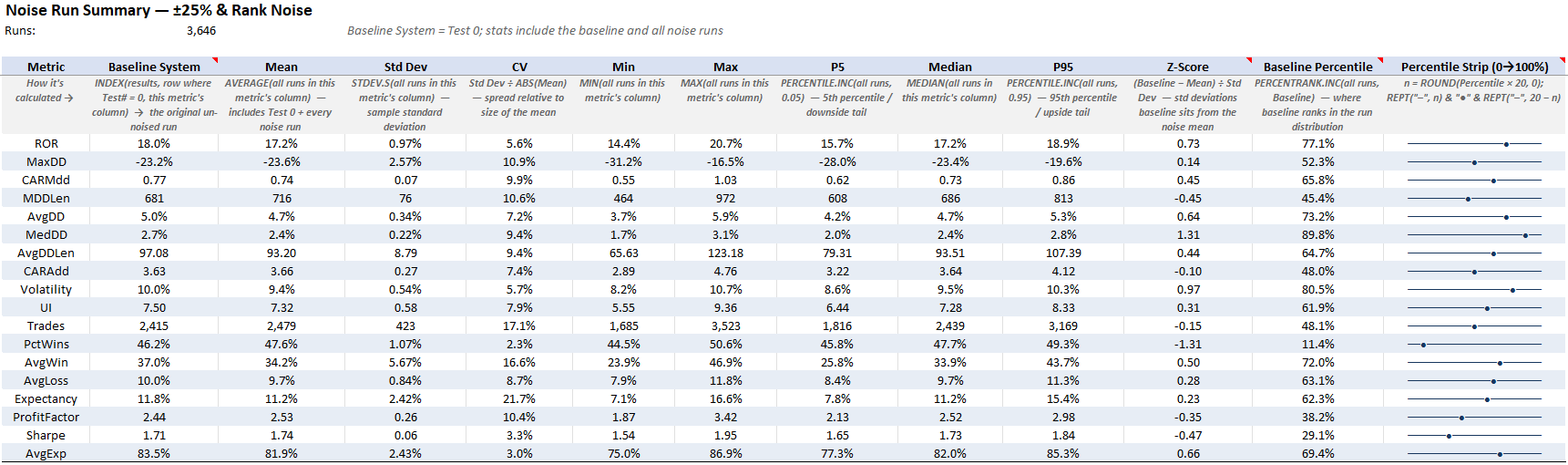
I know that table is a little hard to see (full size excel sheet in GitHub), so I’ll pick a few metrics and walk through them.
Starting first with the rate of return (ROR). The baseline system had an ROR of 17.95%, and this robustness test’s mean ROR was 17.24%. This puts the baseline at the 77th percentile.
The ROR delta is 0.71 points, or about 4.1% difference in ROR in relative terms.
Also, the worst case robustness test results don’t look too bad. The 5th percentile result had an ROR of 15.69%, and the single worst run out of all tests still had an ROR of 14.37%. So even the unluckiest versions of this system had a return of 14% to 16% (compared to the baseline ROR of 17.95%). Not too bad, that’s a pretty low scatter of ROR results.
Next, let’s consider max drawdown. The baseline system had a max drawdown of -23.24%, while the mean of the robustness test results was at -23.60% max drawdown. This puts the baseline system in the 52nd percentile.
The delta of max drawdown is 0.36 points, about a 1.5% relative difference, meaning the baseline system’s max drawdown is basically indistinguishable from the average robustness test result.
Now looking at the worst case side of the robustness test, the 5th percentile of robustness test results had a max drawdown of -27.98%. Still not a terrible result, well within reason (at least for me and how I construct my portfolio).
Now let’s consider Sharpe. The baseline system Sharpe is 1.71, the robustness test average result is a Sharpe of 1.74, which puts the baseline system in the 29th percentile.
That means 71% of the robustness test results had better risk adjusted returns than the baseline system. The Sharpe delta is only 1.7% on a relative basis, so I’m not claiming the robustness test runs are meaningfully better. Instead, the point is just that the baseline sits well within reason of the robustness test results and shows no real signs of curve fitting.
Test 2: Entry Signal Noise Plus Rank Noise:
This robustness test alters the trade signals themselves, and uses the same ranking noise idea from Test 1.
Entry Signal Noise: I randomly rejected 20% of the valid entry signals before they were ever considered by the low volatility and high momentum ranking factor mechanisms. This causes 20% of stocks to be rejected from consideration of a trade that month. That removes trades that existed in the baseline backtest and forces brand new trades into the backtest that the baseline system never took. Basically, it’s like handing the system a different historical sequence of entry signals and asking it to rank and trade that result instead.
Ranking Noise: The same 20% noise on both ranking mechanisms from Test 1 stays on, shuffling the ranked order of every stock that survives the entry signal noise.
Test 2: Added 20% noise to the entry signal and added 20% noise to the ranking mechanism.
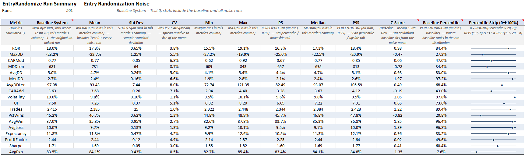
Starting first with the rate of return. The baseline system had an ROR of 17.95%, and the robustness test mean ROR was 17.31%. This puts the baseline at the 84th percentile.
The ROR delta is only 0.64 points, or about 3.7% difference in relative terms.
The 84th percentile sounds bad, but look at how tight the ROR scatter of this robustness test is. The worst ROR of all runs of this robustness test had an ROR of 15.53%, and the best had an ROR of 19.12%.
The full range from the luckiest to unluckiest robustness test result spans only 3.6 ROR points. When 20% of the trades get completely rejected from consideration and what’s left gets its ranking order changed, and the outcome stays that tight, that tells me the returns of the system are being generated by the whole population of trades, and never depended on a lucky selection of a few trades due to curve fitting. In other words, the system can still pick out winning stocks, even with a handicap in place.
Next, let’s consider volatility. The baseline system volatility is 9.97%, while the robustness test mean is 9.76%, which puts the baseline at the 98th percentile.
Again, 98th percentile sounds bad, but the delta is only 0.21 points, or about 2.2% in relative terms. And the whole scatter of robustness test results only spans 9.48% to 10.08%, with a CV of 1.1%. So, the 98th percentile just means the baseline volatility is 0.2 points above the average robustness test run. If the scatter was wide, a 98th percentile result would concern me. But, with a scatter this tight, it’s basically a rounding error.
Now let’s consider max drawdown. The baseline system had a max drawdown of -23.24%, and the robustness test mean was -22.66%. This puts the baseline at the 27th percentile, meaning 73% of the robustness test runs had shallower max drawdowns than the baseline system.
So on the risk side, history actually dealt the baseline system a slightly below average hand, by 0.58 points, or about 2.6% relative. A curve fit system would outperform the robustness tests in terms of max drawdown generally. This is a good sign there is no curve fitting present.
And finally Sharpe. The baseline system Sharpe is 1.71, and the robustness test mean is 1.69, putting the baseline system in the 60th percentile.
The Sharpe delta is 0.02, or about 1.2% relative. The whole scatter of Sharpe from the robustness test results runs from 1.55 to 1.82. Long story short, if you reject a fifth of the valid trades then re-shuffle the stock rankings, you basically get the same system backtest. This shows the system can cut through the noise of history and actually pick valid winning trades consistently.
Test 3: Entry Timing Shift:
This robustness test explores if the edge lives at one exact calendar moment, or is it just there in the market in general? I want to ensure the end of the month rotation timing isn’t a curve fit date selection.
Entry Timing Shift: The system normally rotates at the end of the month. For this test I made it rotate on different days instead: month end plus 1 day, plus 2 days, plus 3 days, and so on, for 22 runs in all (one for every day of the trading month). Every version of the system trades the same exact logic, just on a different day of the month.
Test 3: Added a time shift to the entry/exit, so the system rotated not at the end of the month but at day 1, day 2, day 3 of the month and so on.
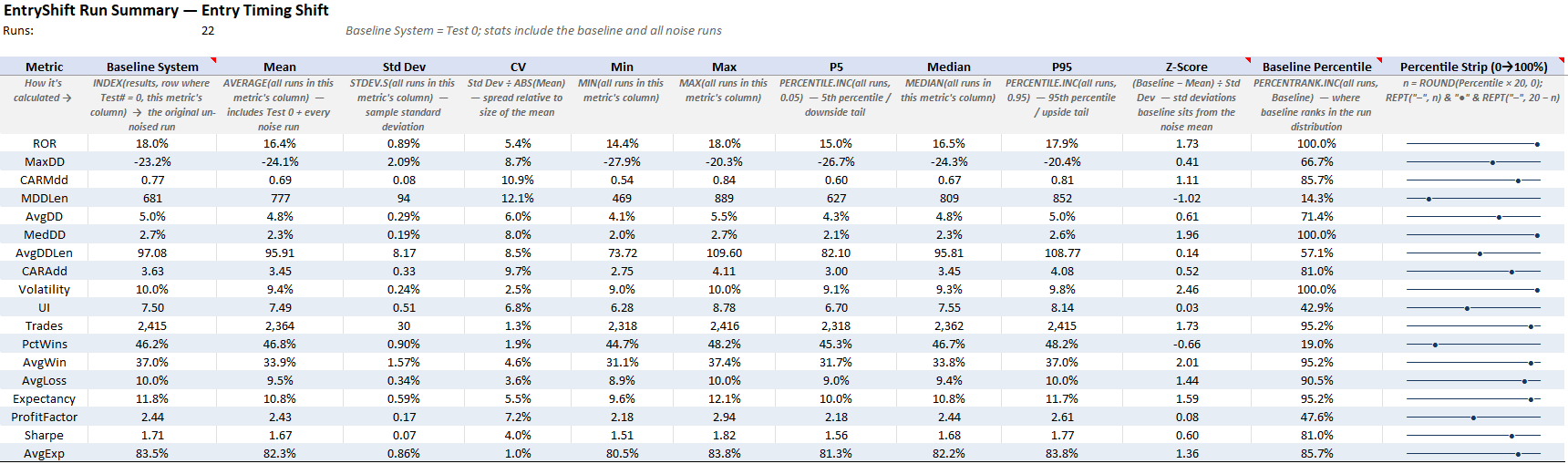
Starting first with the rate of return (ROR). The baseline system ROR is 17.95%, and it lands at the 100th percentile, meaning month end was the single best rotation day of all 22 calendar days.
The 100th percentile sounds bad, and on its own it’s exactly the kind of thing that would make me nervous about fitting to the calendar rotation day. But let’s check the scatter before jumping to conclusions. The robustness test mean ROR is 16.41%, so the ROR delta is 1.54 points, or about 9.4% in relative terms. That’s at the top edge of ideal to be honest.
But the worst case results are what keep this acceptable to me. The worst rotation day of all 22 still had an ROR of 14.37%. So even the most pessimistic calendar day to rotate is not terrible.
Next, let’s consider max drawdown. The baseline system max drawdown is -23.24%, and the robustness test mean is -24.10%, putting the baseline at the 67th percentile.
The delta is 0.86 points, or about 3.6% relative. The worst entry day timing shift had a max drawdown of -27.93%, and the best had only -20.31%. So moving the rotation day moves the max drawdown around between roughly -20% and -28%, with the baseline sitting near the middle of that range. In other words, the risk of the system didn’t depend on the calendar day we rotate on.
And finally Sharpe. The baseline system Sharpe is 1.71, and the robustness test mean is 1.67, putting the baseline at the 81st percentile.
The Sharpe delta is 0.04, or about 2.4% relative, and the worst of all 22 calendar variants still carried a 1.51 Sharpe. So every rotation day of the month produces a system with a Sharpe above 1.5 and an ROR above 14%. This shows the edge still exists no matter what day of the month the system rotates on.
There’s just something about the end of the month that works better. Is it coincidence? Or is it something to do with seasonality (like we explored in the Turn Of The Month article)? My solution here will be to mitigate this timing variation later by developing other systems that rotate at periods other than the end of the month to ensure I have diversification and luck mitigation around time.
Test 4: Entry Shift Plus Entry Noise:
This robustness test stacks two of the previous variations at once.
Entry Timing Shift: The rotation day gets shifted off of month end, the same idea as Test 3.
Entry Signal Noise: 20% of the valid entry signals get rejected before they are ever considered by the ranking mechanisms, the same idea as Test 2.
This makes it the harshest of the four robustness tests. The system trades on a different day of the month (which we showed to be somewhat sensitive), with a fifth of its valid entry signals taken away from it.
Test 4: Added a time shift to the entry/exit and 20% noise to the entry signal.
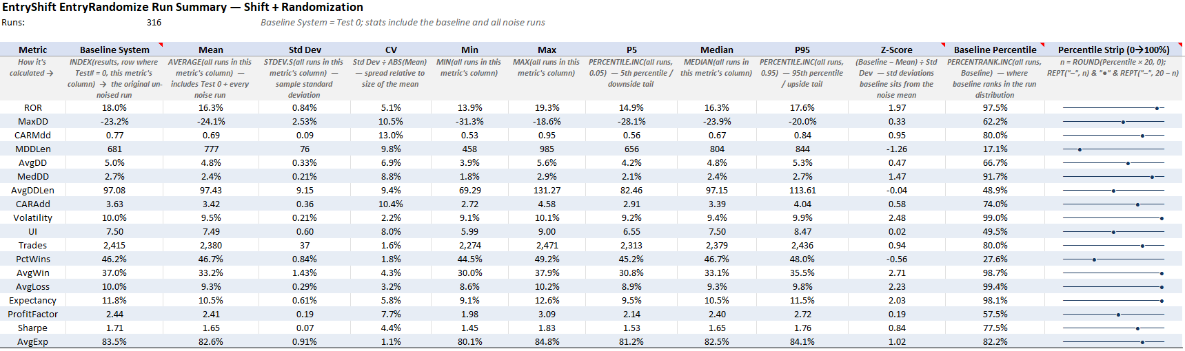
Starting first with the rate of return (ROR). The baseline system ROR is 17.95%, and the robustness test mean is 16.30%, putting the baseline at the 97th percentile.
The ROR delta is 1.65 points, or about 10.1% in relative terms. That’s the biggest ROR delta of the four tests, sitting right at the edge of the range I like to see. That makes sense to me though, this test stacks the two harshest variations together, so I’d expect the biggest performance drop off to show up here.
So let’s look at the worst case results. The 5th percentile run had an ROR of 14.87%, the worst run of all in this robustness test had an ROR of 13.91%, and the best run had an ROR of 19.33%. So even the worst case result is still moderate returns.
Next, let’s consider expectancy, since it tells the same story on a per trade basis. The baseline system expectancy is 11.75% per trade, and the robustness test mean is 10.51%, putting the baseline at the 98th percentile.
Again, 98th percentile sounds bad, but the delta is 1.24 points, or about 11.8% relative. That’s slightly larger than I’d prefer, so let’s check the worst case results again. The 5th percentile run still had an expectancy of 9.5% per trade, and the worst run of all had an expectancy of 9.08% per trade. For a system paying commissions and slippage on a couple hundred trades a year, an average trade in the 9% to 10% range even in the unlucky runs is miles above the point where trading frictions would start to eat into the edge.
Now let’s consider the Ulcer Index. The baseline system Ulcer Index is 7.50, and the robustness test mean is 7.49, putting the baseline at the 50th percentile.
The delta is 0.01, or about 0.1% relative. You can shift the rotation timing and reject a fifth of the trade signals, and the day to day pain of holding this system is basically exactly average compared to this set of robustness test runs.
And finally max drawdown. The baseline system max drawdown is -23.24%, and the robustness test mean is -24.07%, putting the baseline at the 62nd percentile.
The delta is 0.83 points, or about 3.4% relative. The 5th percentile of the robustness test runs is -28.1%, and the worst run of all is -31.3%. So even under the harshest test, the risk picture stays reasonable. Expect mid 20s max drawdowns, plan for high 20s, and know the recorded worst case across every variation is low 30s.
The baseline’s -23% max drawdown sits right in the middle of that distribution. In other words, even the hardest robustness test couldn’t break the risk profile of this system.
Pulling The Four Robustness Tests Together:
Now let’s summarize the four robustness tests all together. What I’ll show is a table that has each performance metric, averages it across all four robustness tests into one expected outcome, and puts that side by side with the baseline system. The last column in the table shows the percent delta between the baseline system and the average robustness test result.
One way you could think about this is that the baseline system is just one historical outcome. The average of all four robustness test results is what you’d expect to see on average after simulating thousands of slightly different historical outcomes.
Test 1 Through Test 4 Summary Table:
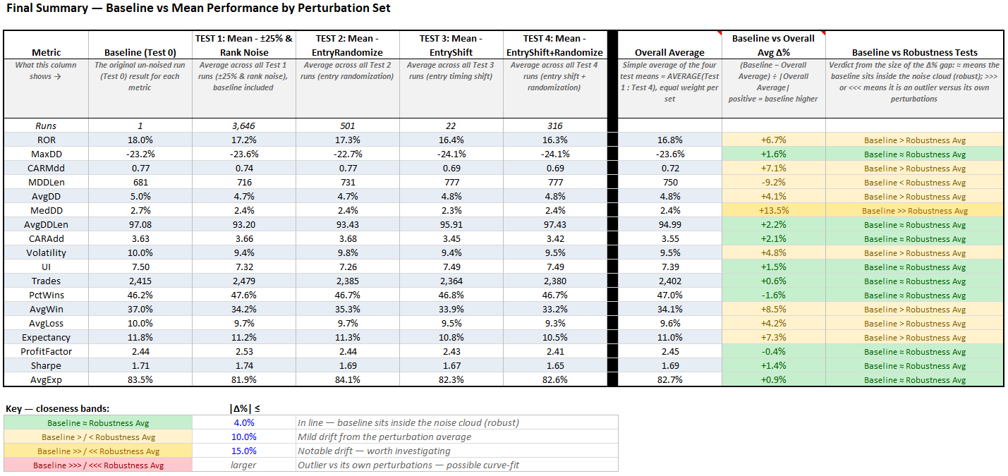
Each robustness test we ran stressed the system in a slightly different way. Averaging them together will give us a decent view of how the system holds up to that stress.
We can then compare the Overall Average column (the average result across the four robustness tests), to the baseline system. That delta is shown in the very last two columns.
Any metric within 4% delta between baseline and robustness test average is green. Anything within 10% delta is light yellow. Anything within 15% delta is dark yellow. Anything greater than 15% delta is red. Long story short, the majority of metrics are green and a few are light yellow.
Across the four robustness tests, the baseline ROR ranked anywhere from the 77th to the 100th percentile. But the average ROR across all four robustness tests is 16.82%, only about 6.7% below the baseline’s 17.95% in relative terms.
On the risk side, the baseline system and the robustness test average are basically the same. Volatility is within 4.8%, Ulcer Index within 1.5%, max drawdown is within 1.6%, and Sharpe within 1.4%.
So yes, the baseline system runs a touch high on some metrics, but by mid single digits in relative terms. The realistic expectation, the average across every robustness test variation of the system, is not too far below it though.
What would be much more concerning is if the baseline system had say an ROR of 17.95% and the average robustness test result had an ROR of say 13%. In this example, that’s a massive delta to be concerned about. But instead we are looking at an ROR of 17.95% for the baseline and an average robustness test result of 16.82%, those values are within about 1 percentage point, more than reasonable.
Basically, all this is to say the baseline backtest is not trading a lucky curve fit historical path. All the parallel historical universes the robustness tests created result in a very similar outcome. Sure, some metrics may be slightly better or slightly worse. But that’s the key word, slightly. The baseline system is well within the bounds of all the other simulated historical paths.
With that said, there’s a limit to what these four robustness tests can tell me. They all vary one system, on one market, using the same basket of stocks, over one period of time. So I wanted to see if the premise of the system worked on other unseen markets as well.
ASX Market Validation:
This is the same core system except moved from the TSX over to the ASX. It used the same two factor ranking method, the same stock filters, the same monthly rotation mechanism, and the same parameter values.
With that said, I did make a few small changes to account for some ASX quirks I’ve picked up on from experience. Such as:
I updated the commission structure for the ASX.
ASX stocks are cheaper in general so I lowered the system’s minimum tradable price.
I also lowered the required turnover a bit as I find this helps ASX related systems and accounts for the fact that the stocks are cheaper in general. (You don’t have to do this though).
None of that changed how the system filters and ranks stocks, or the timing around when it rotates etc.
The results of the system on the ASX market are shown below: