

Market Effect Research: Turn of the Month Effect
How institutional cash flows create a tradeable edge around month end along with three ways to capture it


Welcome to the “Systematic Trading with TradeQuantiX” newsletter, your go-to resource for all things systematic trading. This publication will equip you with a complete toolkit to support your systematic trading journey, sent straight to your inbox. Remember, it’s more than just another newsletter; it’s everything you need to be a successful systematic trader.
Introduction:
This is the second article in a series on small calendar effects that I’ve been researching and trading. In the first, we looked at the holiday effect and ended up with a tradeable system. Now we’re doing the same thing with what’s called the Turn of the Month effect.
If you missed it, you can check out the holiday effect article here:

So, what is the Turn of the Month effect?
It’s the observation that stock returns are disproportionately concentrated around the end and/or beginning of each calendar month, rather than evenly distributed throughout the month. It doesn’t happen on one specific day, but across a window of roughly 10 trading days surrounding month end.
A lot of times these small market effects are too modest to trade individually. But if you incorporate them into a portfolio, they become much more interesting.
These effects can be stacked together into a portfolio of intentionally different return streams, where each one adds a small amount of edge.
Together, they compound into something much more meaningful. If you read the holiday effect article, you already get the idea.
In this article we will start by first going through the research phase, where we prove the effect exists thoroughly. During the research phase we try to understand what, when, and where the effect exists. Once we understand the what, when, and where of the effect, the how to trade it comes naturally, and we will build a few systems to capture it.
The goal of this market effect series is the following:
Teach how to perform and interpret proper market research
Share how to think about these small edges
Use creativity to trade these market effects in novel ways
Show how to combine many small edges into a broader portfolio
Let’s get into it.
Note For Paid Members:
As always, paid members get access to the full code at the end of this article.
You also have access to the Discord community where we can discuss this research and ask questions, and the GitHub repo with all published code.

Reason For The Effect:
Before we look at any data, let’s talk about why the Turn of the Month effect should exist in the first place. If there’s no solid mechanism, it’s more likely the edge is random noise.
There are two plausible reasons that I can think of.
1. Institutional cash flows. Pension and retirement contributions tend to be paid at the end of the month. That cash gets deployed into equities in the first trading days of the new month. These are price insensitive flows that buy equities with no regard to price, systematically, every month. This is likely the dominant explanation and it makes intuitive sense. Billions of dollars in scheduled cash flows hit the market at roughly the same time every month.
2. Portfolio rebalancing and window dressing. Large funds rebalance at month end reporting boundaries. Month end is a natural checkpoint for institutional portfolios, and you get predictable flow patterns as managers buy winners and sell losers to clean up their books and to produce attractive month end holdings snapshots for their investors.
Why does understanding causation matter? Because if this effect ever goes away, we need to assess whether the underlying causes have changed. If we don’t understand why it exists, we can’t distinguish temporary underperformance from a dead effect.
And the causes here are interesting. They’re structural and mechanical. Pension contributions happen regardless of market sentiment. Payroll deposits happen on a schedule. Rebalancing happens at reporting dates. These are flows that happen regardless of price. Pure systematic buying during the same timeframe every month.
It’s important to point out that the excess return may not be predictable to one or two specific days, but rather a range of days near month end. As more traders become aware of the effect it gets front run and the days where the effect shows through can shift around. But the underlying flows that create the window don’t disappear just because people know about them.
Our research in the next section will help us determine the optimal and stable window where this effect is most prevalent. Now let’s look at the data and see what we can understand about the effect.
Research Phase:
Establish The Baseline:
Let’s start by refreshing our memory on the scatter of returns of SPY data across 33 years of history.
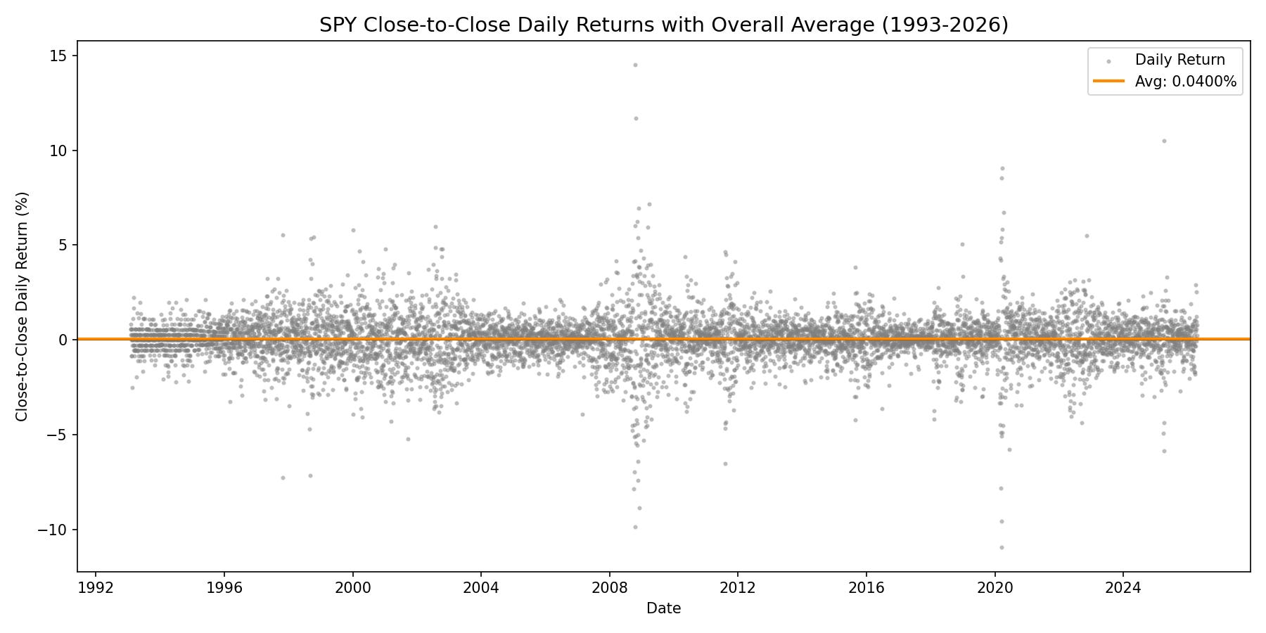
This plot shows the return of every single SPY trading day from February 1993 through April 2026. Each gray dot is one trading day. The orange line at +0.04% is the average daily return across 33 years of trading days. So 0.04% is our benchmark to beat for a given day. If we can capture consistent performance above 0.04%, that shows this effect has “alpha”.
You’ll notice the cloud of dots looks pretty uniform. In calm markets, the range is tight, maybe plus or minus 1% to 2%. During crises (2000, 2008, 2020), the band explodes with individual days swinging 5% or more in a single session.
So there is definitely some variability to the 0.04% benchmark, but as long as we find something that consistently produces positive returns meaningfully above 0.04% per day, then that may be something worth trading.
Let’s break down this cloud of data points to see if we can spot any anomalies around month end. The next few sections will do that in numerous different ways.
Measure The Overall Effect (Day By Day):
This first plot will show the distribution of returns on average across 33 years of SPY data near month end. On the x axis, every trading day gets an offset relative to month end.
Day -1 is the last trading day of the month.
Day +1 is the first trading day of the next month.
Note: The offset jumps directly from -1 to +1; there is no Day 0. Each data point averages roughly 399 observations (one per month across 33 years).
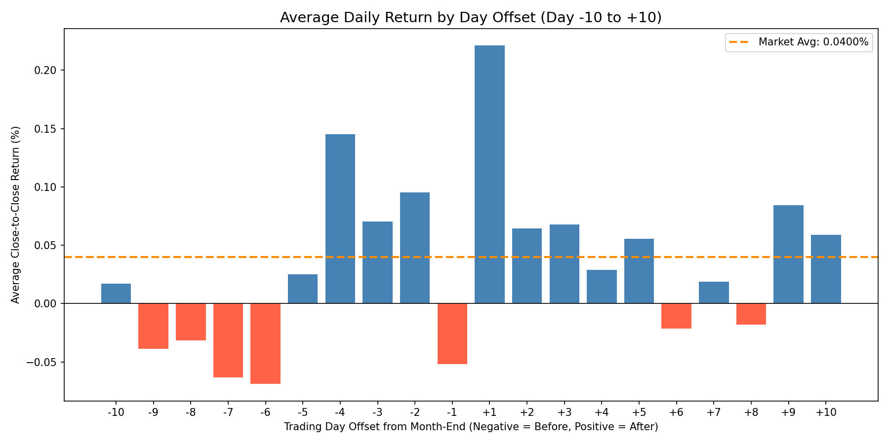
You’ll notice one bar absolutely towers over the rest. Day +1, the first trading day of the new month, averages +0.22%. That’s 5.5 times the overall SPY daily average of 0.04%. That’s an interesting start.
But look at the broader shape of the distribution too. The roughly 10 trading days surrounding month end consistently outperform the rest of the month (days -5 to +5).
Days -4 through -2 are solidly above the 0.04% average line. Day -4 is surprisingly strong at +0.15%, which is 3.6 times the average.
Days +2 and +3 are modestly positive too.
And overall, the -5 to +5 days are generally consistently positive. It’s a cluster of elevated returns spanning both sides of the month end boundary.
One exception is the Day -1 returns. Day -1, the very last trading day of the month, is very red. It averages -0.05%. The last day of the month, on average across 33 years, loses money. That’s an interesting observation, and keep it in the back of your mind because we’ll come back to it later when we build systems from this research. We can do some interesting stuff with this knowledge.
So the Turn of the Month window clearly shows up in the full 33 year average result. But is this effect still working in more recent times, or has it been arbitraged away over time?
Has It Decayed Over Time? (Era Analysis):
This next chart breaks the same bar chart data into three eras: 1993 to 2003 (blue), 2004 to 2013 (green), and 2014 to 2026 (orange). For each day offset, you can see how the average return has shifted around across decades.
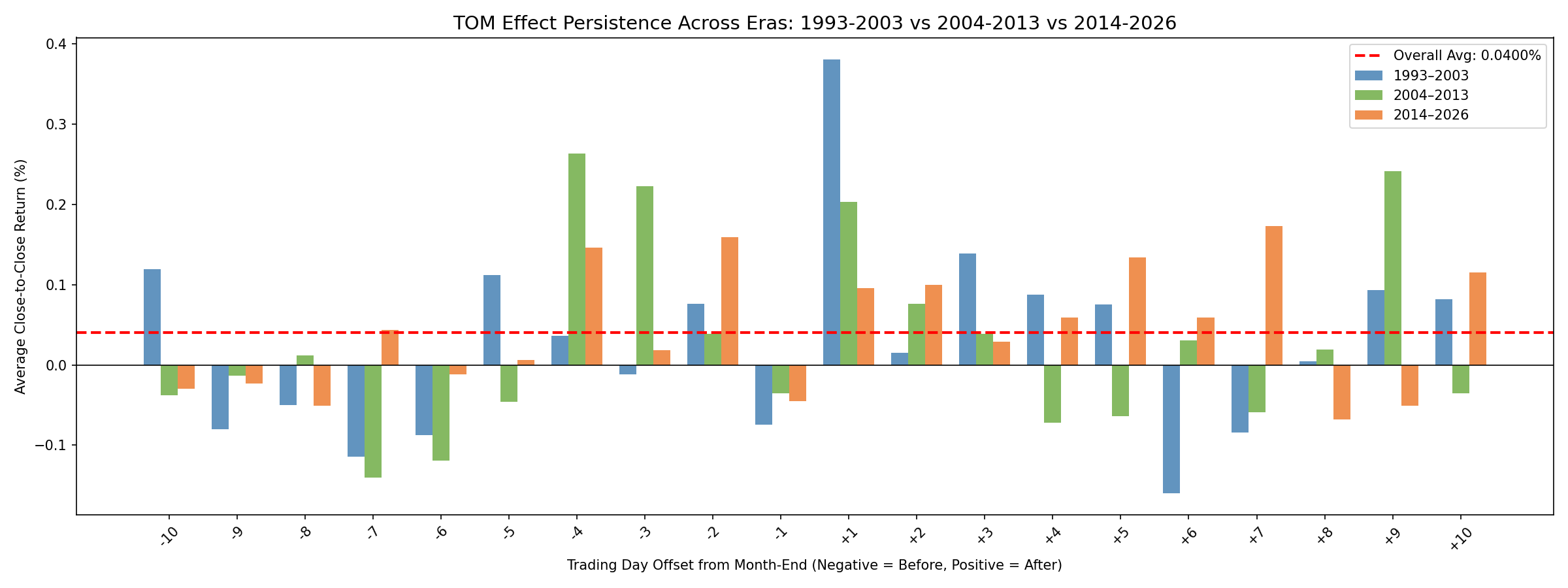
Day +1 showed to be the strongest when we looked at the whole timeseries together before, but when you break up the data by era the Day +1 returns have degraded over time.
It’s tempting to look at that result and conclude the Turn of the Month effect is dying. But that would be missing the forest for the trees. Day +1 is only one day. There is still an interesting phenomenon going on around the -5 to +5 day window.
In every era, there is a cluster of days surrounding month end that consistently show very above average returns. The specific days that perform the best or worst may shift over time (maybe Day +1 is the strongest in one era and Day -4 in another), but the overall window of elevated returns around the end of the month has remained consistent.
Also, Day -1 is constantly negative across all three eras. That negative last trading day of the month is stubbornly consistent.
Breaking down the returns bar plot by era tells us the effect has persisted constantly over time in a window around month end.
Thus far these plots have looked at daily returns in isolation, but when we trade we experience the cumulative sum of returns across all days we are in the trade. So in the next plot we will visualize how the edge sums up if you bought at -10 days and sold at +10 days.
Where Exactly Does It Happen? (Cumulative Walk):
This is a two panel chart. For each day offset from -10 to +10, it shows a running total of how much the average return at that day’s offset exceeds the overall daily average (+0.04%).
Think of it like an average equity curve of a trade from -10 to +10 days in a month, but the 0.04% average SPY return is subtracted out of the result. So these plots are showing excess return above the SPY average return.
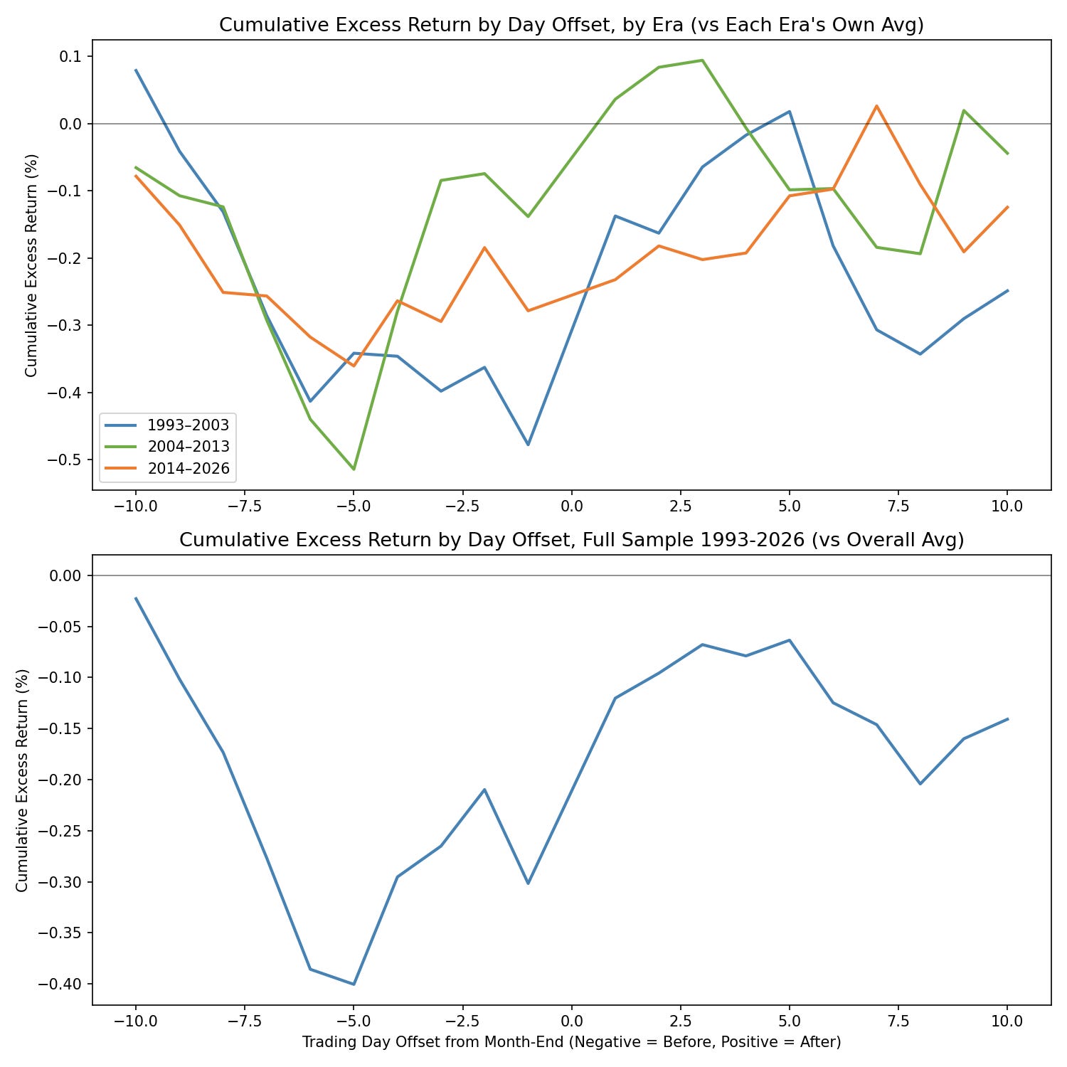
A rising string of days means those days are producing above average returns. A flat string of days means the string of days are producing average returns. A falling string of days means they are experiencing below average returns.
You’ll notice the full sample line (bottom panel) tells a clear story. Starting from the left at Day -10, the cumulative line drifts slightly downward through the days -10 to -5, which are mid-month days.
Around Day -5, it starts climbing. Then Day -1 pulls the curve back down. Then at Day +1, there’s a sharp upward step.
Days +2 and +3 add a bit more rise to the curve, and then the line flattens again as we move into mid-month territory again.
The top panel shows the era by era comparison. The shape of the cumulative step up around month end is present in all three eras (Days -5 to +5).
The effect appears to be more or less consistent across all three time periods. The exact days and pattern that the effect takes changes a little bit, but the upward drift around month end appears to be consistent.
This has direct implications for system design. We can trade this end of month window. Entering a few days before month end and holding through a few days into the next month would capture the cumulative price increase.
So far we’ve been looking at averages, which tell us the typical day. But averages can be misleading if a few extreme outliers are doing all the work. Let’s look at the full distribution of returns to make sure this effect is consistent and not driven by a handful of lucky days.
Distributional Evidence (Is It Real Or Just Outliers?):
The next few sections are where we prove the Turn of the Month effect is a genuine shift in how returns behave and is not caused by a few lucky extreme outlier days.
One important note before we get to the charts. Earlier, we established that the overall daily average SPY return across all 33 years of data is +0.04%. But that number includes the EOM window days themselves, which pulls the average return up.
If we want a true apples to apples comparison, we need to know what non-EOM days return on their own (defined in this section as -5 to +5 Days). When we strip out the EOM window days from the average SPY return, the remaining non-EOM days average just +0.011% per day.
That’s the baseline we’ll use in this section. The -5 to +5 window around month end compared to all other days in the month.
The gap between +0.04% (all days average return) and +0.011% (non-EOM average returns only) already tells you how much the EOM window was pulling the overall average up.
Another thing to point out, I started using the abbreviation EOM to represent the end of month window of +-5 trading days. EOM stands for end of month. And when I discuss it I am talking about the +-5 day window around month end. When I say non-EOM, I am referring to days not in the +-5 day window, i.e. middle of the month days.
The EOM vs Non-EOM Comparison:
The plot below shows two histograms. The top panel shows only non-EOM days return distribution (4,373 days deep in mid-month, i.e. not within +-5 days of month end). The bottom panel shows the EOM window days return distribution (3,986 days).
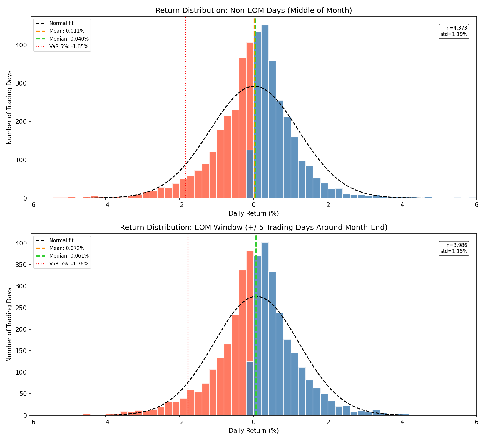
While it’s probably hard to eyeball the distributions themselves (the next plot will help with that), if you look at the cards in the top left and right of each plot, you’ll notice the difference between the two groups:
Non-EOM Days produce an average return of +0.011%, a standard deviation of 1.19%, and a VaR 5th percentile of -1.85% (the loss level you’d expect to exceed only 5% of the time).
The EOM Days produce an average return of +0.072%, a standard deviation of 1.15%, and a VaR 5th percentile of -1.78% (the loss level you’d expect to exceed only 5% of the time).
EOM window days produce 6.7 times the average return of non-EOM days. And they do it at slightly less volatility and slightly less downside risk.
The plot below shows the same two distributions shown in the plot above, just overlaid onto a single chart so you can see the distribution shift directly.
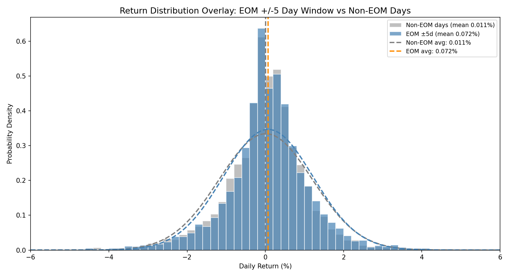
The EOM distribution is shifted to the right relative to the non-EOM baseline. You’ll notice the EOM window days (blue) have fewer losses and more larger gains. The normal distribution fit overtop of the distribution (the dashed lines) shows this shift the most clearly, a clear shift to the right side of returns.
Where Does The Probability Mass Move?
This next chart took me a minute to wrap my brain around. Its a distribution difference chart.
The blue bars show return bins where EOM days have more observations compared to non-EOM days. Red bars show bins where EOM days have fewer observations compared to non-EOM days.
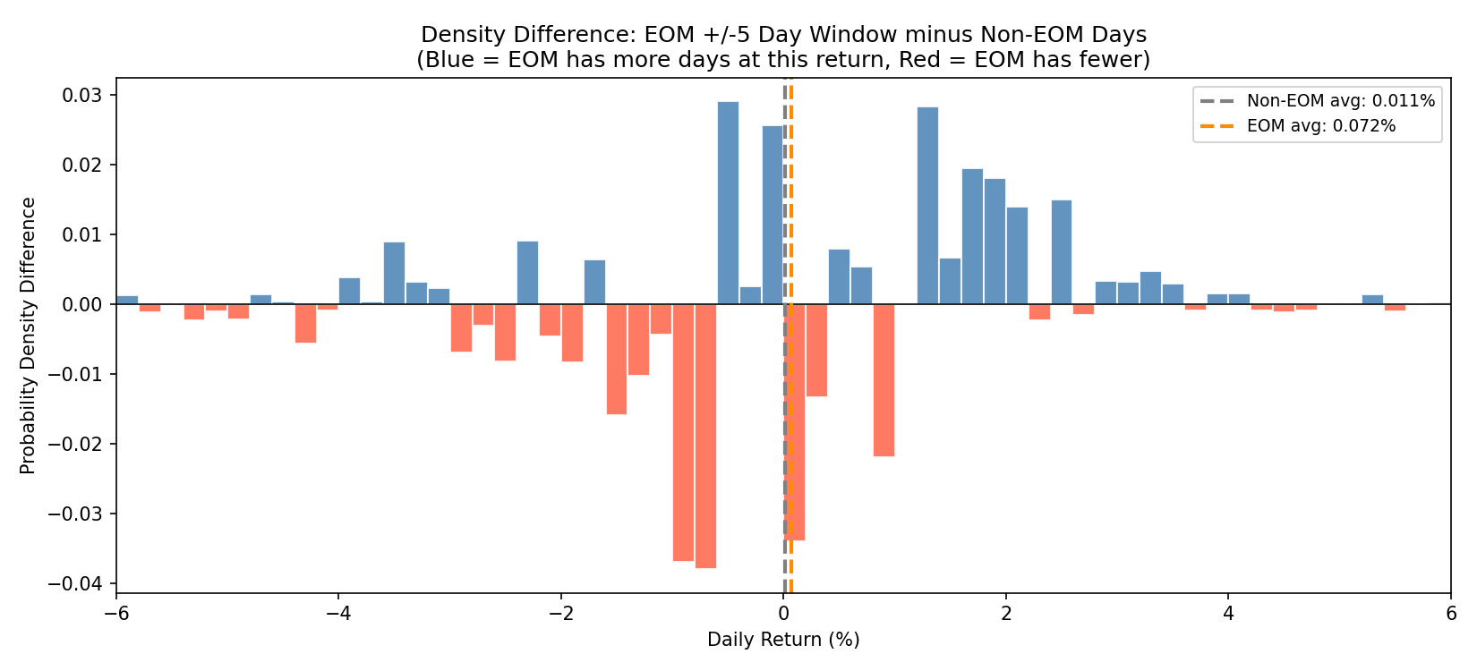
What you want to see is more red on the left side and more blue on the right side.
This would mean there are fewer losses (within the given return bin) on EOM days than non-EOM days, and more positive returns (within the given return bin) on EOM days than non-EOM days.
Still kind of confusing, I get it. Just sit with it for a second, it’s basically just the delta between the two histograms shown in the previous section.
But the plot shows what we want to see. Blue bars dominate the right side of the histogram, while red bars dominate the left side of the histogram. Moderate positive returns are more common on EOM days. And moderate negative returns are less common on EOM days.
This shows the Turn of the Month Effect is a consistent, small rightward distribution shift. It’s a slight upper hand in a game of poker. It won’t always play out, but you know over time the odds are in your favor.
The effect works by providing you slightly more +0.5% to +3% days, and gives slightly fewer -0.5% to -3% days. On average, month after month, that starts to add up.
The Changes In The Right Tail:
This next chart I think is pretty neat, it’s called an exceedance plot. For each percent return threshold on the x axis (from -5% to +5%), each line shows the percentage of days the average return was at or above the threshold on the x axis.
Basically, what is the probability of having a return higher than x%. The higher the line is on the right side of the plot, the higher the probability of larger returns.
The exceedance lines I am showing are the following:
Non-EOM days (gray)
Full EOM window (blue)
Days +1 to +5 only (orange)
Days -5 to -1 only (green).
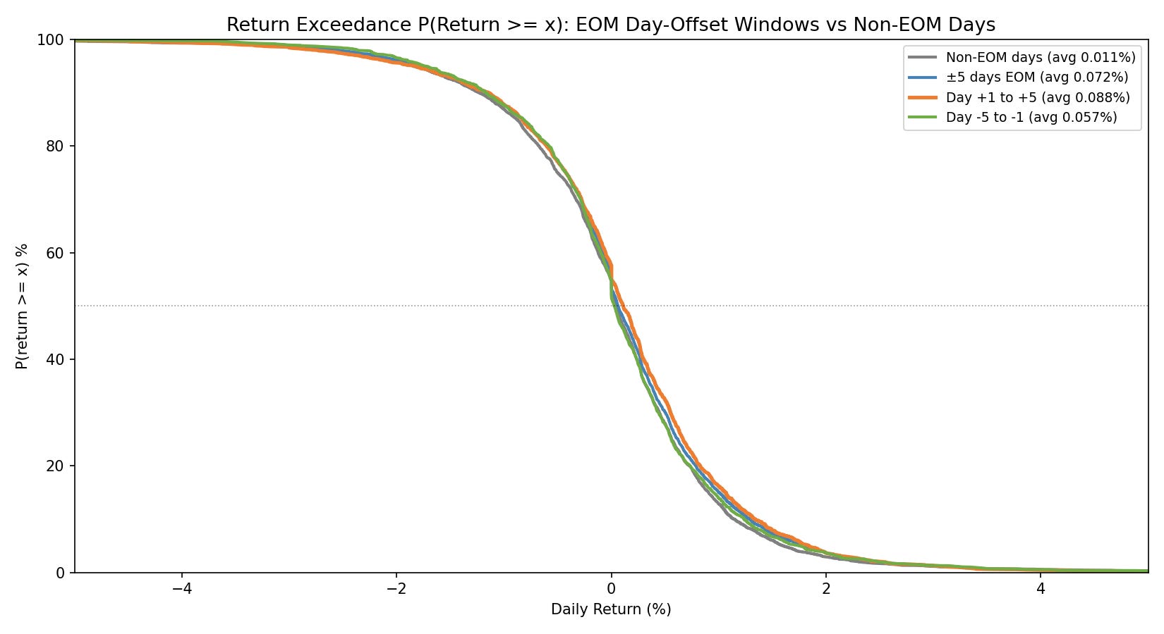
You’ll notice in the 0% to 2% x axis range, the gray line (non-EOM returns) is the lowest. This means there is a lesser probability of higher returns than the other lines (which are EOM window returns).
For example, at the +1% return threshold the orange line (Days +1 to +5) sits at 16.1%, while the gray line (non-EOM) sits at 12.9%. That means the orange line has a 16.1% chance of a higher return than 1% and the gray line only has a 12.9% chance of a higher return than 1%. This basically shows that the EOM window has a slightly rightward shifted distribution when compared to the non-EOM window.
See the zoomed in right side of the exceedance plot below:
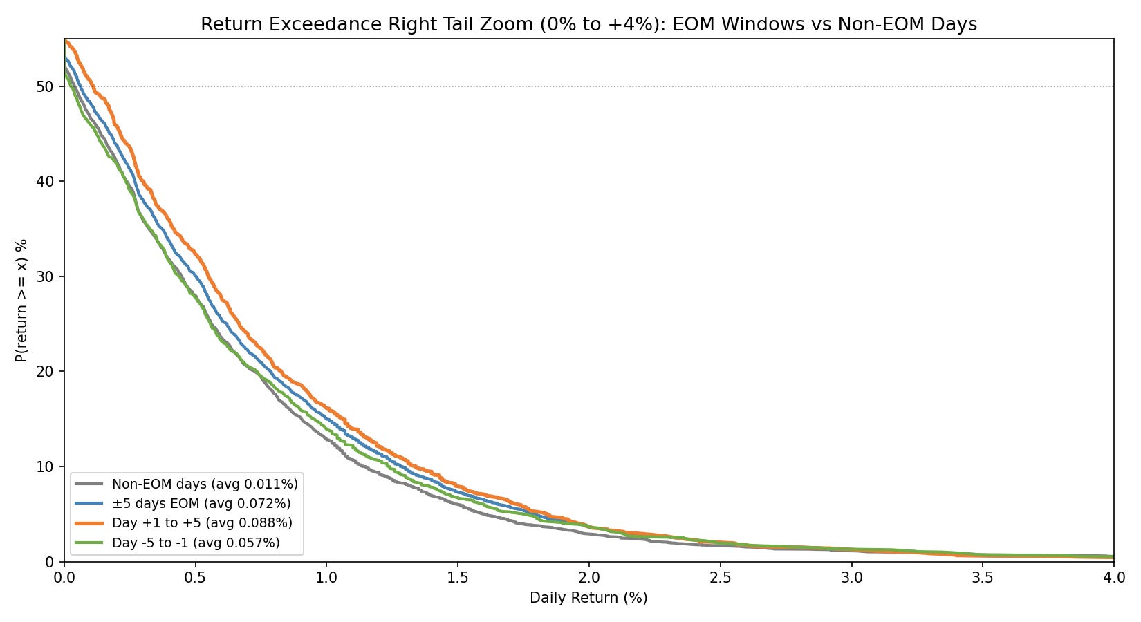
You’ll notice the orange line (early new month days) sits clearly above the gray line (non-EOM days) across the entire positive range from 0% to about +3%. The gap is approximately 3 percentage points in the +0% to +1.5% zone. Beyond +3%, the lines converge. This shows the effect is about consistent moderately sized winners rather than extreme outliers.
The takeaway from all the evidence thus far is as follows:
The Turn of the Month effect is real, it operates through a genuine rightward distributional shift rather than large outliers.
It’s concentrated in the early new month days (+5) but also in the end of previous month days (-5).
It doesn’t happen every month, but on average over time, it does happen.
The best performing days move around over time, but within the +-5 day EOM window, there is meaningful outperformance when compared to the overall SPY average return and the non-EOM SPY average return.
The +-5 day EOM window also has slightly lower volatility and slightly lower risk than the non-EOM window.
The effect isn’t massive, it’s small but it does exist, so we need to get creative about how we capture it.
We used multiple independent methods in this research section to measure the Turn of the Month Effect.
All the evidence points to the same conclusion, which is the +-5 day EOM window produces higher returns with less volatility and downside risk, and it persists across eras.
The question now is:
”How do we trade it?”
The next few sections will focus on the practical implementation of trading this effect. We’re going to work with three different systems, each one showing a different way to use this research result in practice.