

Market Effect Research: Holiday Seasonality - Part 2
Expanding the holiday effect trade into a different market. How to get even more alpha out of the same effect.


Welcome to the “Systematic Trading with TradeQuantiX” newsletter, your go-to resource for all things systematic trading. This publication will equip you with a complete toolkit to support your systematic trading journey, sent straight to your inbox. Remember, it’s more than just another newsletter; it’s everything you need to be a successful systematic trader.
I recently launched a portfolio tracking website (updated daily) that tracks my systematic trading portfolio performance, along with many supporting metrics. You can check in on my personal systematic trading portfolio performance anytime here: TQX Portfolio Tracker
Introduction:
Awhile back I wrote an article on the holiday effect in SPY. The trade was simple. The 10 trading days leading up to a US federal holiday produce, on average, about 2x the daily return of any random window of the same length. The effect held up over decades on SPY and we built a tradable system around the effect.
A few weeks after releasing that article, I was thinking a lot about other instruments that might also follow a similar pattern. I was thinking about commodities that potentially might go up in price around holidays. That’s when I realized that this effect may be prevalent in gasoline.
Why gas? Holidays in the US (Memorial Day, July 4th, Labor Day, Thanksgiving, Christmas, etc.) tend to be the periods of time when people drive long distances and need a lot of gasoline.
So, there may be a gasoline price rise around holidays to price in this short term increase in demand. Then, after the holiday, the excess demand dissipates and prices revert back to normal. That’s the theory anyway.
In this article, I’ll walk through the results of the holiday effect on not only gas but other related energy ETFs. The four energy ETFs explored were:
USO: US Oil Fund ETF
UGA: US Gasoline Fund ETF
XLE: Large Cap Energy Stock ETF
XOP: Oil & Gas Stock ETF
We will look at many different plots to figure out if the effect exists and answer the what, when and where of the effect. Then, if the effect shows promise, I will show you the how by creating a trading system to capture the effect.
Note For Paid Members:
As always, paid members get access to the full code at the end of this article.
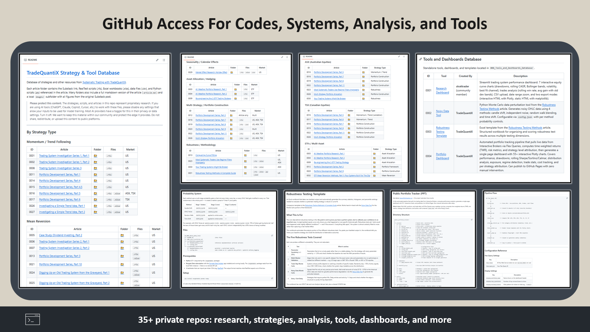
You also have access to the Discord community where we can discuss this research and ask questions, and the GitHub repo with all published code.
Reason For The Effect:
The main mechanism for the holiday effect on gasoline is demand based. People need gas, especially before holidays, because of the following:
Travel demand. Around federal holidays tend the be the highest gasoline consumption days of the year because people drive long distances to visit family or go on weekend trips. Prices rise to reflect this increase in demand. Once the holiday passes, the demand returns to normal levels and prices revert. So gasoline and crude oil should show a price increase before the holiday and a price decrease after the holiday.
This is a forced flow. People planned out their vacations and travel ahead of time. They aren’t going to cancel their trip just because gas prices are a little bit higher. This temporary increase in demand forces the prices higher, then after the holiday demand returns back to normal, price theoretically should follow.
So based on this theory, if there truly is a travel demand mechanism, prices should increase going into the holiday and then there should be a post-holiday give-back.
Research Phase:
Daily Return Baselines:
Before we look specifically around holidays with these energy ETFs, let’s first look at their average market return baselines. These are the baseline return numbers we will be trying to beat with the holiday strategy.
Let’s start with the two commodity specific ETFs, which are where we should see the travel-demand mechanism be most prevalent.
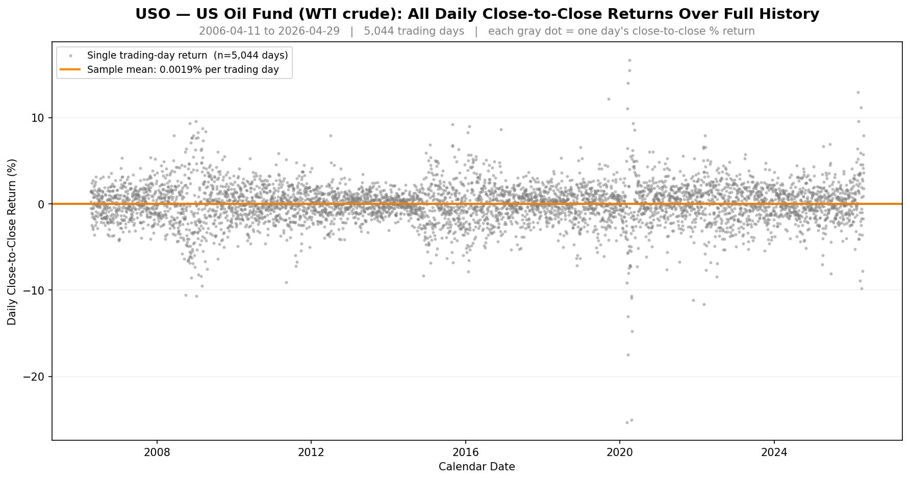
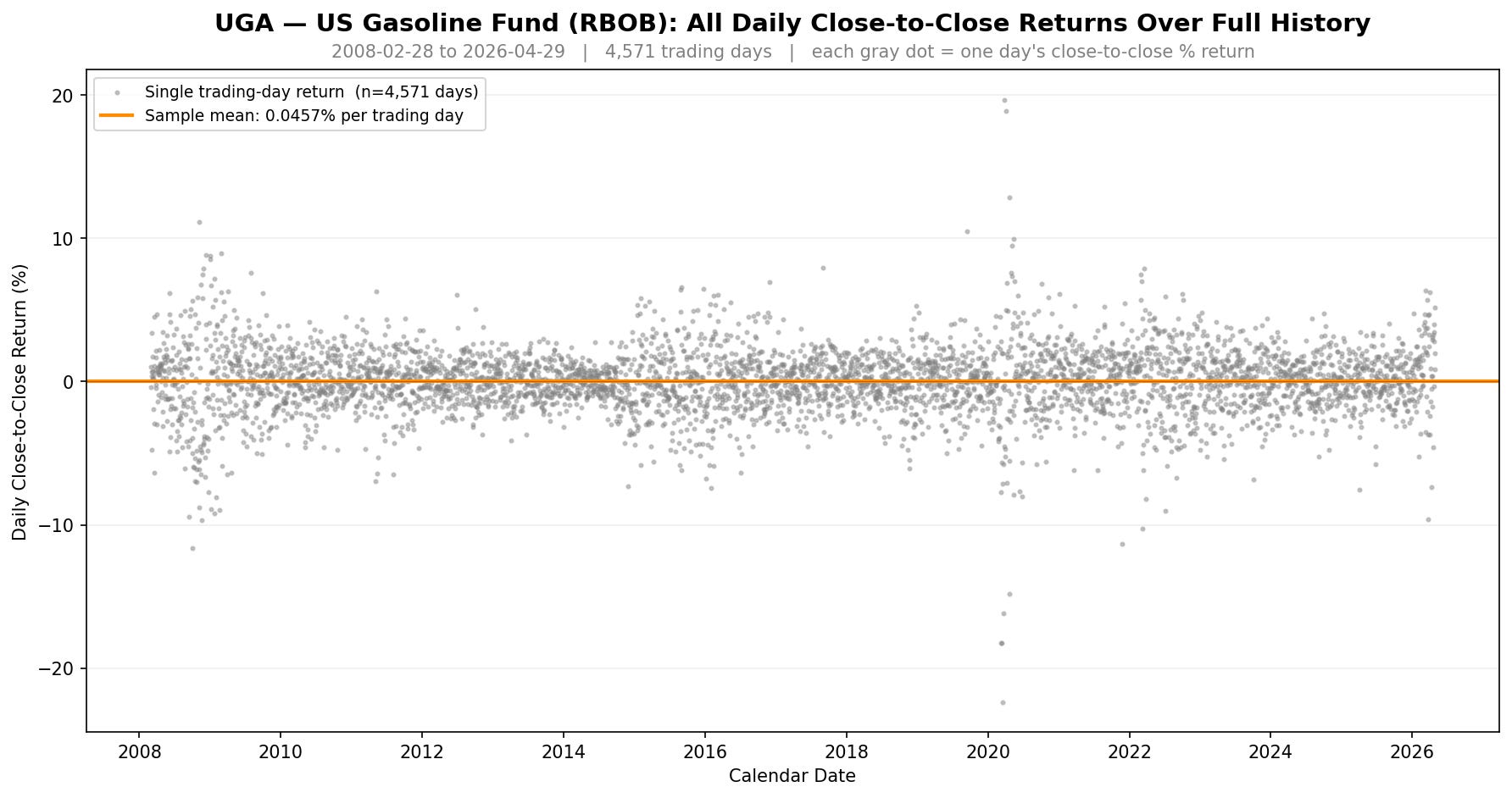
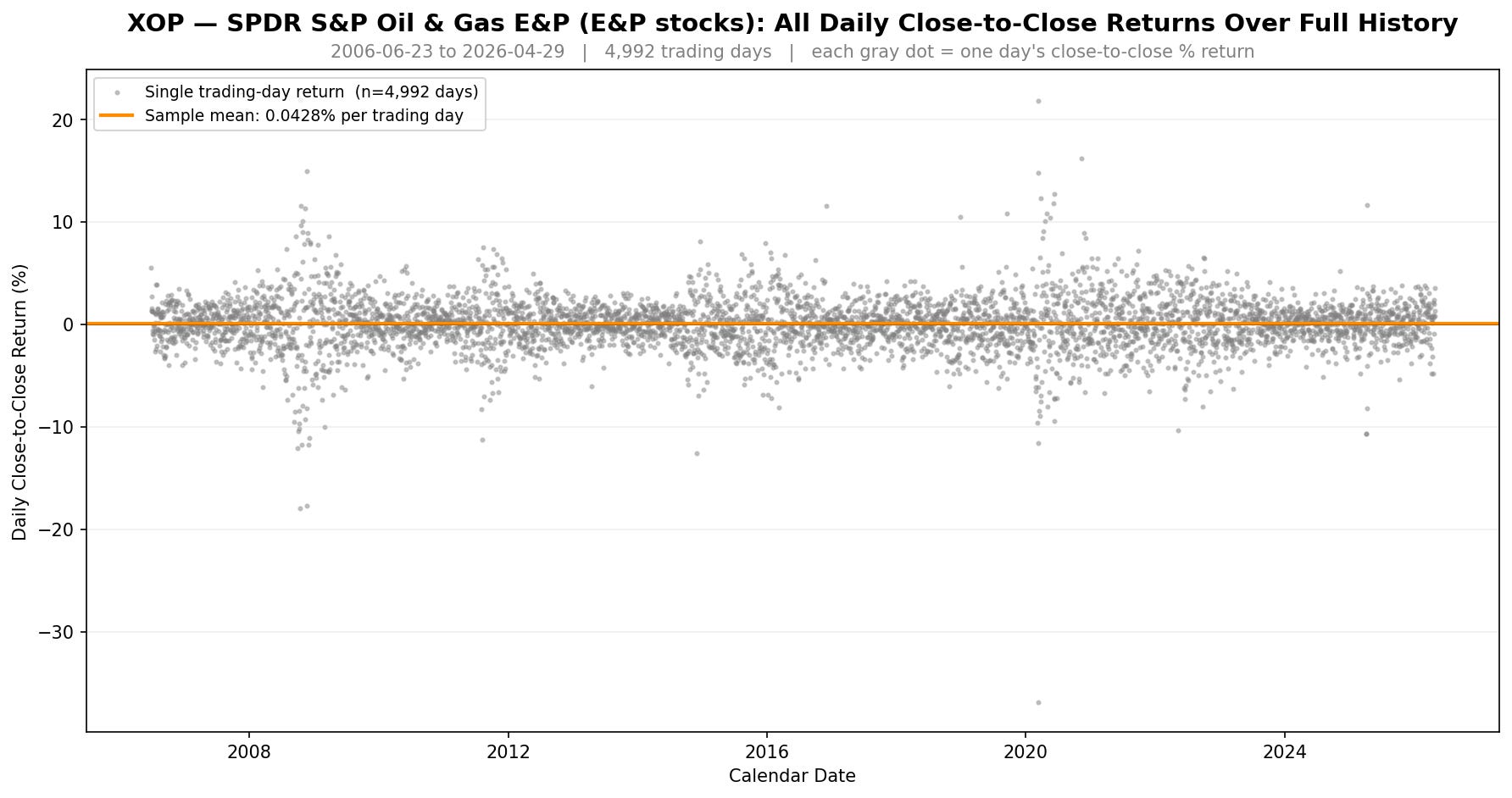
Each dot is one trading day’s close-to-close return. The orange line on each chart is that ticker’s average daily return across its full history.
USO and UGA both show a wide return dispersion. USO has the infamous negative oil futures debacle in April 2020 (you can see those dots cratering well below the rest of the cloud), and UGA tracked that mess too because gasoline futures got dragged down with crude.
The 2008 to 2009 financial crisis, 2014 to 2016 oil bear market, and 2022 bear market spikes all show up in the extremes as well. This goes to show that oil and gas are not neat and orderly instruments.
Now let’s look at the two equity-style energy ETFs.
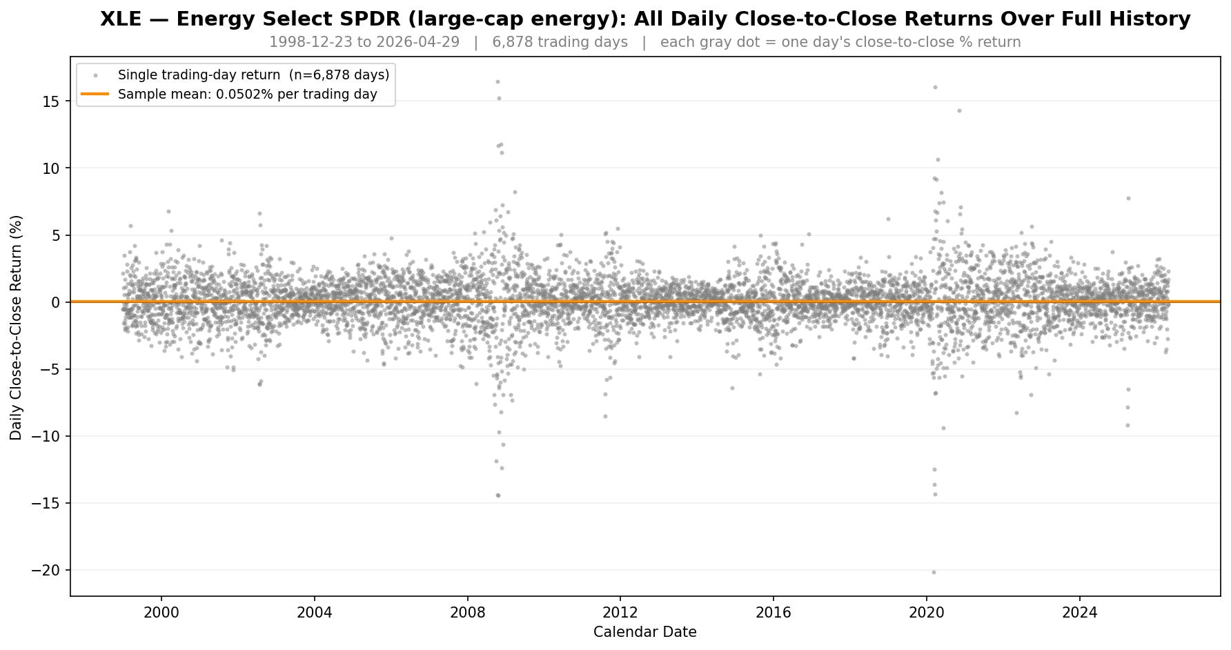
XLE has the tightest cloud of all four since it’s a basket of large cap energy stocks (Exxon, Chevron, ConocoPhillips, etc.). Hence why this ETF has the least amount of price dispersion of the four and behaves closer to an equity index rather than a commodity.
XOP sits between XLE and the commodity-direct names. It’s equity-style, but it tracks smaller exploration and production companies that are more leveraged to oil prices, so the cloud widens a little bit more than XLE during gas/crude oil commodity stress periods.
The orange average lines show the bigger picture though.
USO tracks WTI crude oil and its mean daily return is basically zero at +0.0019%.
UGA tracks RBOB gasoline at +0.046% per day.
XLE is the energy sector equity ETF holding large caps, with the highest average daily return (upward drift) at +0.050%.
XOP tracks oil & gas stocks at +0.043% per day, which is commodity-direct exposure but equity-style.
USO is an interesting one with an average daily return of basically zero. Buy and hold on USO is roughly flat. That’s actually useful for our analysis because any positive holiday-window return on USO is easier to attribute to the holiday itself, rather than to any underlying upward drift.
XLE, by contrast, has a +0.050% daily average baseline upward drift because it’s an equity ETF. So any pre-holiday drift strategy on XLE has to beat a higher average return to show the holiday effect has significance.
Keep these average daily return baselines in the back of your mind as we go through the rest of the analysis. They will be the benchmarks to beat to help prove or disprove the holiday effect is real.
The Holiday Effect In Energy ETFs:
For the next few sections, I will focus on exploring results for the UGA ETF (US Gasoline Fund). Long story short, this ETF showed the strongest and most interesting results. I’ll sprinkle in the results from the three other ETFs here and there as well, but UGA shows the most promise, hence why I’ll put a lot of focus there.
This first chart shows the cumulative returns of buying UGA x days before a holiday (blue) vs. a random benchmark of buying UGA for any random sequence of x days (grey). The random holding period was created by averaging the return of 10,000 Monte Carlo simulations.
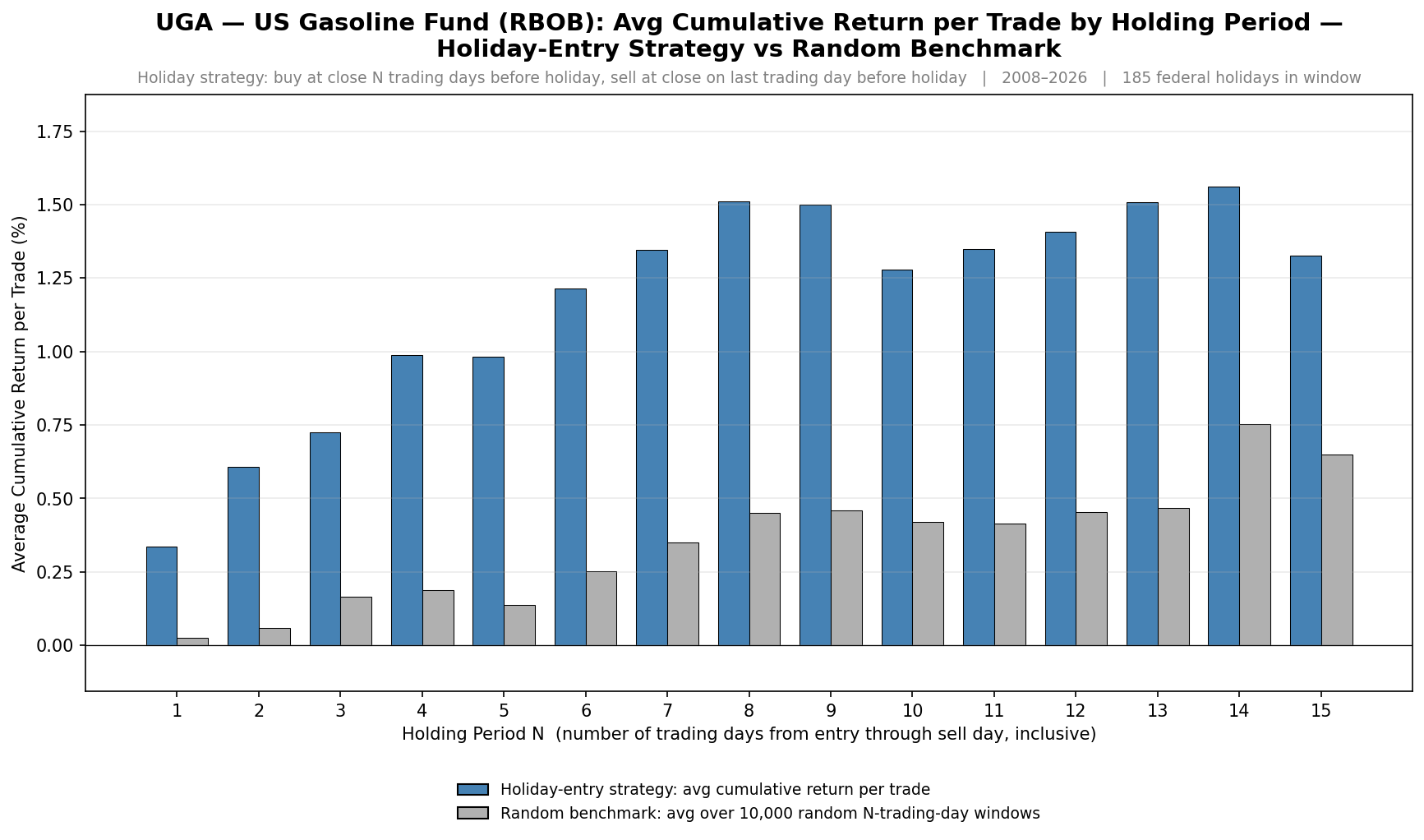
You’ll notice something pretty interesting. The returns of the holiday entry (blue bars) are significantly higher than the returns of the random entry (gray bars) at every holding period measured, from 1 to 15 trading days. UGA’s effect ratio at the 8-trading-day window is around 3 times higher average return, compared to a random holding period of the same length.
Also, the average cumulative return pre-holiday increases from days 1 through 8. After day 8, the average cumulative returns start to flatline. This gives us an initial insight that the best time to buy pre-holiday is around 8 market days before the holiday.
To prove this isn’t random, here is the same chart for the three other energy ETF’s.
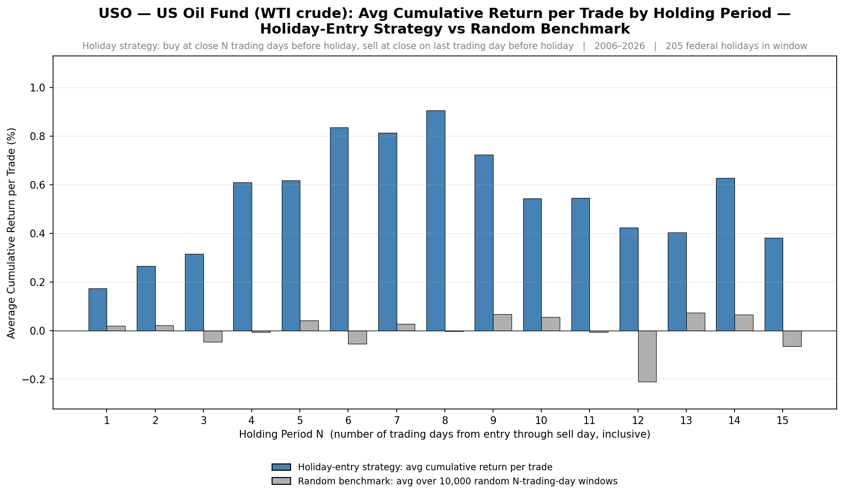
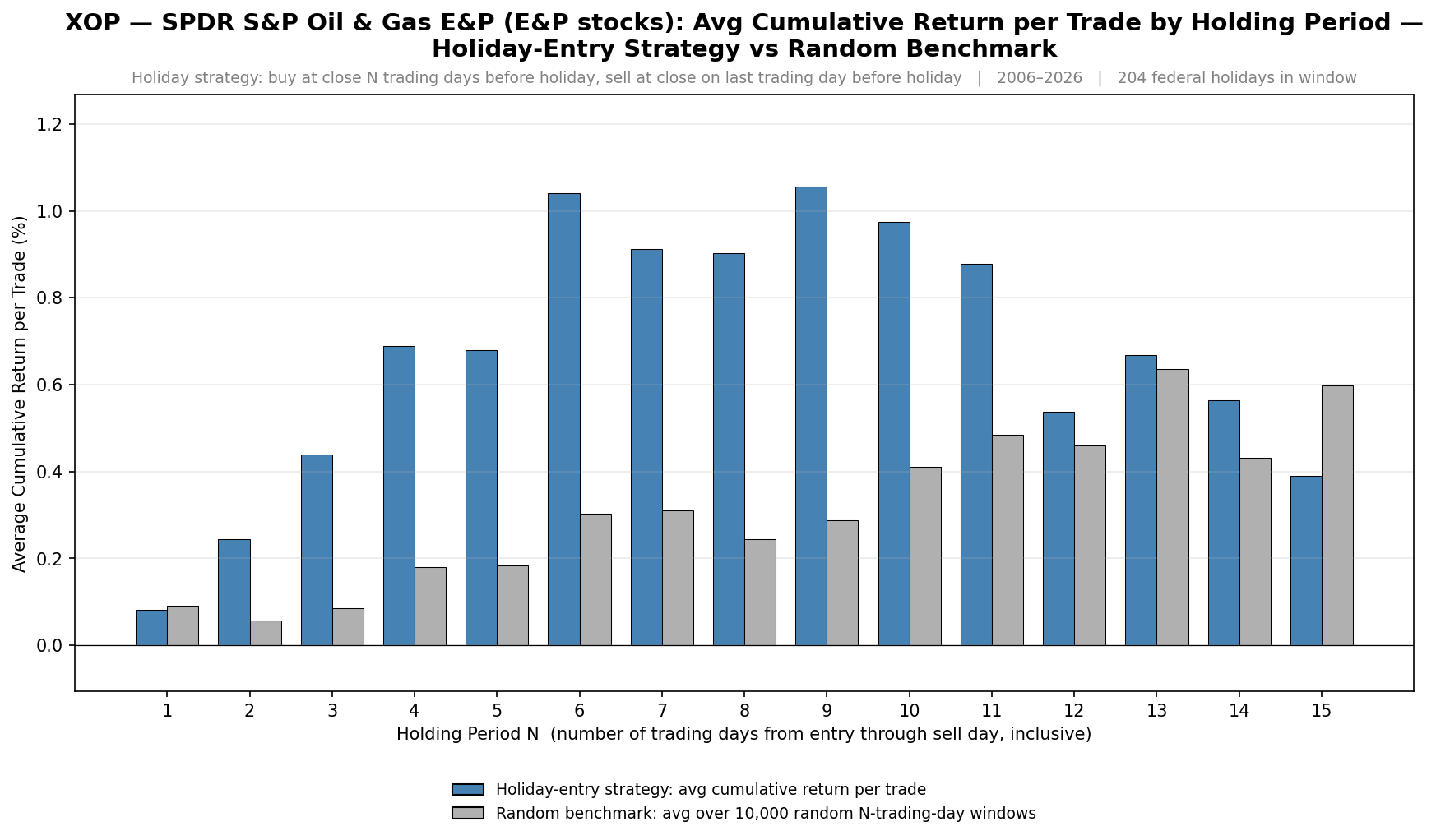
You’ll notice all three ETFs show a very similar effect. A cumulative average return that increases from approximately days 1 to 8 before starting to taper off.
While the size of the average return differs from ETF to ETF, the pattern is fairly consistent across all four ETFs; even within the USO ETF, which has an average return of around 0% per day over the long term.
The Day-To-Day Return Of The Effect:
Now, let’s look at UGA’s day to day average return on each trading day leading up to, and after, a holiday.
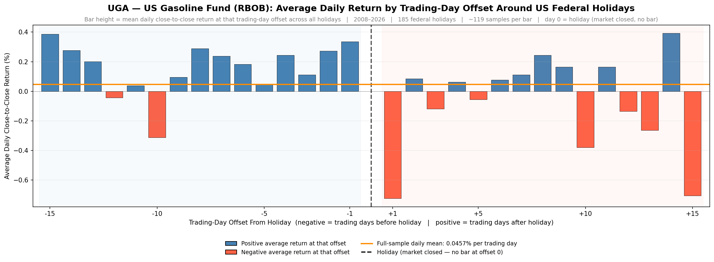
Bars to the left of the vertical dashed line are the average return of pre-holiday days. Bars to the right of the vertical dashed line are the average return of post-holiday days. The horizontal orange line is the UGA ETF daily mean return.
Looking first at the pre-holiday side, you’ll notice the bars in the last 8 trading days leading into the holiday are almost consistently above the baseline average return. That’s the pre-holiday lift we expected.
Now look at the post-holiday side. Day +1, the first trading day after the holiday, is the most negative bar in the entire chart. That’s the price reverting back to pre-holiday prices as demand for gas reverts back to normal.
This chart further shows the positive average daily returns before the holiday and also signifies that there is a negative average daily return immediately after the holiday (concentrated at day +1).
This pattern is also relatively consistent in the other three ETFs as well:
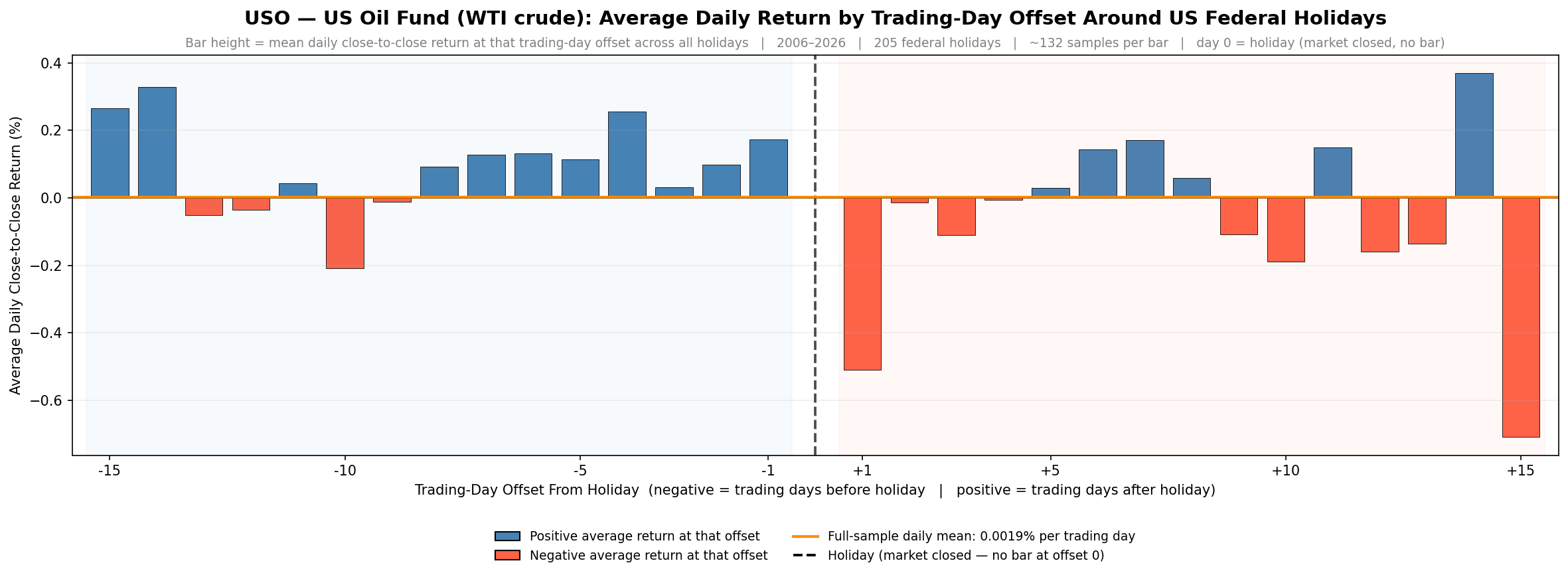
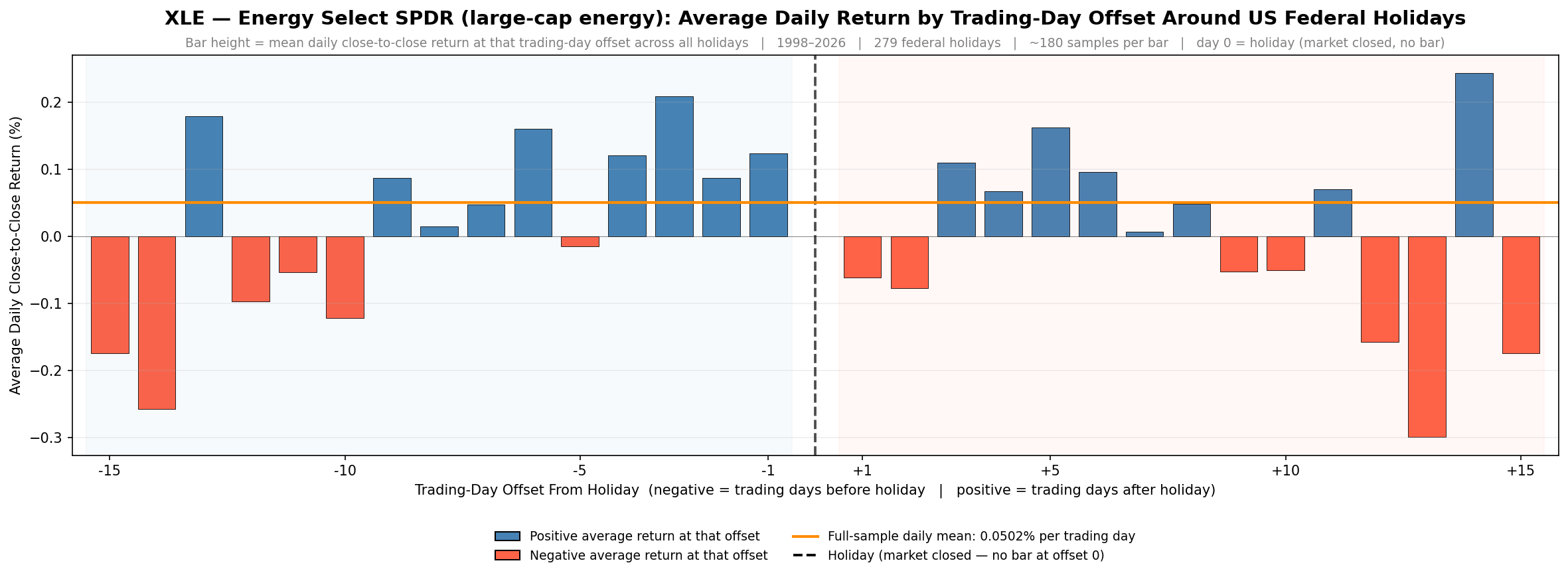
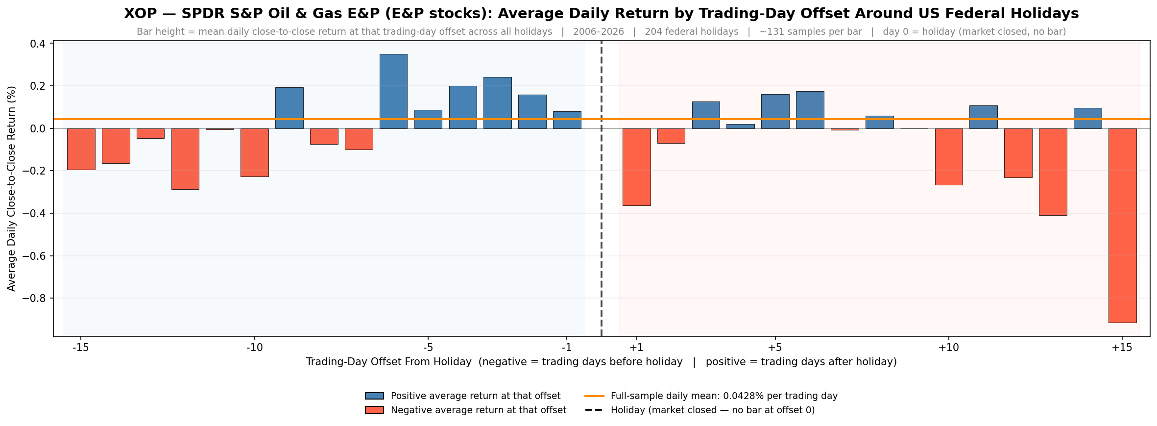
There is a greater than average set of daily returns leading into the holiday, followed by a big sell off on the first day after the holiday (and some ETFs have even more sell off follow through a few days after the holiday too).
Multi-Ticker Return Heatmap:
This next chart puts all four gas/energy related tickers (and SPY for reference) on the same returns heat map so you can observe the positive to negative return pattern in relation to all instruments at once.
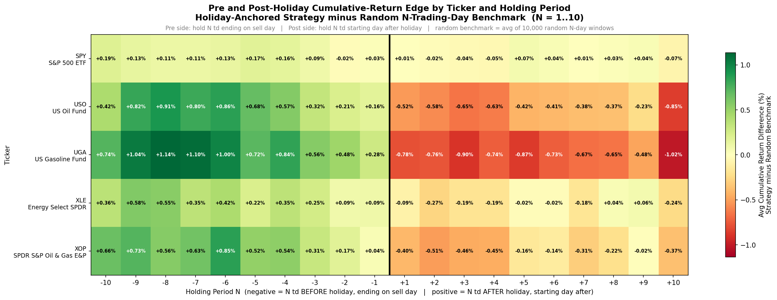
The rows are SPY, USO, UGA, XLE, and XOP. The columns are trading-day offsets from -10 to +10 around each holiday.
The black vertical line represents the holiday. Cell color is determined by the 10-day cumulative return leading into a holiday minus a Monte Carlo average return benchmark.
Green cells mean a positive edge above an average buy and hold return of the asset. Red cells mean a more negative return compared to average buy and hold of the asset.
You’ll notice three things:
First, every row is completely green on the left side (the pre-holiday window). The pre-holiday lift exists in all five ETFs.
Second, the commodity-direct rows (USO, UGA, XOP) have a clear red return on the right side starting at offset +1. That’s the post holiday give-back.
Third, SPY and XLE have relatively neutral returns right after the holiday so there is no real post holiday give-back. XLE seems to behave more like SPY, rather than an oil and gas fund like USO or UGA.
The heat map above showed the cumulative returns above or below an average buy and hold benchmark of the given asset in the pre and post holiday timeframe. This next heat map shows the returns of each day independently (non-cumulative return).
The heatmap below shows the single-day returns at each day offset rather than chained N-day cumulative edge. It’s the same layout and same tickers, but each cell now shows the average return on that exact trading day, rather than the cumulative return over the 10-day window.
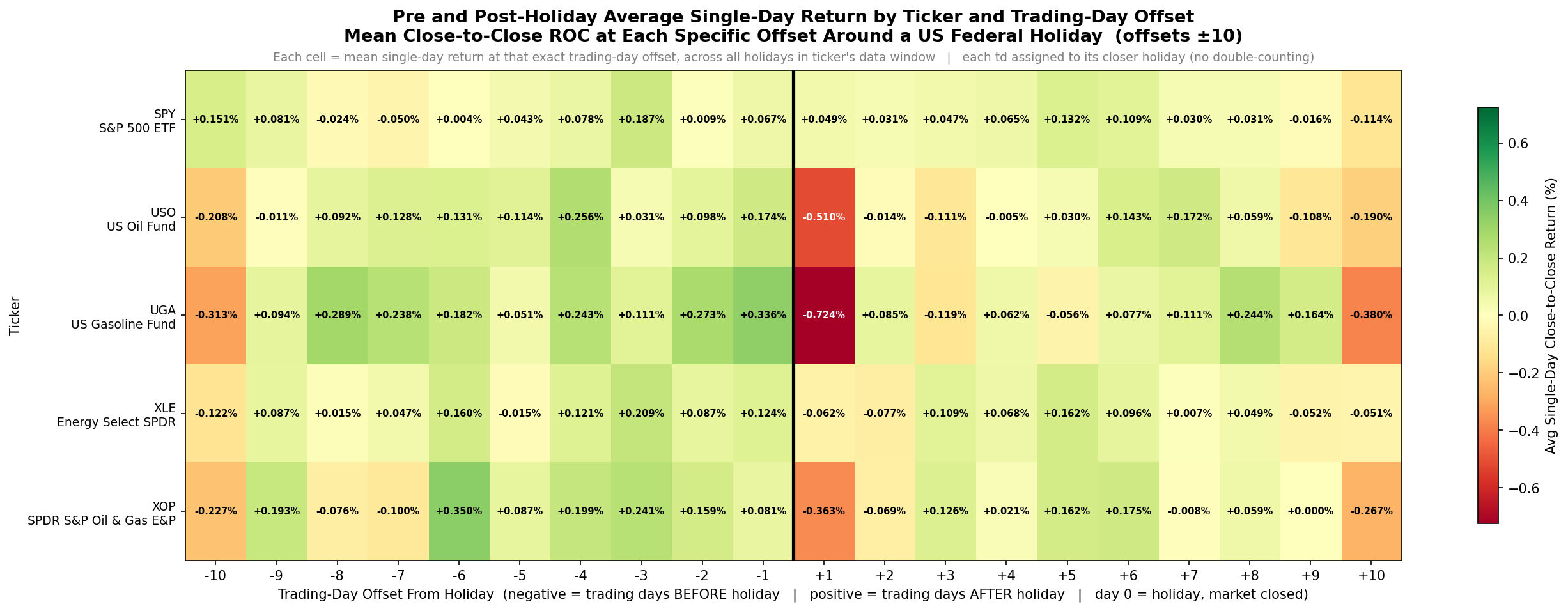
You’ll notice the post-holiday sell off (red cells) is more concentrated in the daily view than in the chained cumulative return view. For UGA specifically, offset +1 is the most negative single-day return cell in the entire chart. For USO and XOP the post-holiday day +1 also shows some give back, but a little less than UGA.
Also, the pre-holiday window shows to be mostly green across the board. Which means there is a consistent excess return nearly everyday leading into a holiday.
Thus far, the research is showing us that being long pre-holiday about 6-10 days out from the holiday works on all four energy ETFs. Also, being short post-holiday seems to only work on the commodity-direct names (USO, UGA, XOP). Being short after the holiday does not appear to work well on XLE. And if you’re going to be short you should only be short for a day or two after the holiday.
Has The Effect Decayed Across Eras?:
So far, we have only looked at average results over the whole time period, but is it stable across regimes, or is the average being skewed by one strong era? Let’s look at UGA specifically as the effect is the strongest in UGA. We will break the data into three eras and rerun the average daily return by trading day bar chart.
The three era splits are:
pre-2012
2012 to 2019
2019 to present
We will look at era 1 first. This first era covers a relatively thin slice of UGA’s history because UGA only launched in early 2008, so we’re working with around 40 holiday observations total in era 1.
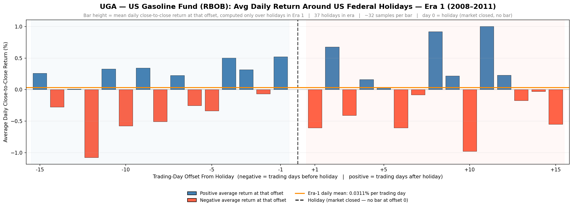
You can see some of the pre-holiday bars are above the average return, but there are more red bars pre-holiday than what we saw in the whole time period average result in the sections above. The Day+1 post-holiday sell off does exist strongly in this era though.
Next, we will observe era 2 from 2012 to 2019:
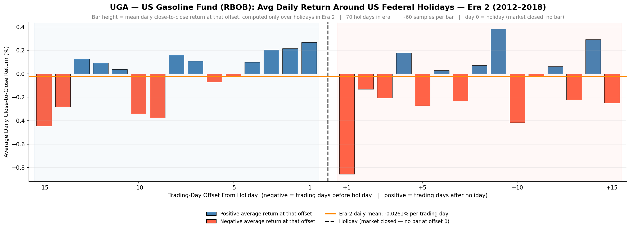
You’ll notice the pre-holiday lift is clearly visible and more consistent in the last several bars before the holiday. Also, the post-holiday side still has the massive Day +1 sell off.
Next, we will observe era 3 from 2019 to 2026: