

ETF Mean Reversion Methods: Validation and Live Trading - Part 3:
In sample / out of sample validation, robustness testing, live vs backtest comparison, and what it actually feels like to trade four mean reversion systems live since August 2025.


Welcome to the “Systematic Trading with TradeQuantiX” newsletter, your go-to resource for all things systematic trading. This publication will equip you with a complete toolkit to support your systematic trading journey, sent straight to your inbox. Remember, it’s more than just another newsletter; it’s everything you need to be a successful systematic trader.
Introduction:
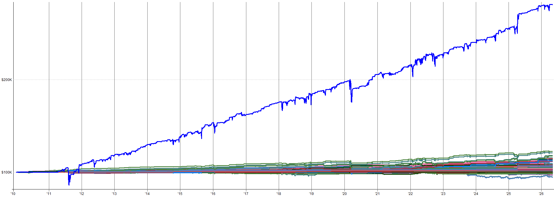
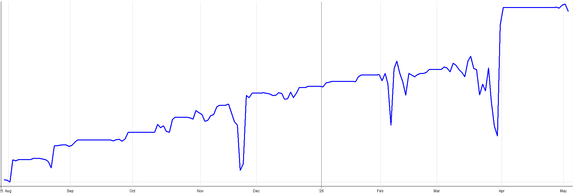
In November 2025, I was fully loaded in my mean reversion mini-portfolio. My entire portfolio was heading into a drawdown as the general market was selling off, and I was picking up more exposure as the markets tanked via the mean reversion mini-portfolio.
I was using portfolio margin to support the additional mean reversion buying. Even though the markets were selling off, my long term trend and momentum systems hadn’t begun to reduce exposure yet.
The entire portfolio was down 10% in just a matter of days. I was a little nervous to be completely honest with you.
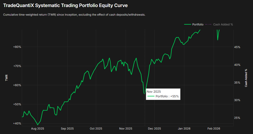
I knew I had to stick with my systems though. I did the work, I knew the possible outcomes, I knew the portfolio would rebound. It’s just different to see it in a backtest than to actually experience it live with real money.
Eventually, the markets popped back up. The positions held by the mean reversion mini-portfolio quickly caused the entire portfolio to recover in just a few days; as you can see by the v-shaped recovery in the equity curve above.
I’ll admit, with the mean reversion mini-portfolio we have introduced in the past two articles, I was a little aggressive with my sizing at first. I was excited about these systems and I sized them for the upside and not the downside. I make mistakes too.
After this experience, I pulled back the allocation to the mean reversion mini-portfolio by about 25% to mitigate this volatility in the future.
This story was the first scary experience I had with these mean reversion systems. It wasn’t that the systems were poorly developed or that the parameters / indicators needed tweaking; it was simply that I was oversized and I learned that lesson the hard way.
The only thing that kept me in the trades and prevented me from selling the positions early or skipping the next trade was my confidence in these mean reversion systems. I had done the work, I knew they were robust, and I knew they would very likely make money over the medium to long term.
In this article, I want to share with you the in-sample and out-of-sample results for the mean reversion mini-portfolio, as well as the results of a few robustness tests. This is extremely important because the stability of these robustness tests and the out-of-sample results are what give you the confidence to keep trading through the scary times.
I also want to discuss more about what it’s like to manage and trade the mean reversion mini-portfolio. As you can tell from this story, there are times when it sucks. I want to ensure that expectations are set and point out that nothing is ever as easy or glamorous as it seems.
Let’s start first with the in-sample and out-of-sample results.
In Sample / Out of Sample Methodology
When I developed each of these mean reversion systems, the in-sample period was set from 2010 to 2018 and I used the leveraged ETFs during system development. 2010 to 2018 is the period I used for all decision making:
What indicator to use
What parameters to use
What entry/exit logic to use
What universe to use
etc.
Everything was designed using only the 2010 to 2018 time window.
I focused on robust system design. I did not spend time optimizing or fiddling with trying to get a very specific time period to produce better results. That’s a dangerous path to overfitting. If a system underperformed from 2014-2015 for example, I left it alone. Any optimizing to make it look better during the specific timeframe would be curve fitting.
Instead, I knew these systems would be combined into the mini-portfolio and that the differences between when each system outperformed or underperformed would complement each other well.
Hence, I was not too concerned with optimizing the performance of one system to be perfect. I instead focused on making each individual system robust, and I knew the performance would follow once they were combined into the mini-portfolio.
For the out-of-sample time period, that was selected to be 2018 to 2026 (which is a pretty long time). Also, pre-2010 was used as out-of-sample on non-leveraged ETFs.
While I tend to heavily prefer more recent out-of-sample time periods rather than out-of-sample time periods from many years ago, it was still data I could leverage to increase my confidence (or hesitation) in these mean reversion systems even more. If pre-2010 had completely fallen apart, that would have probably been a red-flag, even if the post 2018 data results showed promise.
So what this means is I used about 8 years of data for development, but had 8 years forward in time of pure out-of-sample and 7+ years (depending on the ETF) of even more out-of-sample data for the pre-2010 time period. That’s over 15 years of out-of-sample. It’s not too often that you come across a system that can say it has more out-of-sample time than in-sample time.
These days, you’re lucky to find a system online that has ANY out-of-sample validation. Most systems are blindly optimized over a whole time period and then the author sells them like they are the holy grail.
My favorite is when a system underperforms after the release date and when they get called out about it, rather than the author taking accountability, they just say something like:
“Oh, well you need to re-optimize it for the new market environment”
I’ve personally seen this happen 3 or 4 times. It’s nonsense. They know what they did. Systems do fail, it’s unavoidable. But it’s one thing to do your best to develop a system right and it dies vs. blindly optimizing a system on all data and then presenting it with this beautiful backtest just looking to make a few bucks selling a junk system to some poor sucker.
Sorry I am going on a rant here. I wasn’t really planning on taking this article this direction, but here we are. I could delete the last few paragraphs, but I’m not; I feel like you all deserve to hear my raw opinions.
I guess I just want to point out that the things I write about in this newsletter are the actual things I am currently trading or am building to add to my portfolio in the future. If the author doesn’t put their own money behind what they build, then you know their incentives are not aligned with you being successful.
Here are my live results for this mean reversion mini-portfolio since I began trading it in August of 2025:

I put my money where my mouth is.
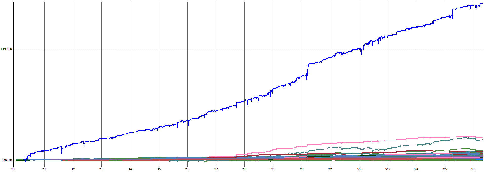
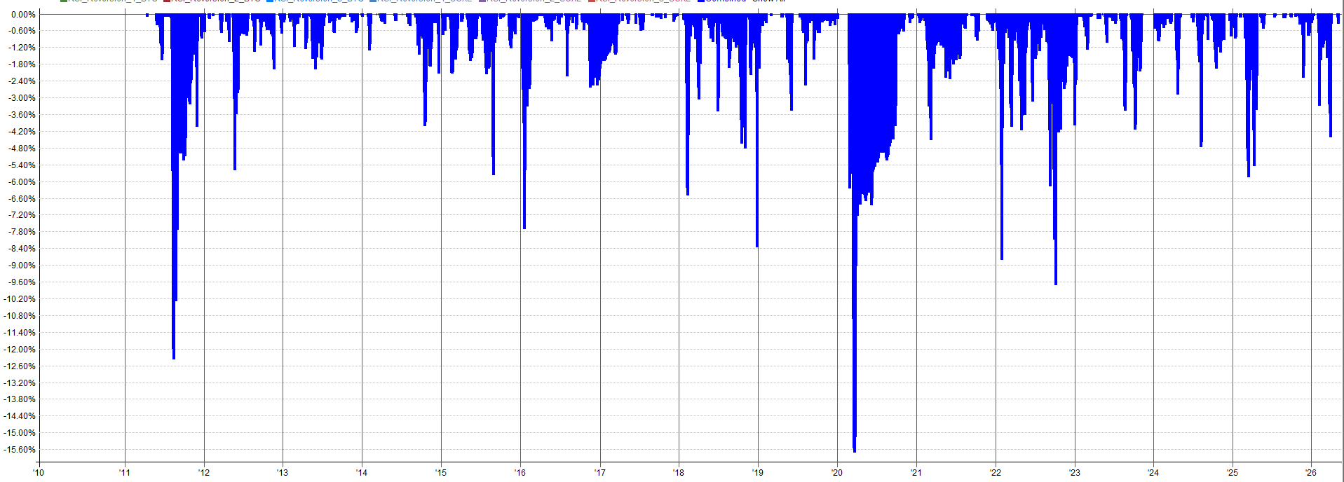
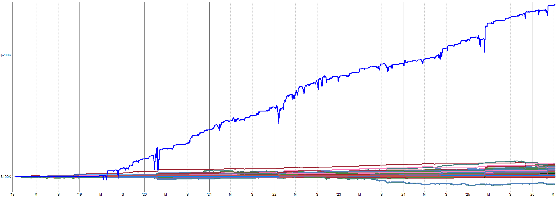
Combined IS and OOS Performance (Leveraged ETFs):
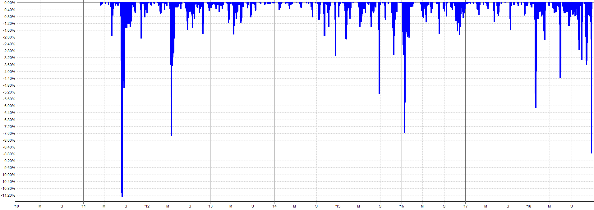
2010 to 2018 Combined IS Results:
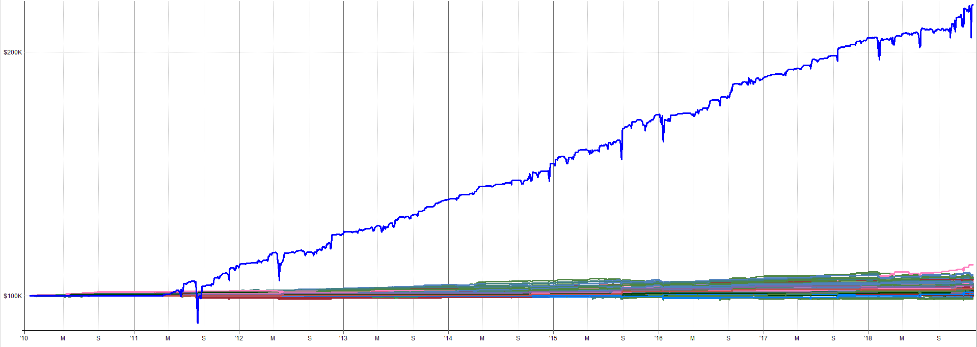

2018 to 2026 Combined OOS Results:
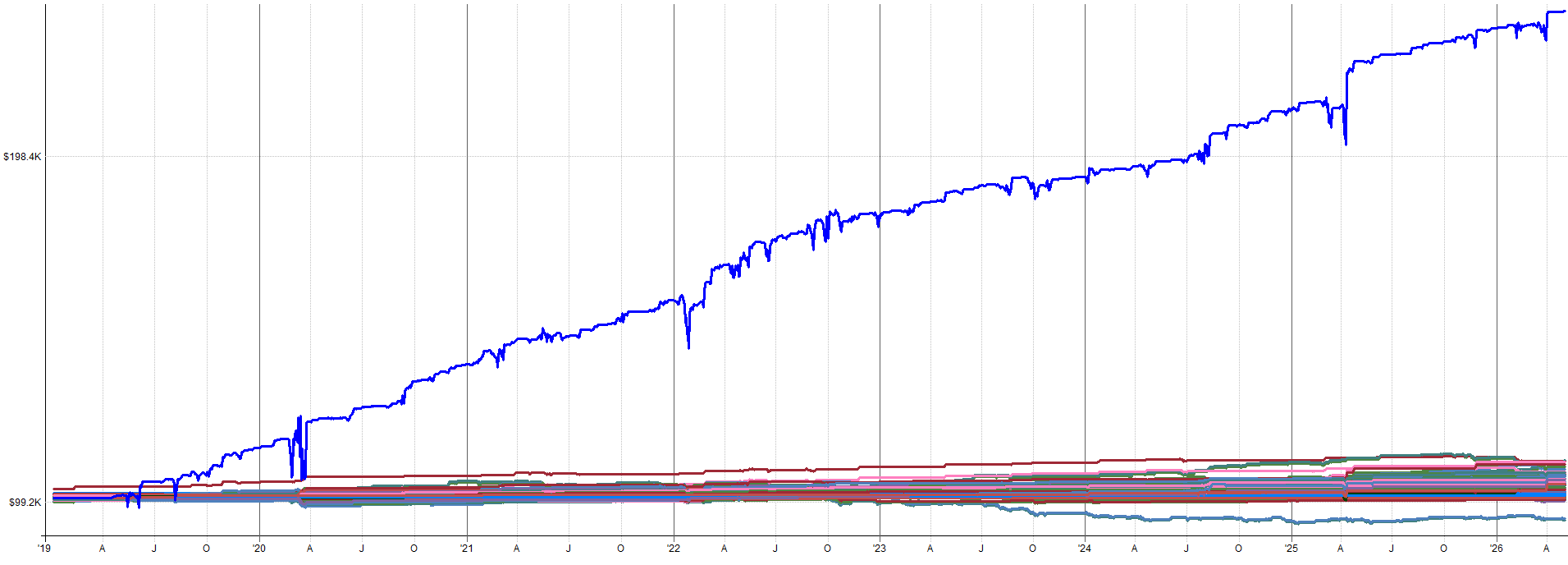

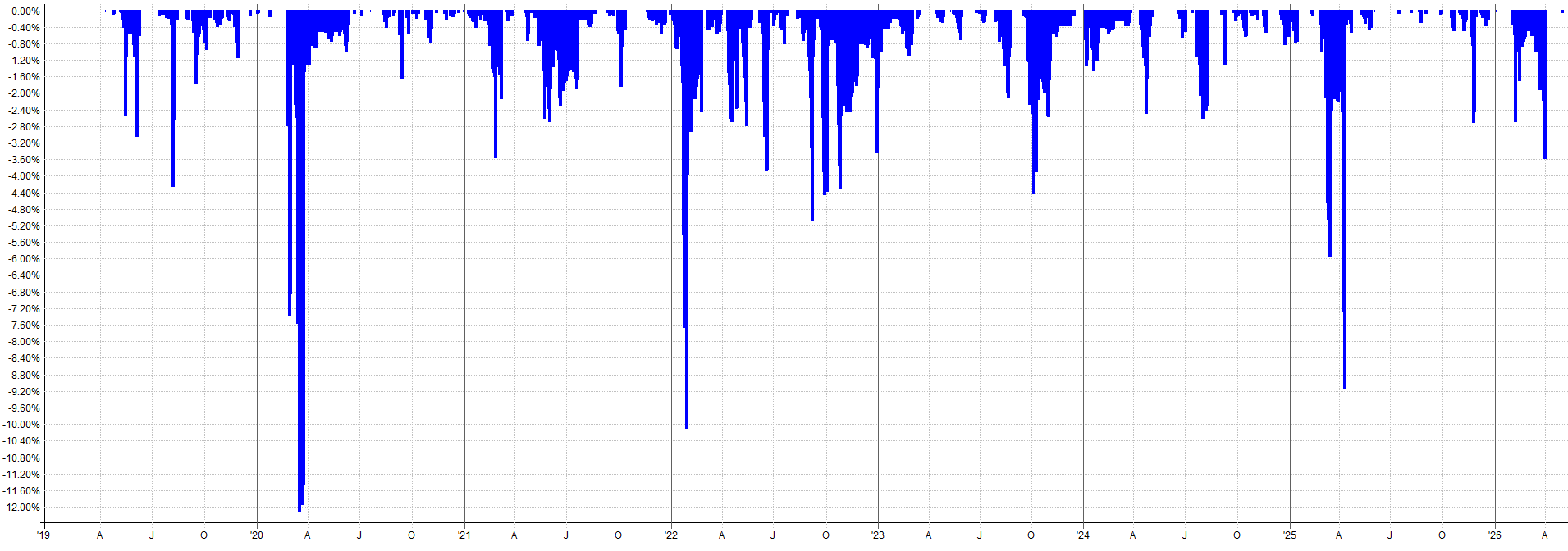
You’ll notice the in-sample and out-of-sample results closely align. You could argue the out-of-sample looks slightly better with a higher rate of return, Calmar ratio, and expectancy.
These are the types of out-of-sample results that are very rare, but I get very excited when I see something like this. 90% of out-of-sample results degrade in some way, and that degradation is usually on the order of 20%-30% degradation to the in-sample results.
That other 10% of out-of-sample results are either just as good as the in-sample or better. This is when you start to think you’re onto something. But, with that said, it’s still possible to be a fluke!
That’s why we will check out some robustness test results in the second half of this article as well.
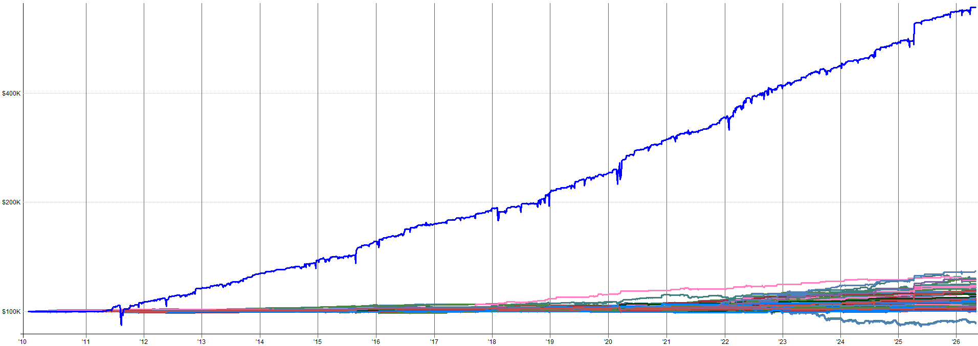
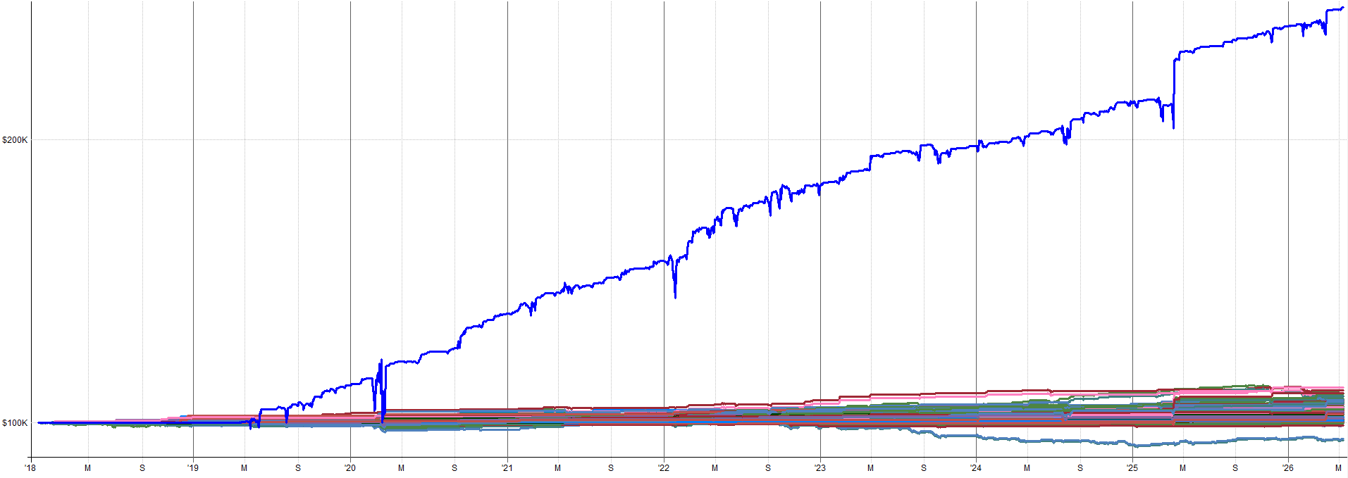
Unleveraged ETF Extended History (Pre-2010 OOS):
2000-2010 Combined OOS Results:
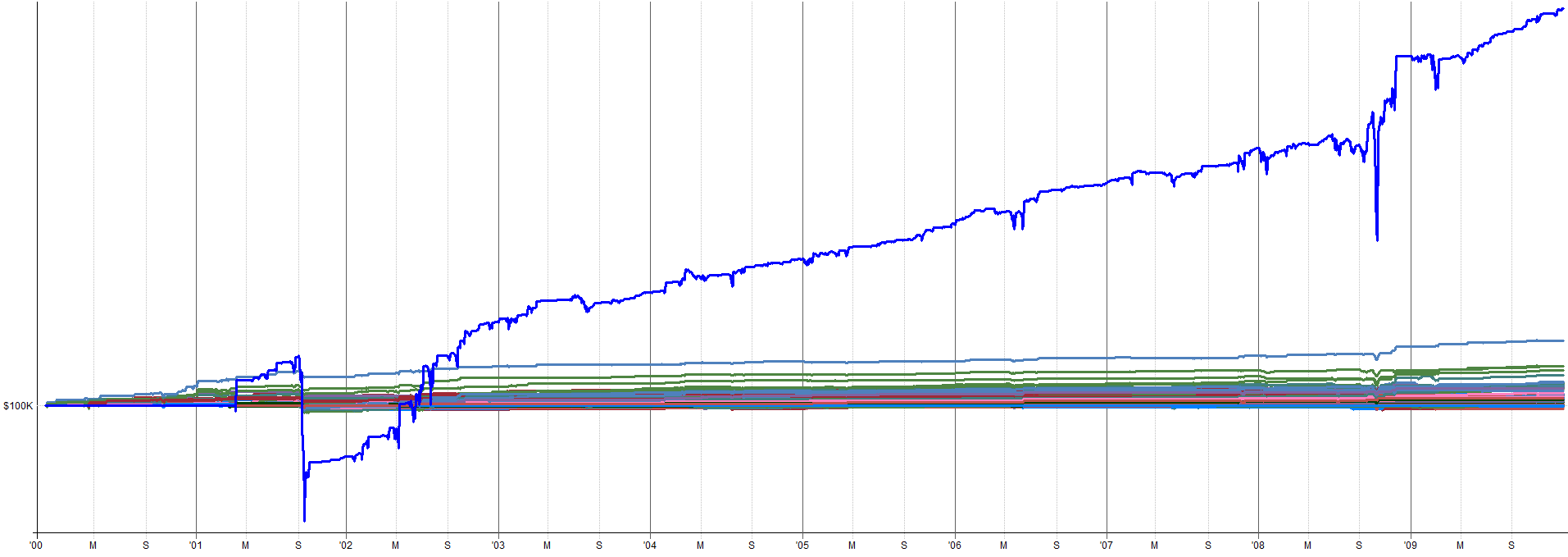

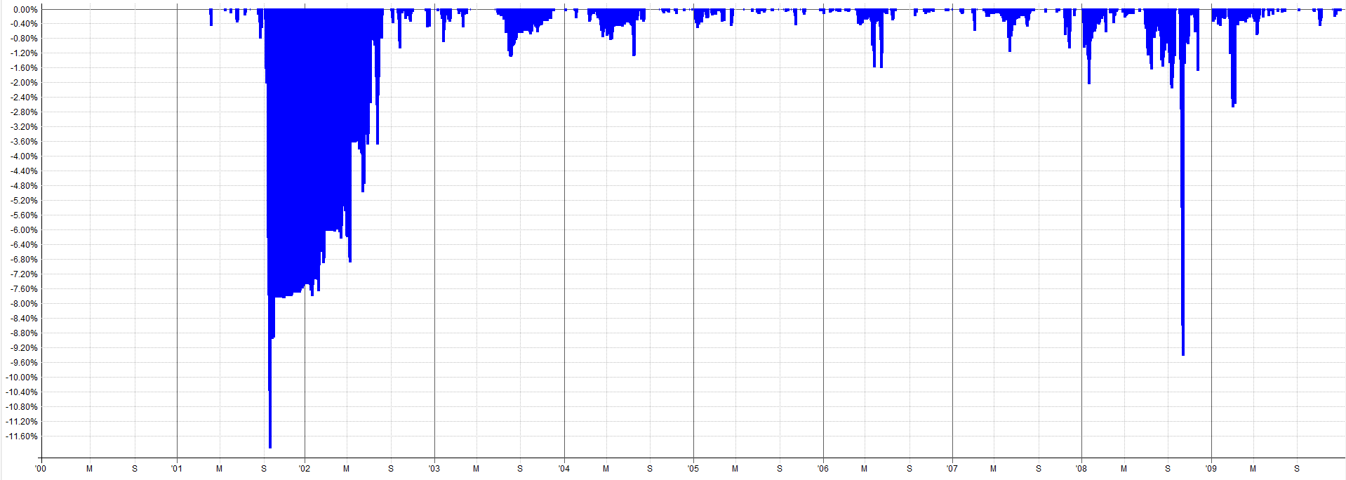
2010-2026 Combined OOS Results:

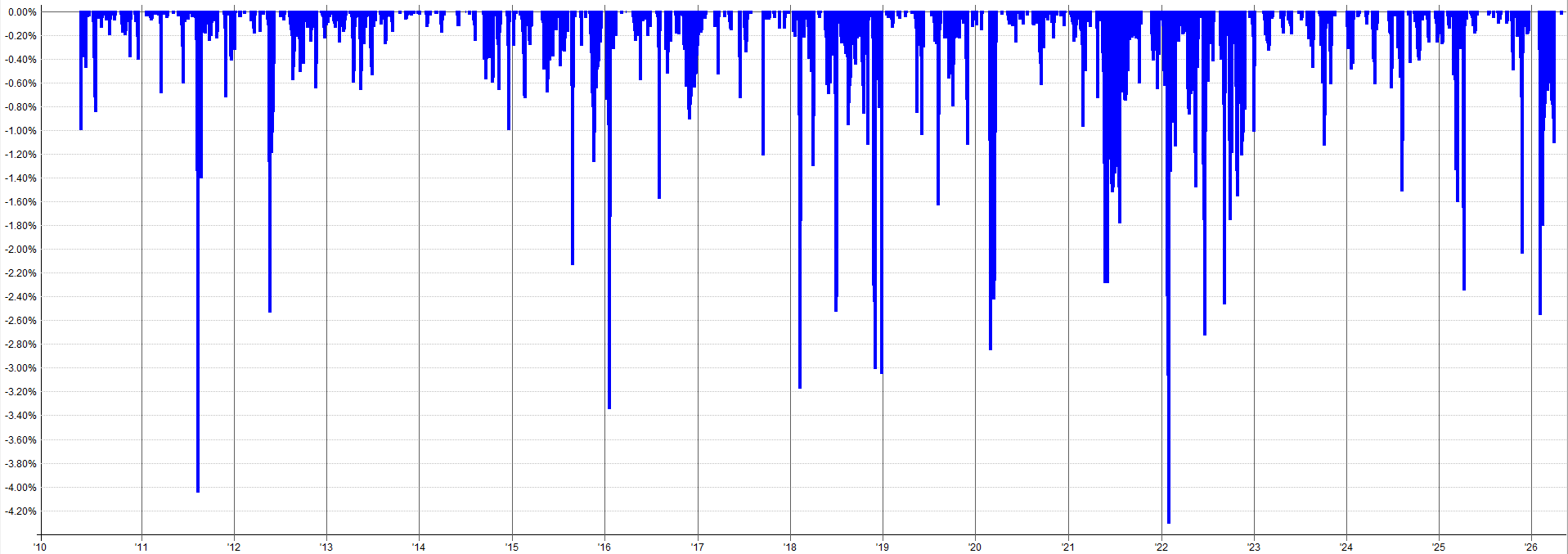
The out-of-sample results pre-2010 still look tradable and in-line with the in-sample results. The drawdown during the 2000 tech burst is mildly concerning as that was the largest drawdown throughout the entire history of the backtest. Granted, this was a very aggressive sell-off so it makes sense that there would be poor performance during this time.
It might be tempting to go back and start optimizing to this period to reduce that 2000 tech crash drawdown, but this is pure curve fitting. Why try to make your backtest look better than it actually is? You want to know that the true results actually looked like this. You need to know this information about possible worst case scenarios and not try to hide the bad portions of the results.
When you mute the worst case scenarios with curve fitting, you understate risk and overstate returns. This can be dangerous when it comes to allocating capital to the system as you will be tempted to over allocate to a curve fit system.
Instead of “fixing” the bad drawdown with curve fitting, handle it with position sizing. You know that a 1 in 20 year event could cause a drawdown like this, so either:
Accept that you’re going to be in pain a few times during your trading lifetime when these events eventually happen (and they eventually will happen).
Allocate to the mean reversion mini-portfolio accordingly. You know an ~11% drawdown on unleveraged ETFs is possible, so a ~30% or more drawdown is also possible on leveraged ETFs. Allocate capital from your overall portfolio to the mean reversion mini-portfolio accordingly. If you only want to experience a 10% drawdown in the mean reversion mini-portfolio, then you can only allocate ~ 33% of your overall portfolio capital to it. Controlling drawdown with portfolio level allocation percentages is a great way to control risk without relying on curve fitting to make the backtest look like the drawdown never happened.
The in-sample and out-of-sample results confirm the mean reversion mini-portfolio likely has merit. But it is also possible this result was complete luck. Hence, we should run some robustness tests on the mean reversion mini-portfolio to ensure it holds up to some scrutiny.
A truly robust system should be able to navigate some noise and turbulence and still be tradable. The markets will only get more noisy with time, so let’s ensure our system can at least withstand a historical backtest with some noise thrown at it.
Transaction cost note: All backtests include commission costs. Commissions are assumed to be the Interactive Brokers commission structure. Slippage is set to zero in the backtests because most entries and exits participate in the closing price auction and thus would see no slippage. Only one system enters intraday with a limit order, which would generally not see slippage unless the opening price gapped below the limit order (in which case there could be slippage as the limit order essentially gets converted to a market order at the open). Based on my 9 months of live trading these systems, zero slippage appears to be a reasonable assumption, at least based on my account size and allocation.
Robustness Testing
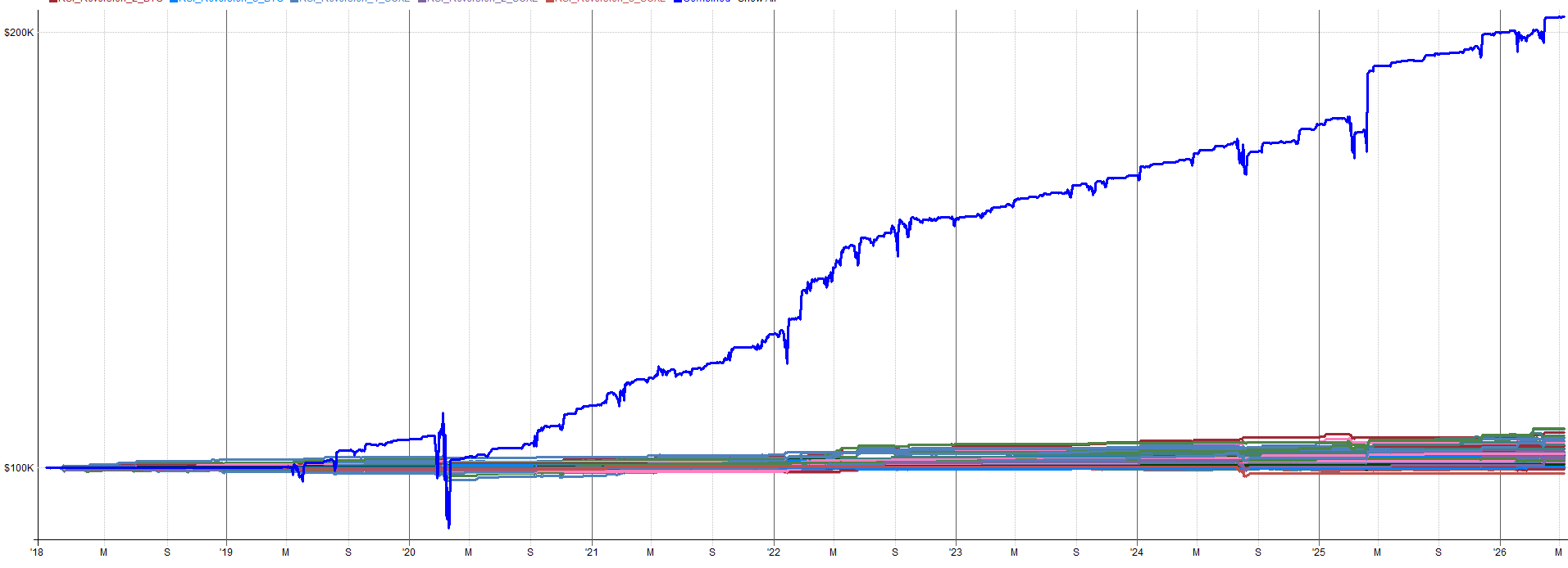
This section will cover a few robustness tests on the mean reversion mini-portfolio. It’s worth noting, every test I will show was run at the portfolio level: all four mean reversion systems (Z_Reversion, Vol_Reversion, Vol_Reversion_2, RSI_Reversion) combined together.
You could test the individual systems in isolation, but since these systems were designed to complement each other, scaling in and out of positions, it makes more sense to test from the perspective of the overall mini-portfolio.
How To Interpret These Robustness Results:
Generally speaking, I like to see robustness test results come in within 70% to 80% of the nominal system results. That’s my soft threshold. I’ve tested 100s of systems and have run robustness tests on pretty much all of them. Generally, the 70% to 80% threshold is reasonable.
Obviously the closer the robustness test result to the baseline system result the better, but there are plenty of caveats and edge cases. To keep it simple, the easiest way to determine if the robustness test is a pass would be to ask yourself:
“If the worst case scenario happened, or if the 5th percentile worst result of these robustness tests turned out to be the true performance of the system, would you still trade it? Would you still allocate your hard earned capital to it?”
Meaning, if your live performance was worse than 95% of results from the robustness tests, would you still be willing to trade it in your portfolio? If yes, then it’s a pass. If no, then it’s likely a fail.
I was very careful when I designed these systems to design them with robustness in mind. I wasn’t optimizing each system to maximize returns or to minimize drawdowns. I will always accept less returns or more drawdown for more overall system robustness. Rather, I was ensuring the parameters and rules I chose were widely stable and it didn’t really matter what I chose, it all more or less worked.
Remember, a curve fit backtest overstates returns and understates drawdowns, which leads to over-allocation. You end up putting more capital into something that returns less than you think and loses more than you think. Robustness testing helps point this out and make us aware of this possibility.
What I want is for the backtest to reflect the actual stability of the system so I can allocate properly. Robustness tests help answer the question:
“Is the backtest hyperinflating results, or is it actually a good representation of the median/likely outcome?”
If the robustness tests show the baseline system result is close to the median, you can probably use it as a good basis for capital allocation. If the robustness tests show the baseline system is in the upper end of the results, then it’s likely the performance is overstated. In this case, we either need to throw away the system, or allocate to it accordingly now that we know live performance would be expected to be lower than the backtest.
Robustness Template Refresher:
If you read the robustness testing article (see link below), you’ll remember the robustness testing Excel template.

This template contains inputs for five robustness tests for a system or portfolio (excel robustness template is stored in the GitHub). If you haven’t read that article yet, consider reading it first. It’ll make the rest of this section make a lot more sense.
As a quick refresher: the robustness testing excel template has tabs for each robustness test. You put the raw output from the robustness test in the input tabs, then the excel sheet plots histograms showing your baseline systems results in relation to other results in the robustness test. It also has a table showing the percentile rank of the baseline system in relation to all results (i.e. is the baseline system in the 50th percentile, 5th percentile, 95th percentile etc. of results).
I ran the combined mean reversion mini-portfolio through three of the five robustness tests in this template. I focused on the parameter sensitivity, trade skip, and noisy data robustness tests. These three I felt where the most pertinent to the mean reversion mini-portfolio.
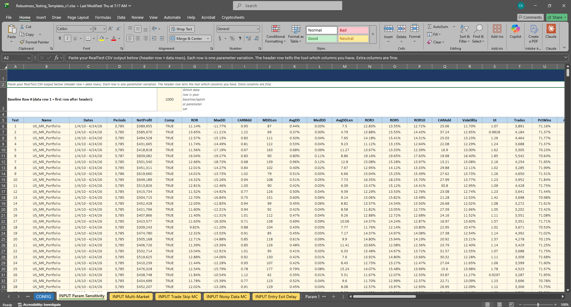
You can download this template from the GitHub and run these tests on your own systems. I’ll also have the results from these robustness tests in the GitHub as well.
In the rest of this section, we will walk through the results of each of the three tests and my interpretation.
Let’s first start with the parameter sensitivity test, which is one of my favorites.
Parameter Sensitivity (All Systems Varied Simultaneously):
This test works by varying each of the four systems’ key entry and exit parameters at the same time by approximately +-25%. Then, comparing the baseline combined mini-portfolio performance to other results across the +-25% parameter space. Each of the four systems had its parameters varied at the same time, it was not a one at a time system by system variation.
If the combined mini-portfolio only works with one precise set of parameters across all four systems, it’s overfit. A robust mini-portfolio should deliver acceptable performance across a very wide range of parameter combinations.
It’s worth noting, I do not have enough computer power to do an exhaustive +-25% parameter variation for all parameters within each of the four mean reversion systems. That’s billions of combinations, if not more.
Instead what I did was focus on the entry and exit rules specifically and run a -25% parameter, a nominal parameter, and a +25% parameter for each system. But even that was millions of combinations.
So I set up the +-25% sensitivity as I just laid out but had it randomly choose what parameters were varied on each run.
So it was not exhaustive, but rather a probabilistic run that randomly varied parameters +-25% (or kept the nominal parameter) across all four systems. I ran this 1,000 times and input the results to the robustness testing excel template.
While maybe not a fully exhaustive test (I don’t think an exhaustive test is even possible at the mini-portfolio level), I figured if there were any issues, they would start to present themselves after about 1,000 runs.
You are more than welcome to do more runs (maybe 10,000) but I would presume the result would be very similar to the 1,000 run result. I think you’ll notice I’m a big practitioner of the 80/20 rule and I like to do things in a reasonable way. I am not the person to wait and manage a robustness test for a week to get 10,000+ results.
I want to get what I think is the minimum viable amount of data which would present concerns (if they exist) and only do more testing if I feel it’s warranted after the 1,000 tests. Analysis paralysis is the best way to always be developing but never actually trading or making any money.
At a certain point you have to consider it good enough and pull the trigger on it and see what happens live. That’s just how I do it. And I would say the last 9 months of my live results are more meaningful than what these robustness tests could show (but I’ll show them anyway!).
With all that said, just to appease the skeptics, I ran the 1,000 random parameter sensitivity tests again in a secondary robustness excel sheet. I then looked at the results and compared to the first set of 1,000 random parameter sensitivity tests.
If my claims are true (that 1,000 tests gets you to around a converged solution), I would expect to see similar results between the two 1,000 test datasets. And that’s exactly what I saw, both datasets showing very similar results. Which means the 1,000 parameter sensitivity tests was enough to actually show meaningful results and make decisions from.
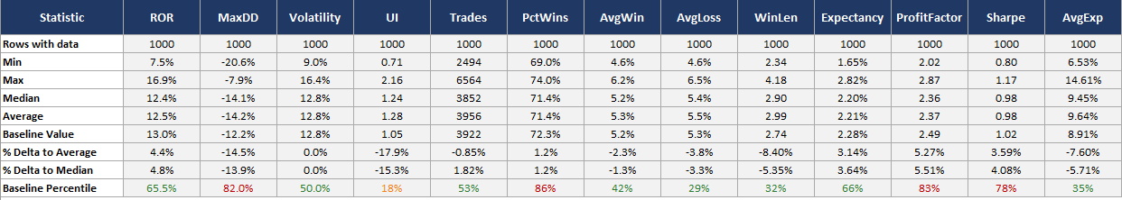
Combined Mini-Portfolio Parameter Sensitivity Table (Dataset 1):
Combined Mini-Portfolio Parameter Sensitivity Table (Dataset 2):
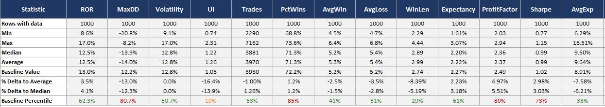
You’ll notice the Baseline Percentile row (bottom row) are very similar between the two datasets. This shows that the baseline system performance sits in approximately the same percentile in relation to all other parameter combinations within a +-25% space.
Since both datasets of 1,000 random parameter combinations result in approximately the same percentile, I am arguing that 1,000 tests is more or less converged and suitable to learn something from.
Let’s pick apart the results for a few of the metrics. Starting first with ROR, the system is in the 62nd to 65th percentile and about 3.5% to 4.5% above the average and median ROR result across the parameter sensitivity studies.
I generally tend to expect the 50th percentile or median result during live trading. The baseline system result is 13% ROR while the median result is 12.5% ROR.
So, the system results may be slightly overstated on the higher end, but only by about 0.5% ROR. I am more than comfortable with this result as the median ROR result is nearly identical to the baseline system ROR result.
Next let’s look at max drawdown. Keep in mind max drawdown will inherently be a less stable metric as it is only one data point over the entire backtest history. The baseline system is in the 80th percentile, which is a little better than ideal. The median max drawdown is about -14% while the baseline system max drawdown sits at -12.2%.
So, there is a 1.8% difference in max drawdown between the baseline system and what is more reasonable to expect (the median value). I can live with that. While the percentile may be saying the system is in the “overfit” range of results, the scatter of max drawdown outcomes is actually relatively tight, between -8% and -20%.
That may seem wide, but for how noisy the max drawdown data point is, that’s a tight scatter. I could even live with the worst case of that range. I am comfortable with this result given I can live with the worst case result and that there is only a 1.8% delta between baseline and median max drawdown results.
Let’s look at one more, Sharpe. The baseline system Sharpe sits somewhere in the 73rd to 78th percentile of parameter sensitivity results. Again, while high (we like to see the baseline system near the 50th percentile of results), take it in context with the scatter. The median Sharpe result was 0.99 while the baseline system Sharpe is 1.02, a 0.03 Sharpe difference. A couple of different trades in a backtest could make a larger difference in Sharpe than that.
The scatter of Sharpe results ranges from 0.77 to 1.17, the baseline system sits right near the middle at 1.02. So while the baseline system’s 73rd to 78th percentile result seems scary, really it’s only slightly overstated compared to the expected median Sharpe of around 0.99.
I think what we are learning here is we need to look at this table holistically and not just focus on the percentile results. The percentile results are a good way to do a fast spot check, but you need to contextualize it with the rest of the data to make quality judgements about a system.
A result that would scare me would be a percentile result of 70% or more for most metrics and a large delta between baseline and median/average results, and a large scatter between min and average.
As an example, if baseline Sharpe was 1.02 but the percentile was 75%, the median Sharpe was 0.85, and the min Sharpe was 0.5; that would signify there is a lot of variability in the parameter space. This would tell me the backtest results I am seeing are severely overstated and I need to be careful and allocate accordingly (or throw the system away).
Luckily this is not what we are seeing. While we see higher percentiles for a few metrics, the scatter is tight and the delta between baseline and median results is small, so I am much less concerned about a higher percentile result. These robustness test results are signifying we should expect just a few percentage points of degradation between baseline and median results for most metrics, which is normal and I am more than comfortable with.
Now let’s visualize this data in a slightly different way. Tables are nice but plots sometimes tell the story in a way that’s easier to visually understand.
Combined Mini-Portfolio Parameter Sensitivity Histograms:
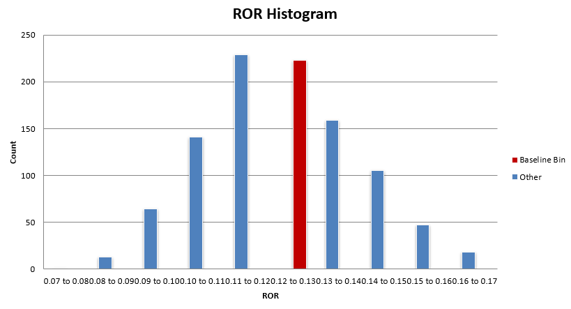
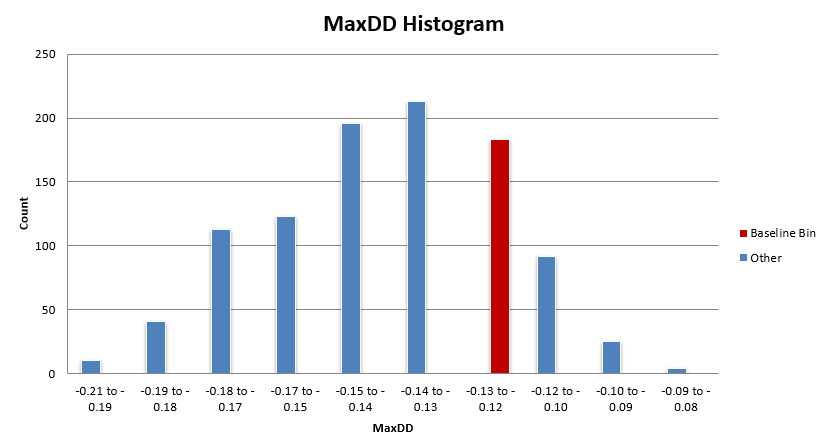
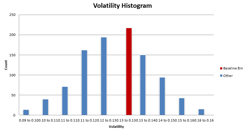
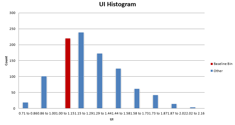
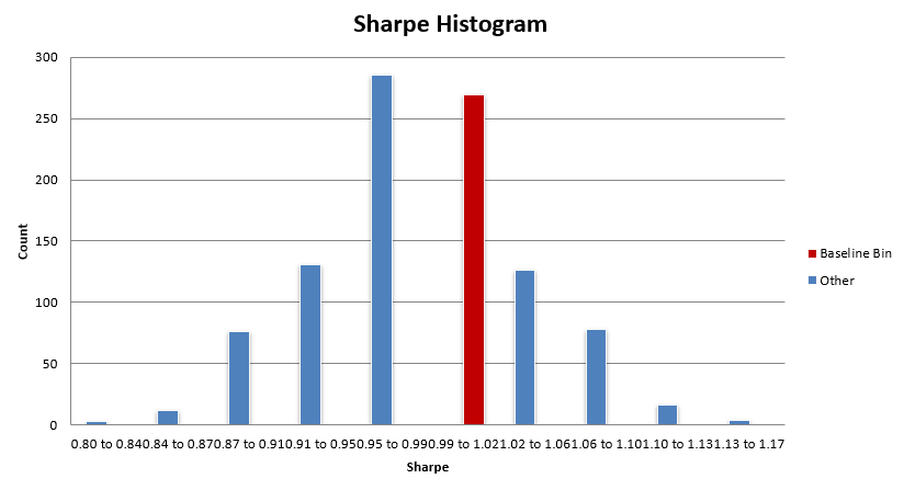
What you want to see is the baseline system histogram bin (in red) sitting in the bulk of the distribution. While most of these distributions are not normal, there tends to be a region of high density in results, and that’s where you want to see your baseline system residing.
You don’t want to see your system in the right tail of the distribution (or the tail with better results). In this case, the mean reversion mini-portfolio is within the bulk of these distributions.
Some metrics have the mean reversion mini-portfolio sitting on the better side of the bulk distribution, but as discussed earlier, the difference between the baseline performance and the median performance is very small for the most part.
Overall, this mean reversion mini-portfolio is nowhere near an upper edge of performance and is showing to have similar performance with the bulk of the other parameter sets within the +-25% universe.
Another interesting way to visualize results is to just flip through the equity curves of the results. Tables and histograms can explain the deltas and expected stability, but the equity curve is what gets lived from day to day. If you can look at the equity curves and live with the median or even the worst case result, that’s a pretty good sign.
Below I show the worst and best result from the parameter sensitivity tests (dataset 2 specifically) based on Sharpe.
Worst Result (Based on Sharpe):

Best Result (Based on Sharpe):

The best case looks great, but we shouldn’t expect it. The worst case result is a little more choppy, but is still more than tradable (at least for me). Especially in an overall portfolio context, I’d be more than happy to have the performance of the worst result in my portfolio. Anything better than this worst case is just extra goodness.
So, overall when looking at the parameter sensitivity tests holistically, I am feeling good about these results. If I didn’t, I wouldn’t be trading the systems. Now let’s move on to the next robustness test, a trade skip analysis.
Monte Carlo: Trade Skip Analysis (All Systems Simultaneously):
In this robustness test, we randomly skip a percentage of trades across all four systems within the mini-portfolio at the same time and re-run the backtest across 1000 simulations. Each simulation will result in a different outcome because different trades were skipped. This produces a distribution of different outcomes.
The purpose of this test is to ensure the results are not dependent on a handful of lucky trades. We want to randomly skip trades and ensure the results are still tradable. If we start skipping trades and the equity curve completely falls apart, that would be a fail of this test. That would show that there is a small percentage of trades that matter and the rest is noise. We don’t want that.
Instead, we want stability over time, meaning every trade (or at least most trades) is meaningful, and when all trades are meaningful, no single trade is meaningful at the same time; so if a handful of trades get skipped, the system still works just fine.
To a smaller degree, this test also ensures that if trades are missed due to vacation travel, broker outages, mistakes, automation bugs, internet outages, etc. the system still holds up fine. Ideally no trades will ever be missed, but on rare occasions it will happen. This test also helps expose the possible outcomes of such instances. The reason for the test though is still the same, if the portfolio’s returns are concentrated in a handful of critical trades, missing them is catastrophic.
How I did this test for the mean reversion mini-portfolio was I added a bunch of binary random switches to the entry rules. If the random switch says “1” then execute the trade like normal, if it says “0” skip that trade. In this test, about 33.3% of the trades were skipped.
Because of the dynamics of this system and how it trades a specific universe of ETFs, if we start skipping trades the exposure of the mini-portfolio will decrease. That’s okay, we just won’t put as much weight into the metrics that are impacted by exposure (ROR, max drawdown, volatility etc.).
Instead, we can focus on metrics like expectancy, percent win, average win, average loss, profit factor etc. These metrics are not impacted by differences in exposure and will highlight if the system is stable when trades are randomly rejected.
For a system like a trend following system that trades a large universe you would interpret and use this test slightly differently. Since the universe is large, when a trade is skipped you can replace it with another trade that also meets the entry criteria. This keeps exposure consistent between baseline results and trade skip results.
So metrics like ROR, max drawdown, volatility etc. are comparable. But since this mean reversion mini-portfolio trades a small fixed basket of ETFs, there isn’t any trade replacement going on, so we can only focus on results not impacted by exposure.
The table below shows the baseline (actual) result compared to the min result, median result, max result, and spread (max - min) for the trade skip robustness test runs. Again, focus on the metrics: expectancy, percent win, average win, average loss, and profit factor.
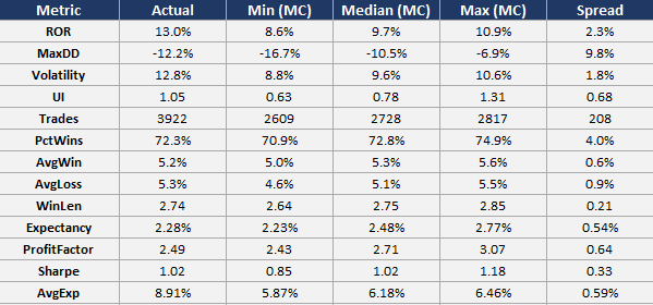
First, let’s discuss percent wins, average win, and average loss. These three metrics in the baseline (actual) system result were 72.3%, 5.2%, and 5.3% respectively.
When we compare these metrics to the median result of the trade skip runs, we see percent wins go from 72.3% to 72.8% (slight increase), average win go from 5.2% to 5.3% (slight increase), and average loss go from 5.3% to 5.1% (slight decrease). This means that across the board the median result of the trade skip Monte Carlo is better than the baseline system.
This same story holds for expectancy and profit factor. Expectancy in the baseline system goes from 2.28% to 2.48% when compared to the median result; and profit factor goes from 2.49 to 2.70 when compared to the median result. Again, the median result is better than the baseline result.
This tells me that more bad trades are being skipped than good trades; which kind of makes sense given the negative skew of mean reversion. Mean reversion tends to have very ugly left tails and short but dense right tails. The trade skip is causing small winners to be skipped, but there are a ton of small winners, so skipping some of these doesn’t affect the result too much (which is exactly what we want to see).
But when a losing trade is skipped, there are higher odds it was a large loser, so skipping it makes a bigger difference to the outcome of the strategy. This is what we want to see. This result tells us that skipping trades does not have a negative impact on the stability of the system. The underlying system metrics hold together and there are not a handful of outliers inflating the results of the system.
It’s also worth pointing out, the difference between the min and max result from this trade skip test look great as well. The scatter between min and max for expectancy, percent win, average win, average loss, and profit factor is super tight, which means the system is super stable and all of the Monte Carlo runs resulted in a very similar outcome. I’d even be okay realizing the min result across the board in live trading, which is always a strong sign of robustness.
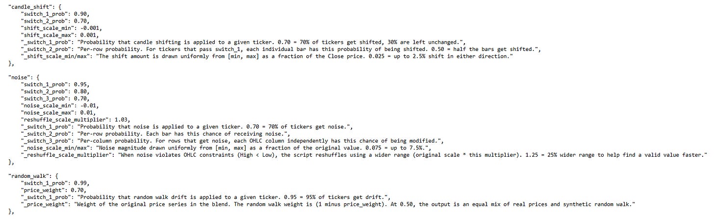
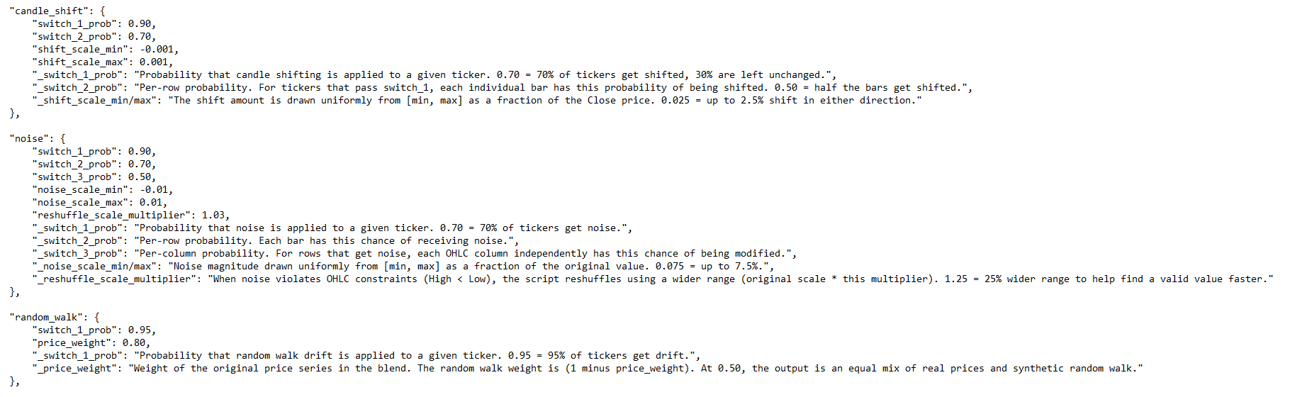
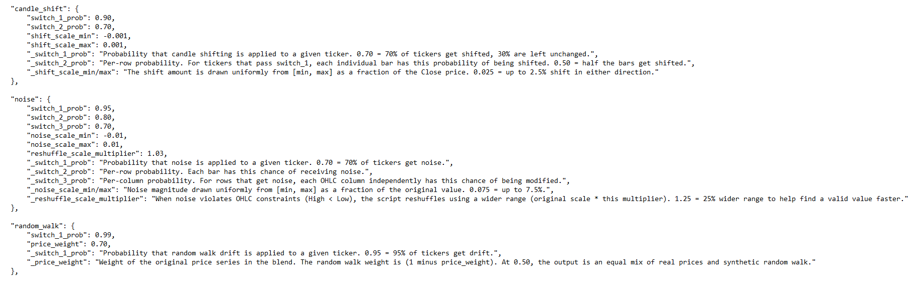
Monte Carlo: Noisy Data Analysis (All Systems Simultaneously):
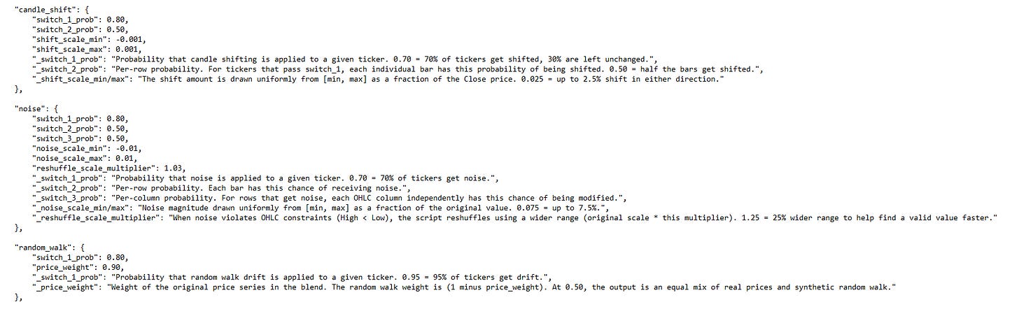
I really like this next test because it’s the only test that changes the data itself, rather than the systems response to it. To perform this study, we add random noise to the price data feeding the mean reversion mini-portfolio. I created three different datasets with different levels of noise: low, medium, and high.
It is worth pointing out that noise is defined and can be implemented in different ways. These three methods are how I added noise to the data (I used all three methods at the same time with varying severity):
Candle shift: Shifts entire OHLC candles up or down by a random delta. Preserves the candle range (High minus Low stays the same).
OHLC noise: Adds independent random noise to individual OHLC fields. Reshuffles High/Low if OHLC constraints are violated.
Random walk: Blends the original price series with a synthetic random walk to create gradual drift. Preserves candle structure by applying the same delta to all OHLC fields.
If the combined portfolio only works on the exact historical price series it was tested on, the signals may be fitting to specific price paths and random patterns that will never repeat, rather than capturing a real structural edge. The system should be able to hold up to some noisy data and not self destruct the second the data changes a little, because the future will be slightly different than the past.
One thing I learned while running this test is that depending on how you implement the noisy data, your results can actually get better, which is counter intuitive.
Mean reversion systems enter on pullbacks, so if noise is added that shifts the price downward and the system enters, the next candle may not necessarily have any noise added, so it makes the rebound even more aggressive, increasing the returns of the system.
So, the most stringent way to add noise to this system would be to have very small candle shifts up and down and very small changes to OHLC data. This is because artificially lower closes and lows allow the system to get better fills, and artificially higher closes and highs allow the system to get better exits. Instead, focusing on the random walk implementation is where most of the noise was added.
A very small amount of candle shift and OHLC noise was added to the data, but varying severities of random walk was added. How the random walk is applied is by randomly generating a random walk price series with the same volatility as the underlying symbol, then a weighted average between the two series is applied; where the weighted average blend percentage can be played with to preserve more or less of the original price series.
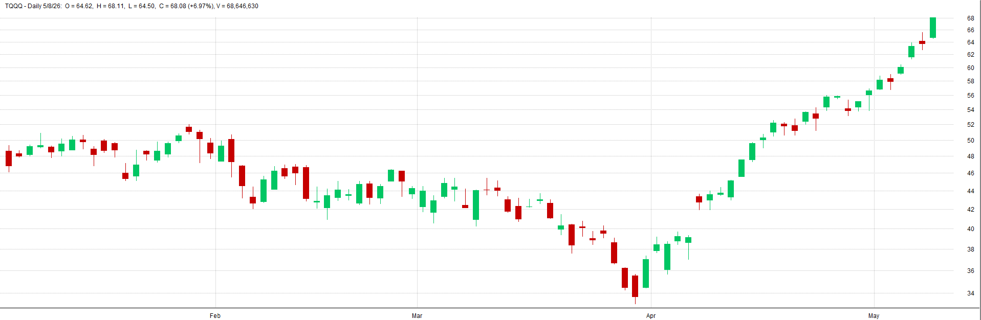
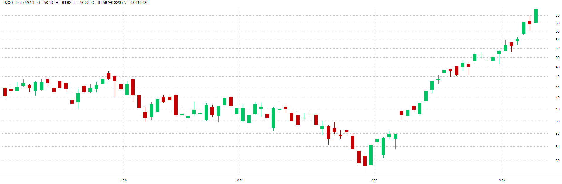
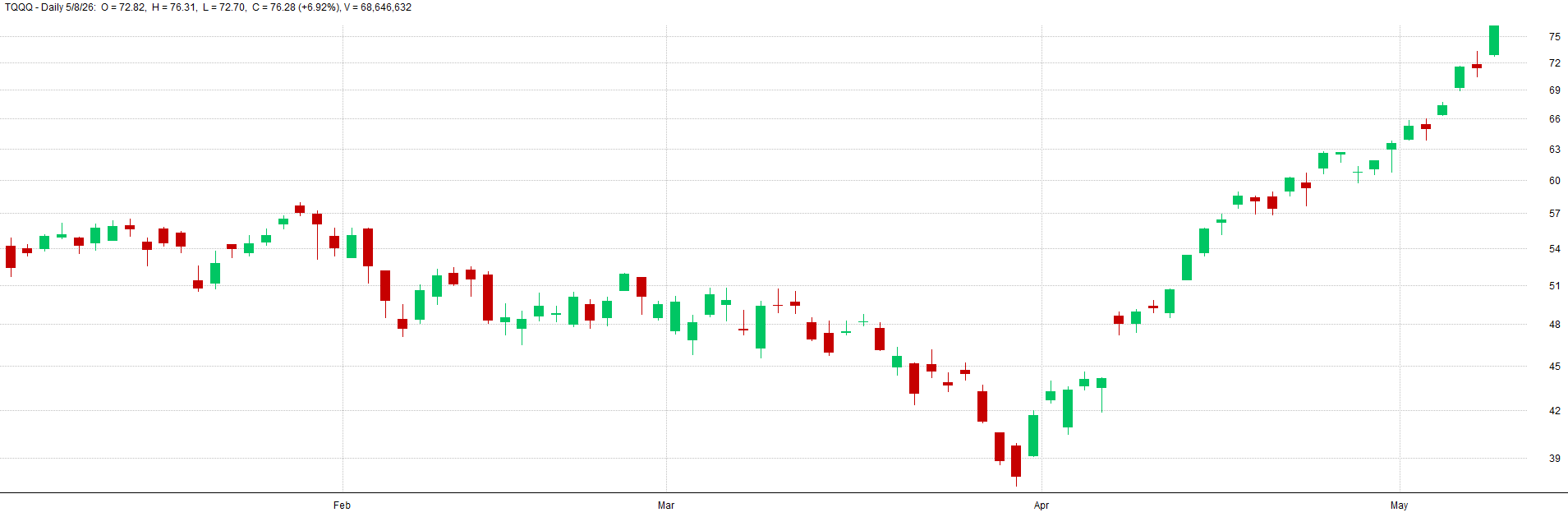
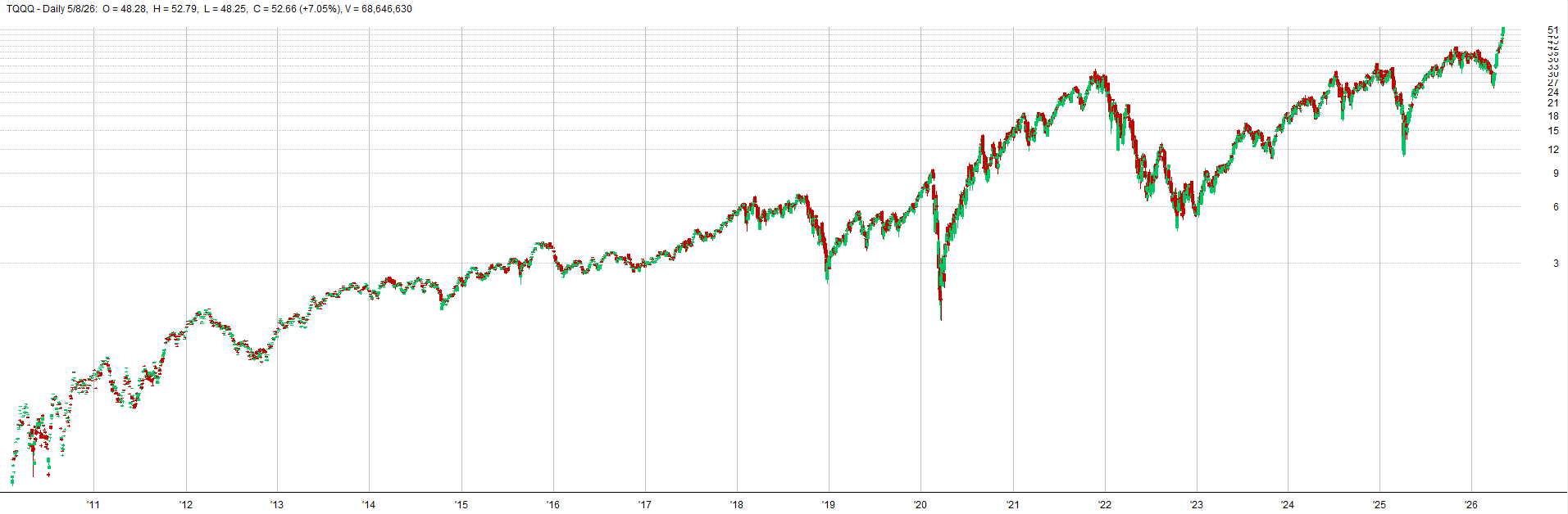
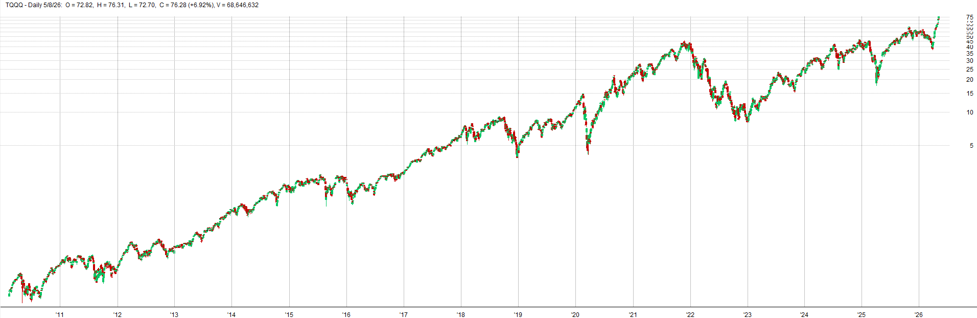
See below for TQQQ examples of varying levels of noise from low, to medium, to high noise.
Low Noisy Data - TQQQ Example:
Medium Noisy Data - TQQQ Example:
High Noisy Data - TQQQ Example:
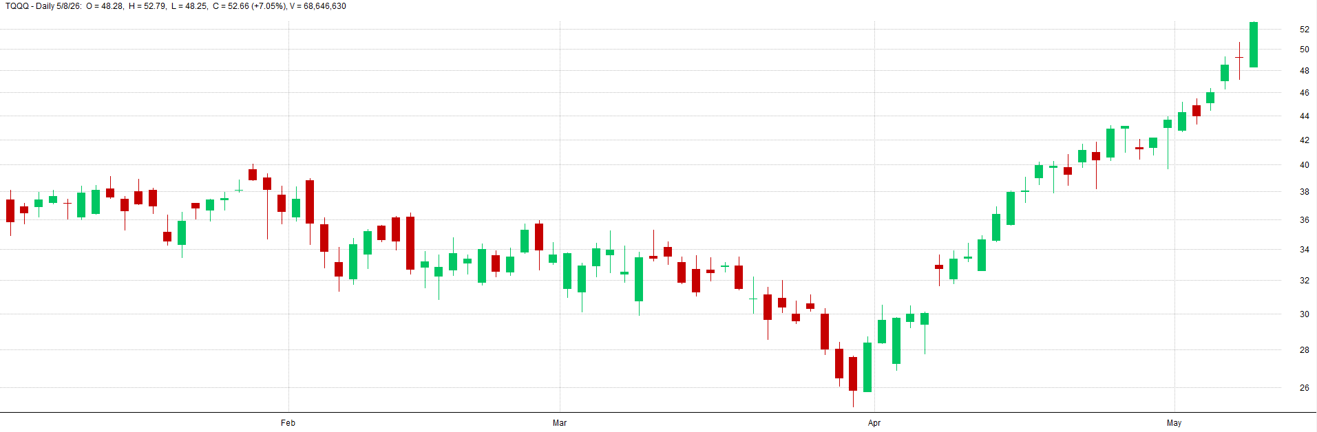
Real Data - TQQQ Example:
Here is a comparison that is more zoomed out of how the price series can differ due to the random walk weighted mix into the price series:
Zoomed Out With Random Walk - TQQQ Example:
Zoomed Out Real Data - TQQQ Example:
I ran three levels of noise: low, medium, and high. For each noise level I created 5 different universes of noise. This means noise was randomly added to 5 sets of data.
So, each data set had noise added to different candles, and different random walk sequences were created and mixed into the underlying price series. This allows us to test 5 different versions of the price series per noise level.
The configurations I ran for each noise level are as follows:
Low Noise:
Medium Noise:
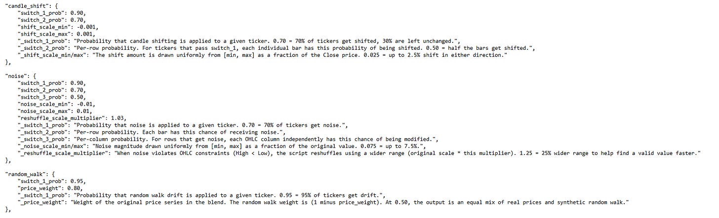
High Noise:

Now let’s get into the random data results table. It’s worth pointing out, I did run this test on the leveraged ETFs all the way back to 2010, but I kept running into issues on low priced tickers. Some of the tickers had very low prices on the back adjusted data in the early years, so adding the noise was causing some goofy results where a systems equity curve would shoot up massively.
I’ll need to look into this more and fix the noisy data code to account for this issue. But for now, I am just showing the 2018-2026 noisy data results to avoid some of the weird price noise anomalies that were happening in some of the high noise datasets.
Random Data Results:
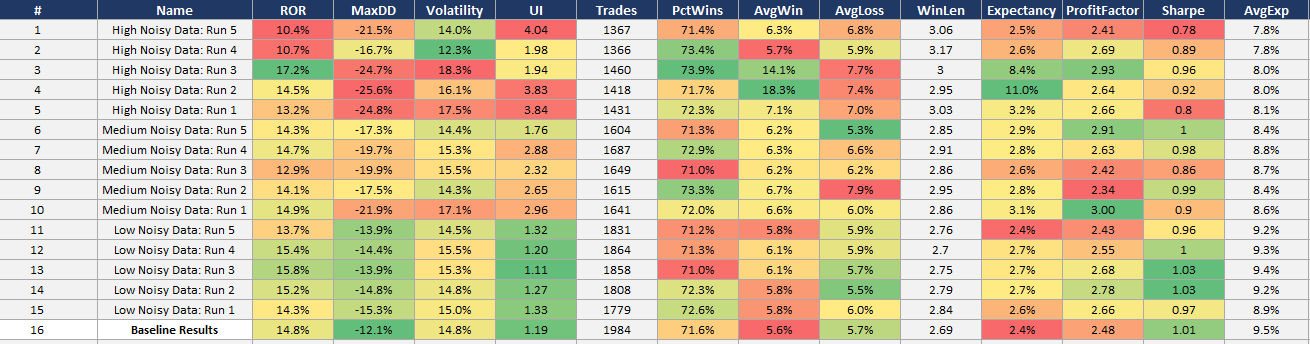
The baseline data results are the bottom row. Each noise level and sub-run within each noise level are shown on the rows above the baseline data results.
We want to see the system perform similarly on noisy data as real data. Some degradation may be expected, but we definitely don’t want to see the system completely fall apart.
A good sign that the system can capture an underlying phenomenon and is not overfit to a specific price path is if the system can still make money when the price history is slightly different.
Adding noise doesn’t remove the phenomenon from the data that the system harvests, it just disguises it in a different way. If the system can still pluck it out of the data and trade it with similar profitability as the baseline data, that’s a great sign of robustness.
These results show just that. The noisy data results are on par with the baseline data results. There is some degradation, the max drawdown, volatility, and Sharpe generally get a little worse with the noisier data; but that is as expected. Even the results of the highest noise data is still more than tradable.
Below I show some example equity curves. I show first the baseline system from 2018-2026. Then I show one example equity curve from one of the noisy datasets (low, medium, and high). This will give you a feel for what the noise does to the results.
Baseline Results - Equity Curve:
Low Noise Run 4 - Equity Curve:
Medium Noise Run 2 - Equity Curve:
High Noise Run 4 - Equity Curve:
I would trade every equity curve shown here (and every other noisy equity curve not shown here as well).
Again, a great sign of robustness is when the underlying data is noisy and the system can still pick up on the underlying effect and trade it profitably.
Live vs Backtest Comparison:
As you can see from the previous section, the results of these robustness tests, along with the in-sample and out-of-sample results, gave me the confidence to pull the trigger and go live with this mean reversion mini-portfolio.
Also, just knowing how these systems were designed and how they intentionally had robustness and diversification built into the mini-portfolio gave me the further boost of confidence to go live (remember the whole thing about diversification across entry/exit timing, entry/exit price, indicator readings, instruments traded etc. that we discussed in depth in part 2).
I’ll be honest. I’m not a natural mean reversion guy. I’m naturally a longer term trend and momentum trader. I like the positive skew of trend and momentum, and the slower pace. Mean reversion is the opposite in all ways.
But the testing showed these were the most promising mean reversion systems I’d ever developed. The methodology this mini-portfolio follows is also one of the most robust methods I’ve ever developed. I had no excuse, so I pulled the trigger.
Sometimes trading these mean reversion systems still makes me nervous. Again, it’s just the nature of how these systems go against my natural trader mindset. But other times trading these systems makes me excited, because they capture the bounce that my other systems miss out on. And as you can tell from the story at the beginning of the article, sometimes I get too excited, which then leads to nervousness when negative outcomes happen.
Hence, why I had to size down my positions. Reducing my position size / allocation helped a lot. I find I am much less nervous now when the mean reversion mini-portfolio loads up on positions. So take the lesson from me and be on the safe side and allocate a little less than you think you should, rather than a little bit more.
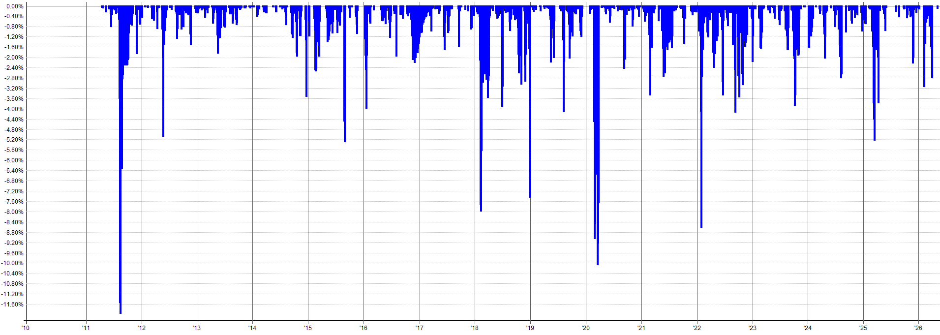
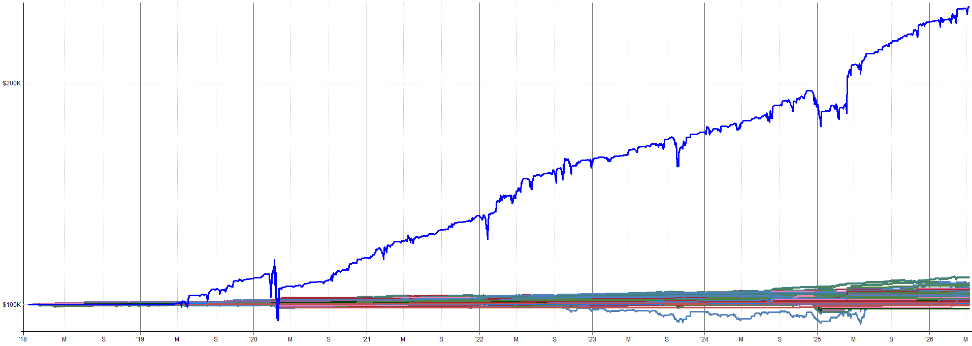
Anyway, I know I have already shown these results, but here they are again. The live out-of-sample real money results since August of 2025 with my mean reversion mini-portfolio.
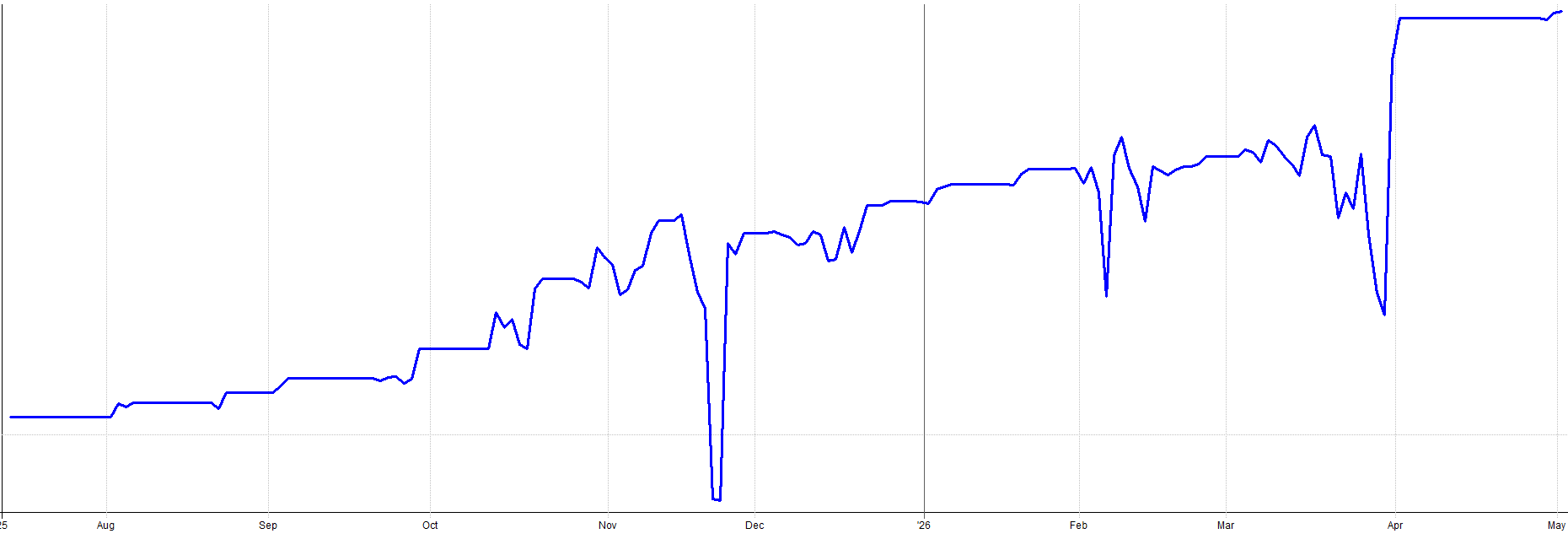
Compare these results to the backtested results for the same time period:
It’s worth pointing out a couple things. During live trading, I started on unleveraged ETFs for the first few trades as a proof of concept. I wanted to ensure everything was working before going to the full risk allocation on leveraged ETFs. That’s why the first few trades return a little less than the backtest.
Also, remember I sized down my allocation last December after the late November drawdown I experienced where my overallocation to the mean reversion mini-portfolio made me too nervous for comfort.
I also added one other mean reversion system partway through the time period on top of the four shared here. It’s nothing special, just different indicators and more diversification across price, time, instrument etc.
The only reason I didn’t share it here is because the idea came from a trading friend of mine and I didn’t want to share someone else’s ideas. But again, it’s nothing special, just more variation on top of the mean reversion methodology shared in this article series.
With all that said, the backtested and live performance aligns very well. It’s normal to have a little bit of variation. Given all the subtle tweaks I made over time to better nest this mean reversion mini-portfolio into my overall portfolio, I’d say my backtest assumptions hold up pretty well to a live trading environment.
Execution Reality and Live Trading:
Order Management Workflow:
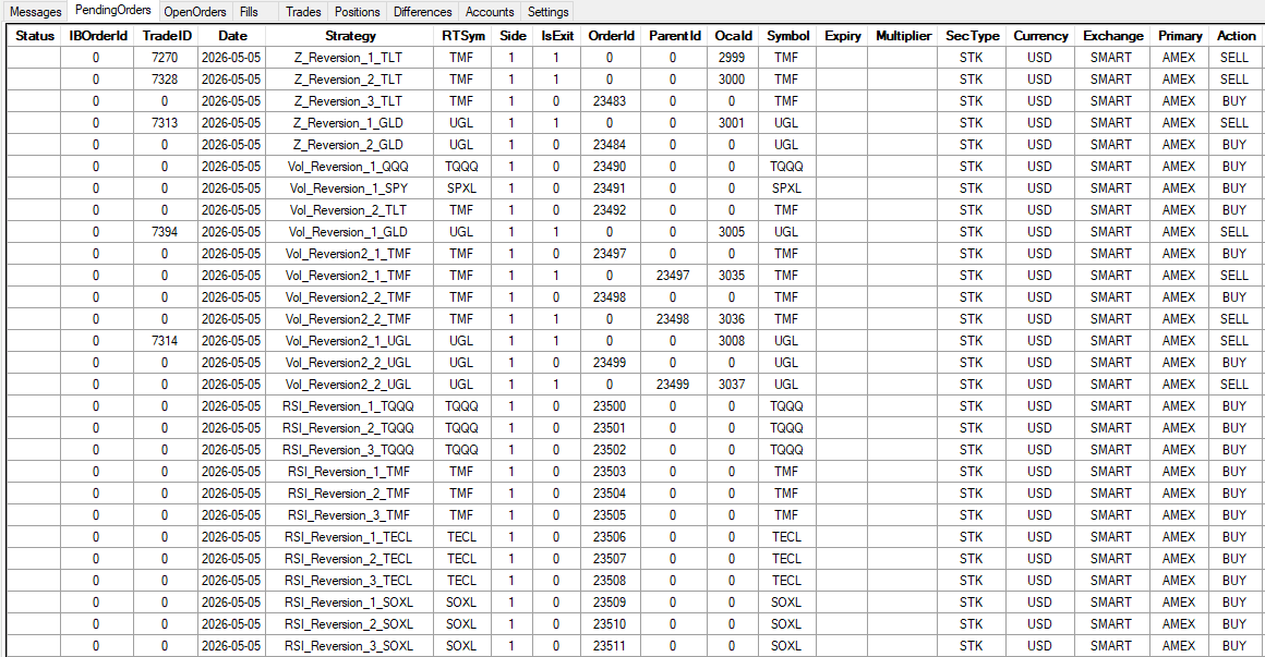
Let me walk you through the daily routine I follow to trade this mean reversion mini-portfolio because I bet some people imagine this is way more time consuming than it actually is.
It only takes a couple of minutes to trade every day. I use RealTest (outputs orders) with Order Clerk (reconciles and places orders with broker). The two tools work together to make the process of trading the mean reversion mini-portfolio (along with the rest of my portfolio) very straight forward.
I’m not sitting there manually calculating position sizes and entry levels and placing 30 staggered entry orders every day because these mean reversion systems scale into positions. All I do is click a few buttons. The system generates the orders, I spot check them, and I click submit.
On a busy day, all four mean reversion systems are sending orders for almost all ETF assets traded. Anywhere from 20 to 40 orders all getting placed in one day. On a quiet day, it’s maybe 5 to 10 orders for just a couple of different ETFs. But both scenarios are the same amount of work for me.
Today was a moderately high order count day:
The mean reversion mini-portfolio runs in the same Interactive Brokers account as my other systems. Long term trend and momentum systems hold the bulk of my exposure. The mean reversion mini-portfolio fills in the exposure cracks and takes up the rest of my open capital.
When mean reversion orders get filled, I sometimes go into margin. I’ll hold that margin for a few days until the price reverts, then exit the mean reversion position and go back to nominal portfolio exposure.
The crossing orders problem:
So, there’s one small issue that arises from time to time with the mean reversion mini-portfolio that is slightly annoying. It doesn’t happen too often, I only just recently noticed it.
It has to do with placing so many orders at staggered prices on the same instrument. The issue is that sometimes one system wants to buy a position and another wants to sell a position and you have an order crossing and Interactive Brokers cancels one of the orders.
Basically, if the price closed in the right spot, one system would want to sell and another would want to buy and, from the perspective of the broker, you would effectively be selling the position to yourself. The broker doesn’t like that, so they cancel one of the orders.
This really doesn’t happen that often, but it can be exacerbated if you trade other systems on the same ETFs as the mean reversion mini-portfolio. I have a couple seasonality trades on bonds I’ve implemented using the same TMF ETF as the mean reversion mini-portfolio. I’ve noticed when the seasonality system kicks on, I sometimes get trade rejections on the TMF ETF. It’s annoying, but I deal with it because it hasn’t been anywhere close to detrimental enough to meaningfully harm the system.
It goes back to the whole diversification across many assets, entry/exit levels, entry/exit times etc. If the order of one sub-entry from one system on one asset within the mean reversion mini-portfolio gets canceled, it really doesn’t do much at the mini-portfolio level. That’s the mindset I take with this rare situation.
With that said, if there is something I can do about it I will. If I am working from home that day or if I get home from work early, I’ll check in on the trade and see if any of the conflicting orders are unlikely to get filled. If so, I’ll cancel the side that is more unlikely to be filled and re-place the order for the side of the trade that is more likely to get filled. That 5 minutes of work every once in a while solves the issue.
And even so, most of the time when this order crossing issue happens, neither order would have been filled anyway, so many times it doesn’t even matter. If I can’t be home near the market close to modify the order, I just let the cancellation be, and move on.
This is an 80/20 solution. It’s not perfect, but live results still track close enough to backtests. This is the interim solution until I build/find a better solution. I accept the imperfection for now.
What It’s Actually Like To Trade:
Hopefully the introduction to this article provided a good framing for the bad side of trading the mean reversion mini-portfolio.
It’s important to share the good and the bad.
Because, as I learned, you need to size for the bad if you want to experience the good over the long term. So, let me walk you through what live trading this mean reversion mini-portfolio actually feels like.
The equity curve on a weekly or monthly chart looks smooth. Up and to the right in what seems like a straight line.
You look at it and think:
“I can handle this.”
But the day to day feel is a different story.
I got burned by this exact thing. The high timeframe equity curve looked so smooth that, as I mentioned, I oversized my allocation to the mean reversion mini-portfolio. I was excited to trade it. It was new, stable, and very uncorrelated to the rest of my systems.
I overlooked the shorter timeframe volatility, the day to day spikes. These are what we actually feel as traders. We don’t feel the zoomed out 10 year backtest performance, we feel the day to day and week to week performance, which is a lot more choppy.
Mean reversion inherently means you’re buying into drawdowns. You’re adding to positions when the market is dropping. Negative skew is baked into the system dynamics.
The systems buy when most people are most fearful and when most traders emotional states say:
“Stop! no more!”
But the mean reversion systems say:
“Keep buying, continue the scale-in with signal strength as designed”.
The hardest psychological moments are on Fridays. It feels like every time the markets sell off it’s on a Friday and I end up fully loaded on mean reversion positions, holding that risk through the weekend. These uncomfortable moments are why you get paid for trading this system.
Holding the risk nobody else wants to.
Providing liquidity to people trying to de-risk going into the weekend.
Holding that risk over the long term should pay off. But from time to time you’ll get whacked for it. You’re stuck in a scary situation for two days and you can’t do anything about it. That’s just part of the game.
The experience I discussed at the start of this article was uncomfortable enough that I went back in and lowered my allocation after. The lesson was to zoom in and consider the day to day volatility and consider worst case impacts.
It’s very easy to get into an uncomfortable position when you allocate too much, especially with leveraged ETF products. I got greedy and sized for the upside instead of the downside.
I know I always preach to size for the worst case scenario, but even I still make mistakes. Mistakes are how I learn. I always learn everything the hard way. In fact, I prefer learning the hard way. It makes me better and really solidifies the learning experience so I don’t do it again.
I’ve come to have peace with losing money if it means I got a good learning experience from it. It honestly happens to me all the time. It’s just me paying my market tuition.
What I Would Do Differently:
Size More Conservatively From the Start
I already mentioned this, but it’s worth repeating again because it’s the single biggest lesson I learned.
Size smaller than you think.
The reality is you live day to day. You don’t experience the monthly or weekly equity curve. You experience the daily swings. Shorter term fluctuations and volatility are what you actually feel. Don’t let the smooth high timeframe equity curve trick you into oversizing.
My thought process would be to size for a drawdown that’s double what the backtest shows. If the backtest says 15% max drawdown, allocate as if you’ll see 30%. Because when you’re living through it, it feels twice as bad as the number on the screen.
As an example, say you’re allocating a percentage of your overall portfolio to this mean reversion mini-portfolio. Maybe you don’t want to see more than a 10% drawdown from this mean reversion mini-portfolio when viewing from the overall portfolio context. If the mean reversion mini-portfolio has a 15% max drawdown, that means the max allocation would be 10/15 = 66% allocation.
But let’s be safe and assume the real worst case drawdown of the mean reversion mini-portfolio is 2x what the backtest says, i.e. 30%. That means portfolio level allocation to the mean reversion mini-portfolio would actually be 10/30 = 33% allocation. This is a simple yet effective way to think about allocation to the mean reversion mini-portfolio, or any system really.
Building Confidence and Scaling Up
It’s been about two-thirds of a year since I launched the mean reversion mini-portfolio. At this point I am starting to feel real confidence in the systems.
But that confidence took about nine months of live trading to build.
It didn’t happen after the first week.
It didn’t happen after the first good month.
It happened gradually, as the live equity curve kept matching what the backtest said it should do.
Starting a new system or set of systems is scary. No matter what the out-of-sample or robustness tests show, there is always an unknown. We never know what’s around the corner. So if you’re like me and are adverse to mean reversion systems, start smaller than you think.
Not only size for 2x the worst case drawdown, but add even more padding on top of that, at least until you start to get confidence with it.
Maybe even start with one or two of the systems instead of all four. Then add the others as you gain experience, understand how it works, get a grip on what the day to day feels like, and get the live trading operational side of things down.
As confidence builds, add more systems or scale up size to the 2x max drawdown allocation size. No need to go all in at once or go full size all at once. You can ease into it.
Don’t do what I did and go crazy with sizing just to be scared to death because I’m holding more risk than I ever have before.
Conclusion:
Part 1 introduced the four systems and the entry and exit logic. Part 2 showed how they combine into a portfolio with ranking, correlations, and return analysis. Part 3 proved the robustness of the method and the truths of trading it live. Hopefully this provides a good framework and understanding of what it takes to go from backtesting to live trading and what to expect along the way.
The portfolio effect is the only holy grail. You’ll notice not a single one of these individual systems is amazing. That’s by design. I would rather have four mediocre but robust systems that combine into something strong than one perfect looking system that fails because it was curve fit.
IS/OOS validation across multiple windows (2010 to 2018 in-sample, 2018 to 2025 forward out-of-sample, pre-2010 backward out-of-sample on unleveraged ETFs, 2025 to today live results) confirms the edge is stable in time.
Robustness testing confirms the system is in a stable parameter region and the system can withstand noisy data because the markets will only get more noisy with time. Also, live results since August 2025 track backtest expectations, which confirms the most important aspect about a system, that it works with real money (at least thus far!).
The biggest lesson learned was to size more conservatively than you think. Allocate for 2x the drawdown you expect. Don’t let the smooth equity curve fool you. The drawdowns tend to be short lived but they can be very steep. And start small and build up slowly as confidence grows.
Disclaimer
The information and services provided by the Systematic Trading with TradeQuantiX newsletter are for educational and informational purposes only and do not constitute financial advice, investment recommendations, or guarantees of trading performance. Any information provided is general in nature and does not take into account your individual circumstances. Trading involves significant risks, including the potential for substantial financial losses, and past performance is not indicative of future results. The information is provided ‘as is’ without warranty of accuracy or completeness. All decisions and actions based on the information provided are the sole responsibility of the reader. You should seek independent professional advice before trading. The Systematic Trading with TradeQuantiX newsletter is not liable for any losses, damages, or outcomes resulting from the use of this information or our services.
Robustness Test Excel Sheets:
These excel sheets are also in the GitHub, along with the noisy datasets, and the systems used in the robustness tests.